AirTap’s journey: From Figma to a fully custom Shopify store design

Rebecca Anderson
AirTap’s journey: From Figma to a fully custom Shopify store design
In mid-2024, AirTap approached Unison, a marketing agency based in Enschede specializing in websites and online marketing campaigns, to create a custom Shopify webshop. The objective was threefold: generate awareness for AirTap’s hydrogen machines, educate visitors about the benefits of hydrogen therapy, and drive sales of their machines and accessories.
Unison, already experienced in creating Shopify webshops, saw this as the perfect opportunity to explore Instant Page Builder. After discovering Instant through LinkedIn, they were intrigued by its flexibility and functionality—particularly the design freedom it offered compared to limited Shopify templates. With the help of Instant’s Figma to Shopify plugin, Unison built a comprehensive and visually stunning Shopify storefront for AirTap in just two months.
This case study details how the entire site was crafted, the design and purpose behind each page, and the key role Instant played in making this project a success.
The project overview
AirTap’s vision was clear, and Unison stepped in with a structured plan to bring that vision to life.
The webshop had three primary goals:
Increase awareness of hydrogen therapy and AirTap’s machines.
Provide detailed, accessible information about the science and benefits of hydrogen therapy.
Facilitate seamless purchases of machines and accessories.
Unison began with the design phase, where two designers created all required sections in Figma. These designs were seamlessly translated into functional Shopify sections using Instant’s Figma to Shopify plugin. And section by section, AirTap’s store design came to life in Instant.
“During the process of converting the Figma designs into working sections in Instant, the team introduced several new functionalities. We incorporated as many as possible, like dynamic sliders based on collections (for accessories), and the conversion of sections designed for desktop to mobile-friendly versions became much easier.” – Benny Stapel, Digital Marketer at Unison.
AirTap’s website: A page-by-page breakdown
With the foundation set, Unison turned their attention to building each page with specific goals and audience needs in mind.
Here’s a look at the final store design:
Home page: A comprehensive introduction
AirTap’s home page sets the tone for the entire website, balancing education, trust-building, and strong calls to action.
Here’s what was included in the design:
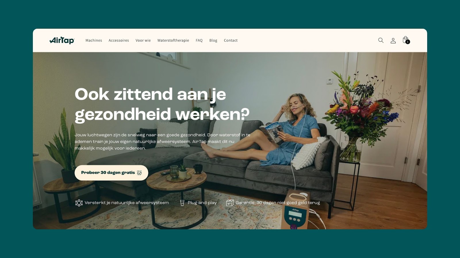
Hero banner: A bold introduction highlights the benefits of hydrogen therapy, immediately engaging the audience.
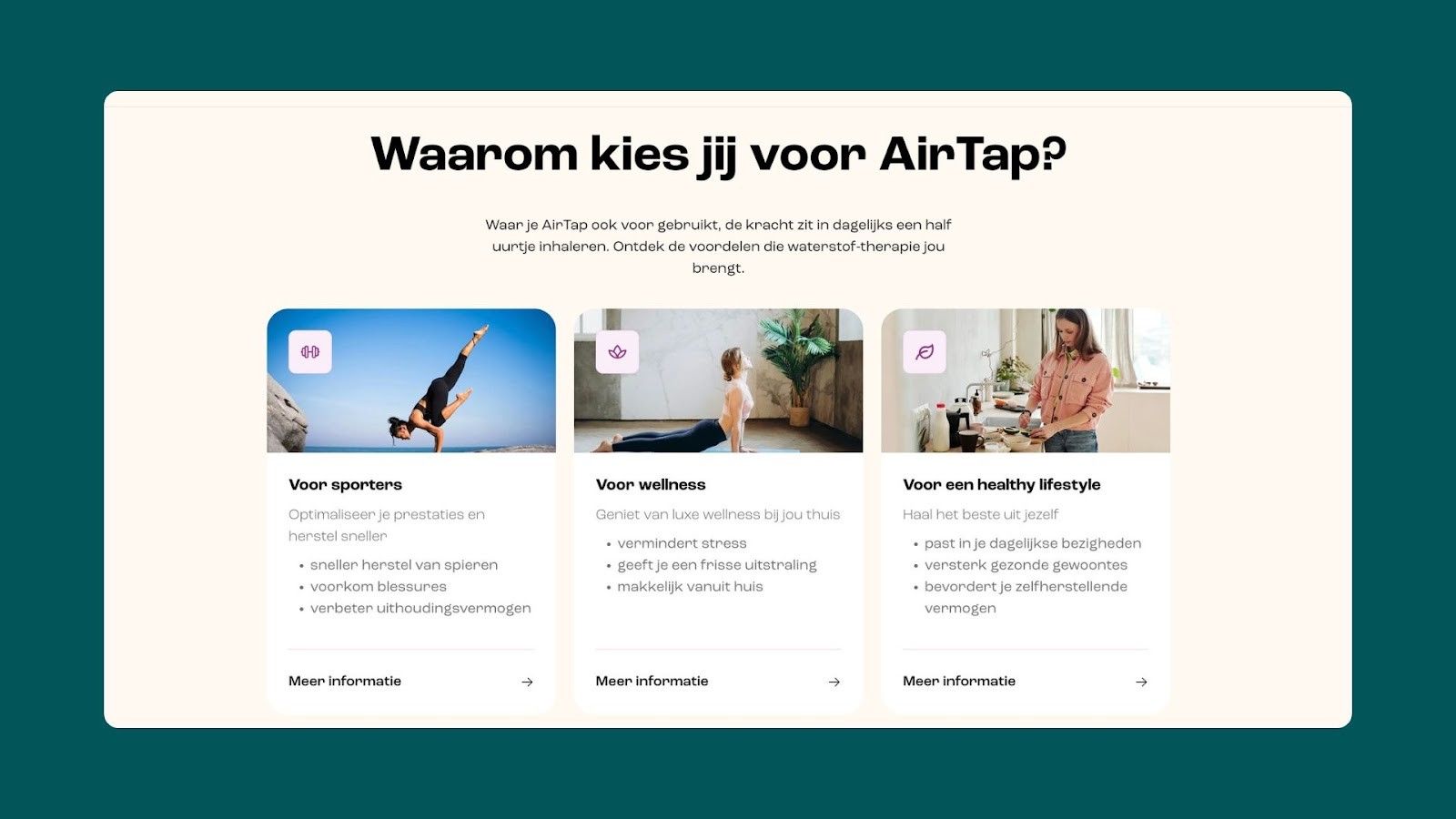
Target audience section: This section segments visitors by their interests—athletes, wellness enthusiasts, health-conscious individuals, and people over 50—each leading to dedicated pages.
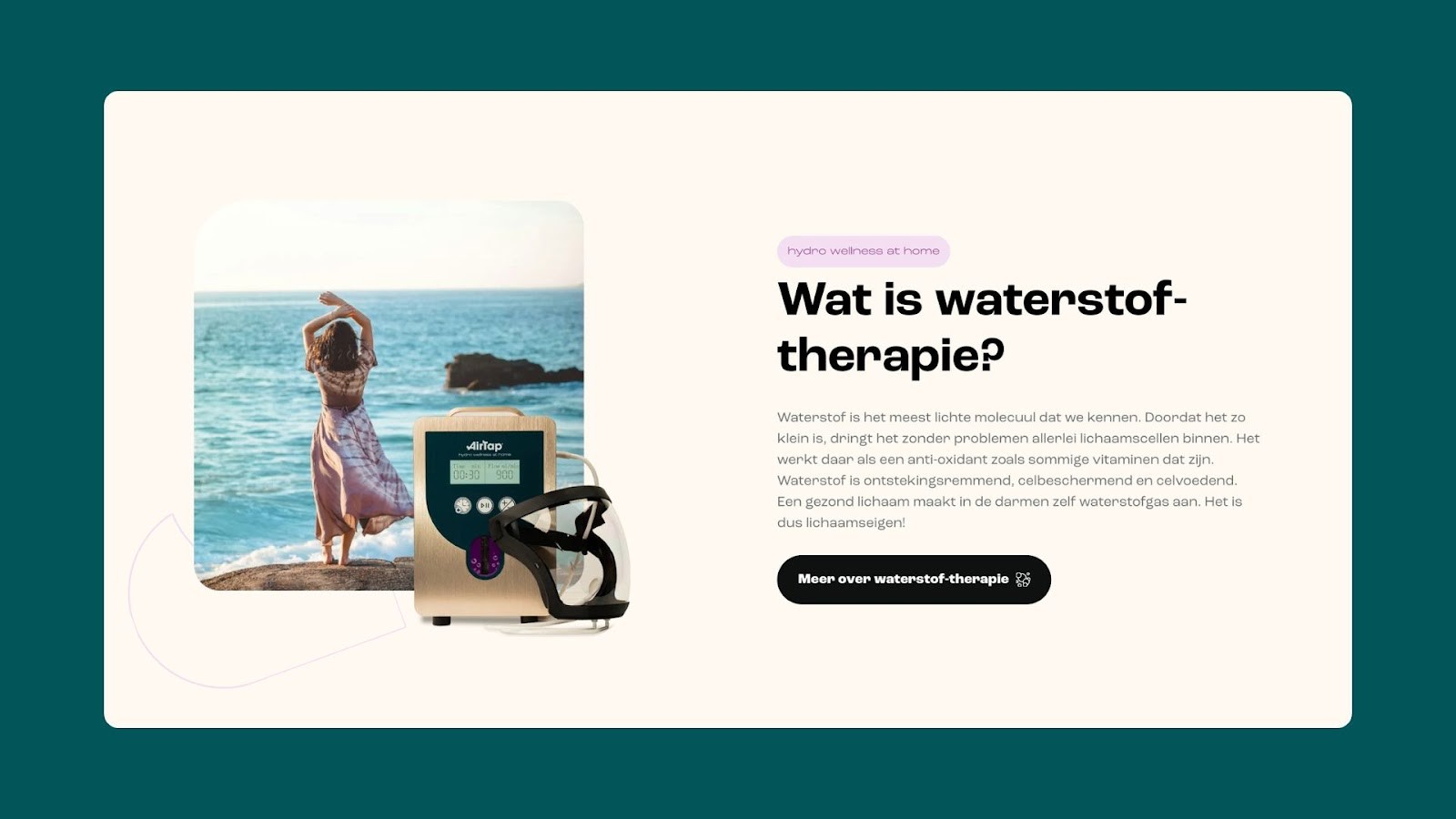
Product and science overview: Key sections explain hydrogen therapy and showcase AirTap models, helping visitors understand the technology while exploring product options.
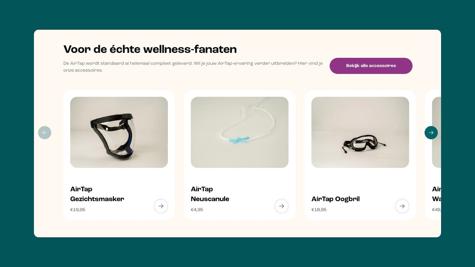
Accessories slider: A dynamic collection-based slider allows users to browse complementary products effortlessly.
Overall, their Shopify home page serves as the starting point for visitors, designed to captivate and inform.
Product detail pages: Built for conversions
AirTap’s product detail pages combine functionality and reassurance, answering potential buyer questions while focusing on closing the sale.
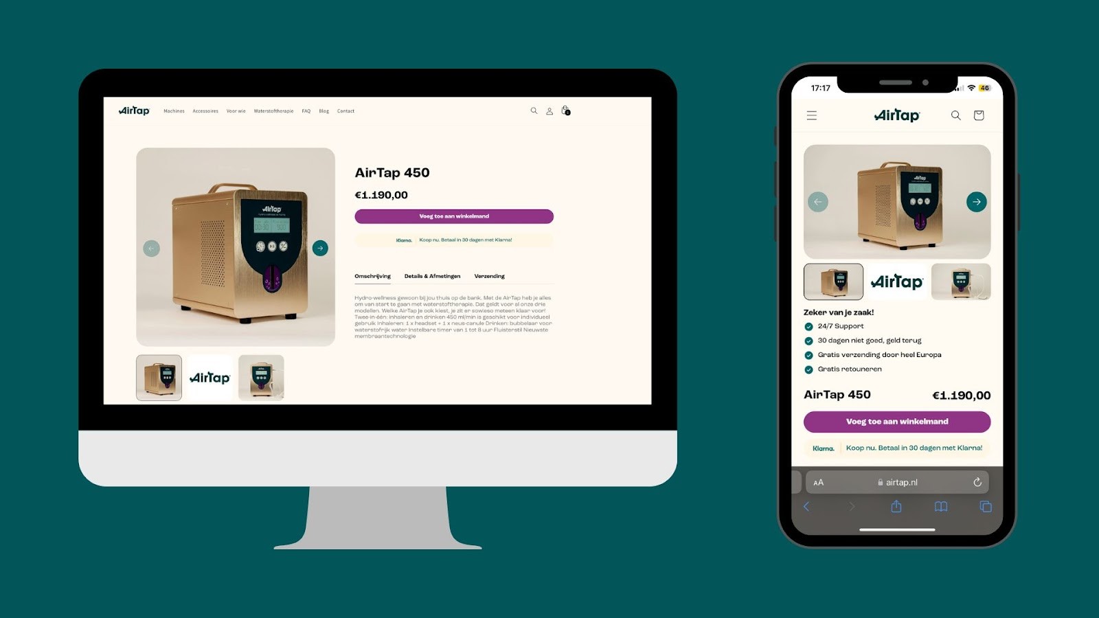
Here’s a look at some of the key elements incorporated into their PDP design:
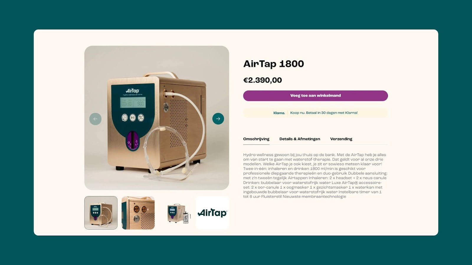
A buy box prominently displays product details, pricing, and trust builders (24/7 support, 30-day money-back guarantee, and free shipping).
Tabs for the product description, dimensions, and shipping ensure users can easily find essential information.
A sticky banner keeps the product title, price, and an “Add to Cart” button visible as users scroll, streamlining conversions.
With this carefully crafted design, their Shopify product pages ensure that customers have all the information needed to make a purchase.
Machines page: Product exploration made easy
To simplify decision-making, the Machines page showcases AirTap’s three core models with detailed cards.
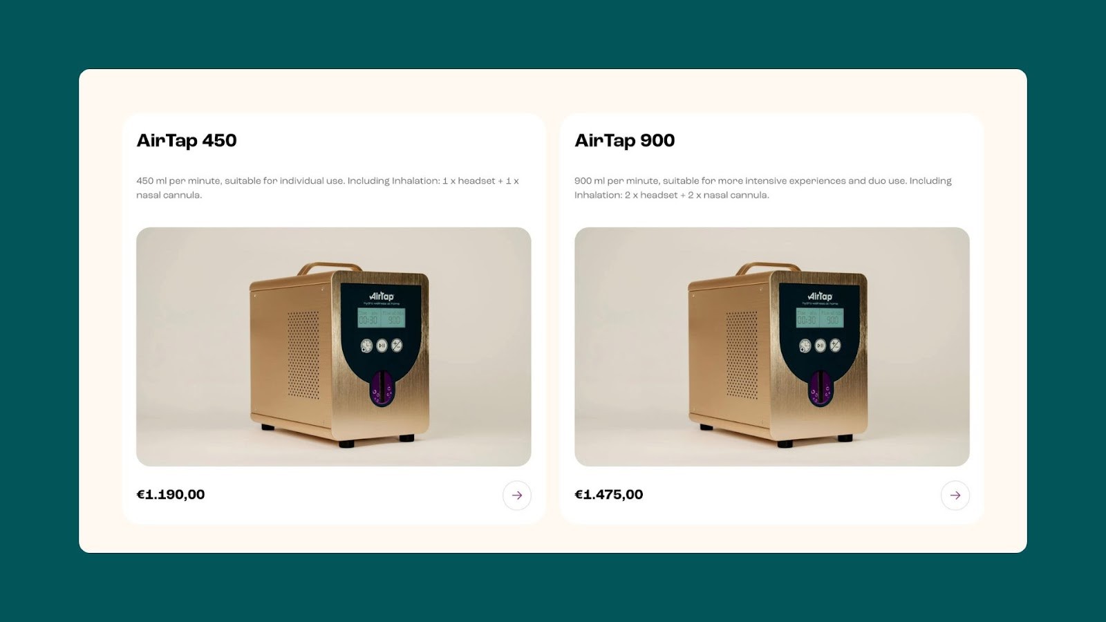
Each card highlights specifications, pricing, and use cases, making it easy for visitors to compare options.
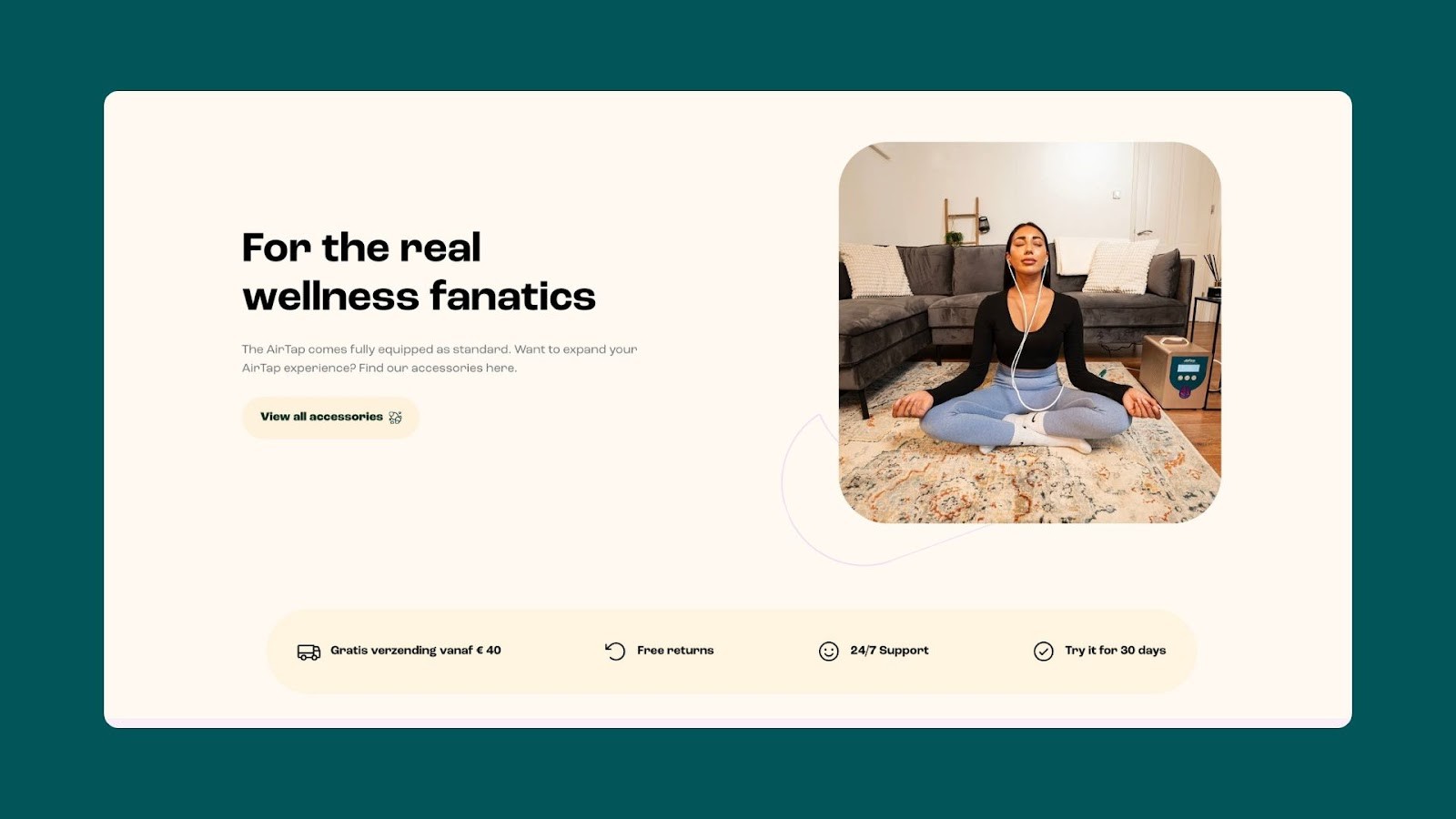
A dedicated CTA for Accessories encourages users to expand their purchases and explore complementary products.
This page acts as a bridge between education and action, guiding users toward the product that best suits their needs.
Hydrogen Therapy page: Educational and trust-building
Hydrogen therapy is the cornerstone of AirTap’s product offering, and this page positions it as an innovative health solution.
Scientific backing: Links to credible sources like PubMed and Nature Medicine add authenticity.
Detailed explanation: Clear sections describe how hydrogen therapy works and its proven benefits for health and wellness.
Trust icons: Free shipping, free returns, and 24/7 support icons provide reassurance.
This page builds trust and educates visitors, laying a solid foundation for conversion.
👉Take a look at the full Hydrogen Therapy page design.
Audience-specific pages: Personalization in action
From education to segmentation, AirTap caters to its diverse audience with four dedicated landing pages:
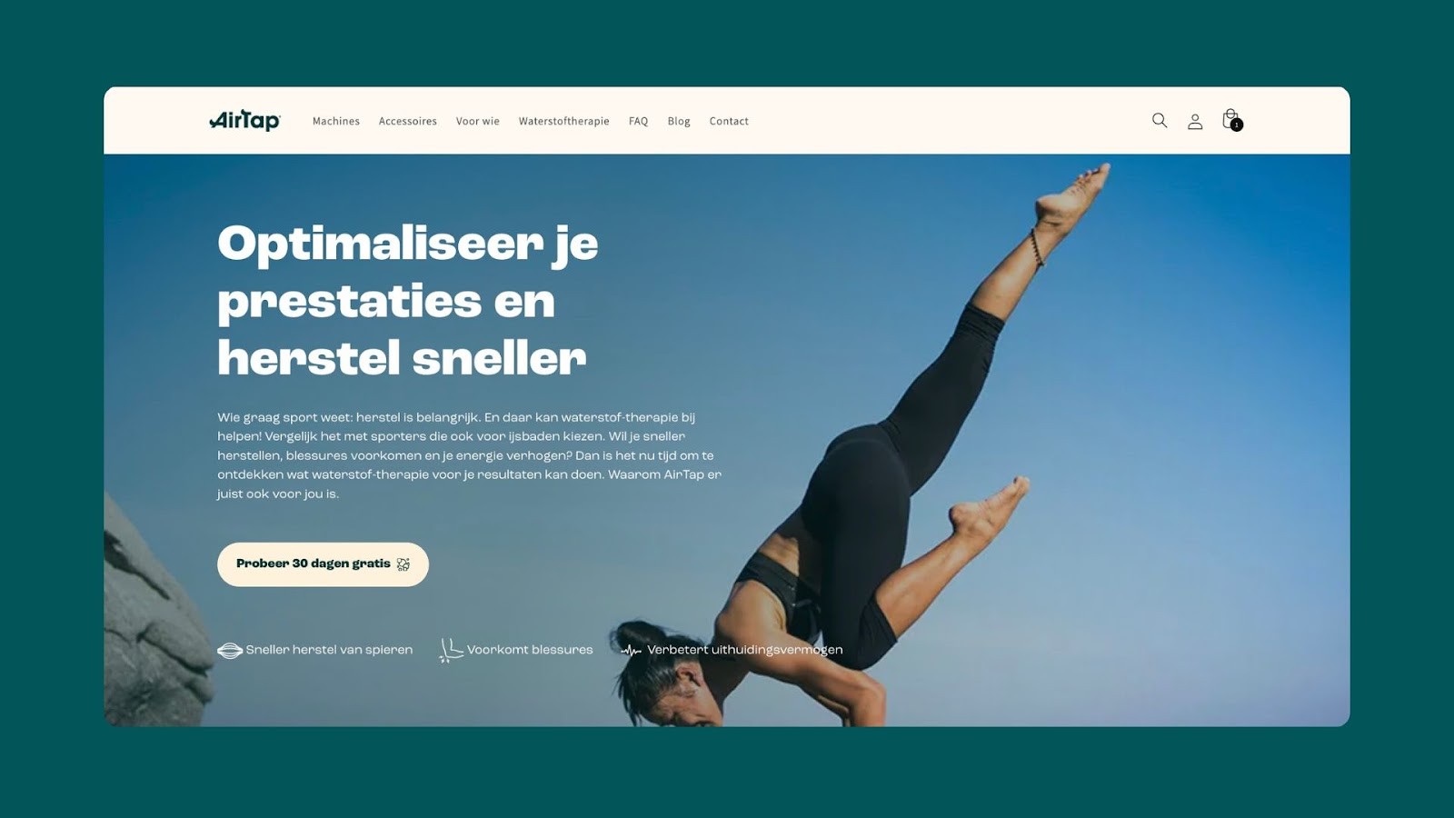
For Athletes: Focusing on recovery, endurance, and performance optimization.
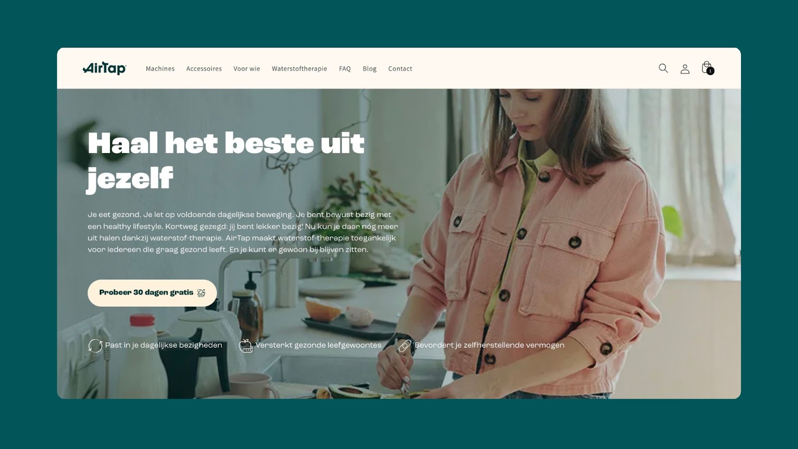
For a Healthy Lifestyle: Supporting health-conscious routines and self-healing.
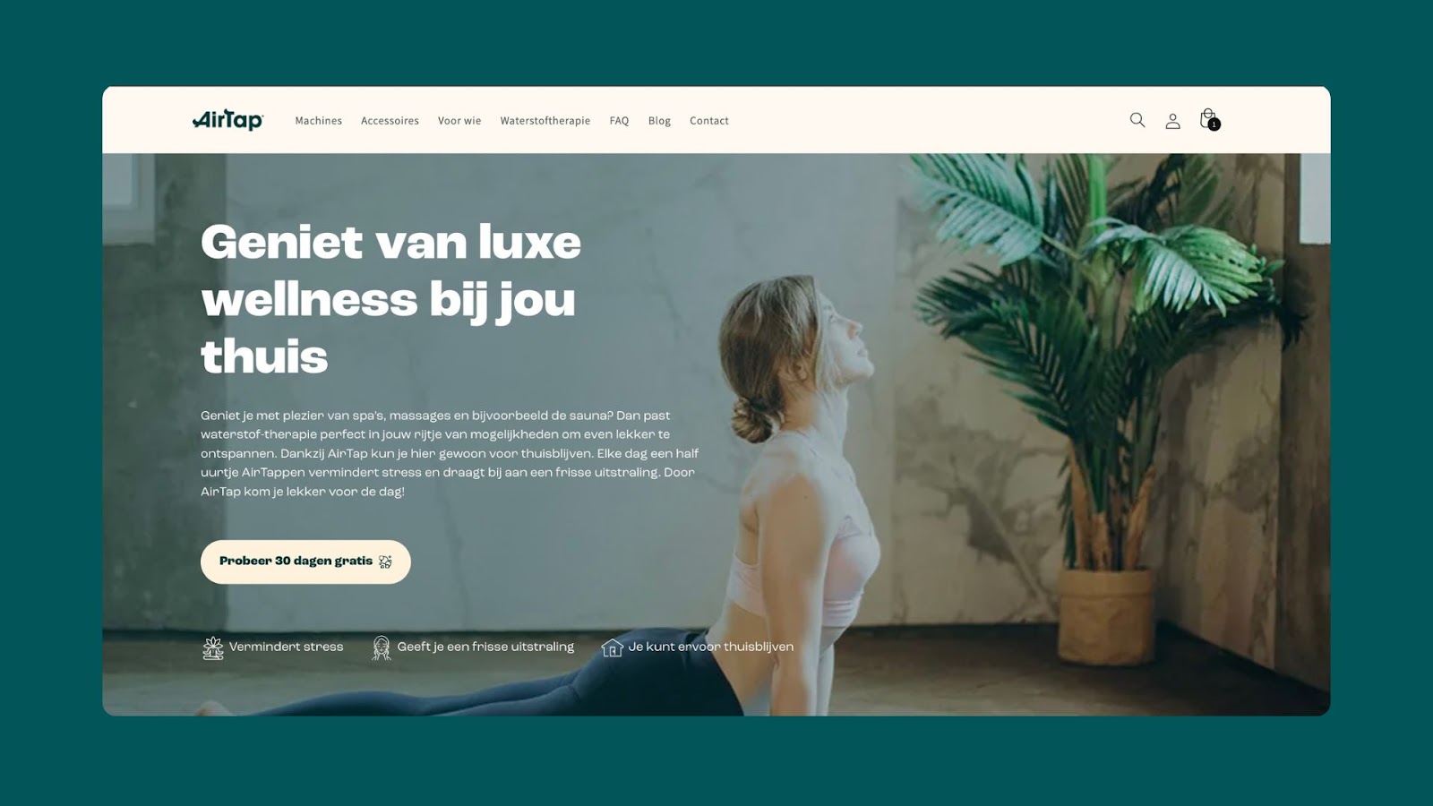
For Wellness: Positioning AirTap as a luxurious, spa-like experience at home.
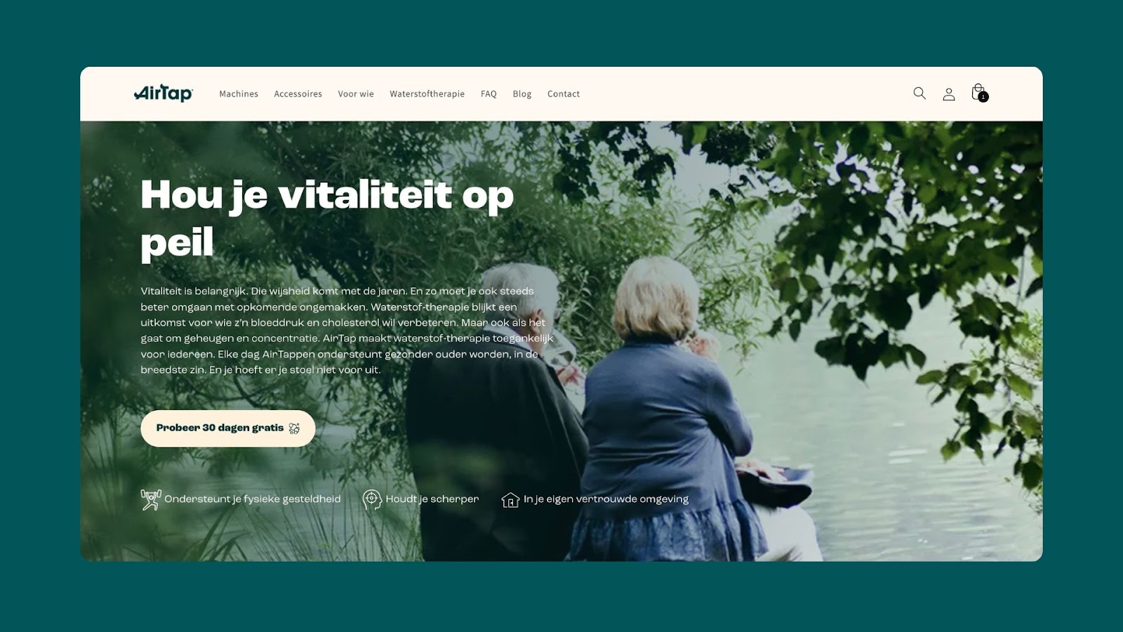
For People Over 50: Addressing age-related concerns like memory, vitality, and physical well-being.
Each page features a hero banner, relatable testimonials, and tailored product recommendations to drive relevance and engagement.
About page: Building trust through storytelling
To create a personal connection, the About page shares AirTap’s origin story and mission. Founder Ramon Walter’s journey into hydrogen therapy gives visitors insight into the brand’s values and expertise, further strengthening trust.
👉Take a look at the full About page design.
Accessories page: Upselling with style
Dynamic sliders and hover effects highlight AirTap’s range of accessories, encouraging upsells. Each product links to a dedicated page, making exploration intuitive and engaging.
👉Take a look at the full Accessories page design.
Contact page: Simplifying support
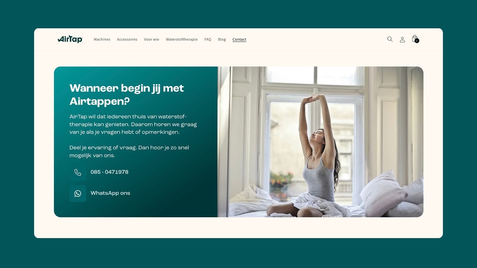
AirTap ensures customers can easily reach out through the Contact page, which offers multiple communication channels, including phone and WhatsApp. An embedded form allows visitors to subscribe to updates, while additional sections reinforce the benefits of hydrogen therapy.
👉Take a look at the full Contact page design.
Why Unison chose Instant Page Builder
Throughout the process, Instant Page Builder proved to be an invaluable tool for Unison. Its flexibility enabled the team to execute custom designs without Shopify theme limitations.
"The ease of working within Instant proved to be surprisingly helpful on more than one occasion. It gave us complete freedom to build the website we wanted. As we went along, we realized that there were many more possibilities than we had initially expected.” – Benny Stapel, Digital Marketer at Unison.
AirTap’s Shopify storefront is a testament to what’s possible with Instant Page Builder. By combining education, personalized experiences, and seamless functionality, Unison created a site that perfectly aligns with AirTap’s goals.
Want to elevate your Shopify store like AirTap? Start building with Instant today and experience the freedom of custom design without limitations.


