How to design landing pages that convert: Tips from a CRO Designer

Rebecca Anderson
How to design landing pages that convert: Tips from a CRO Designer
In e-commerce, your landing page is more than just a place to park traffic; it’s where conversions either thrive or die. It’s not enough to have a great ad—your landing page has to carry the same energy and promise that convinced someone to click in the first place.
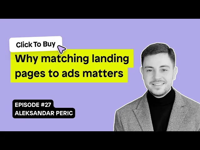
In this episode of Click To Buy, we spoke with Aleksandar Peric, a CRO specialist and designer, about the often-overlooked importance of matching your landing page design to your ads. Aleks walks us through his approach to creating high-converting landing pages, how A/B testing plays a crucial role, and the pitfalls of misaligning user expectations with design.
Click To Buy, Episode 27: Why matching your ads and landing pages matters
To get the full episode, listen on Spotify or watch the video version on YouTube:
The role of Conversion Designers in landing page success
Becca: "For listeners who aren’t familiar with the term, can you explain what a conversion designer does?"
Aleksandar: "Sure. A conversion designer is essentially a hybrid between a CRO (conversion rate optimization) specialist and a UX/UI designer. We look at data, customer feedback, and the brand itself to come up with a testing plan. But we don’t stop at just the analytics—we also design the actual tests to make sure they look great and, most importantly, convert well. It’s about balancing aesthetics with functionality. You want something that not only looks good but also makes people take action. Our job is to make that happen."
Why ad and landing page consistency matters
Becca: "What’s your take on the importance of making sure your landing pages match the ads?"
Aleksandar: "It’s critical. When someone clicks an ad, they’re expecting a certain experience, and if the landing page doesn’t deliver, you’ve already lost them. I’ve seen brands direct traffic from highly targeted ads to generic homepages or product pages, and it’s a huge mistake. Those pages usually aren’t tailored to the ad, so they lack the focus and messaging consistency that reassures users they’re in the right place. If the visuals, copy, and call to action aren’t aligned, you lose trust—and with that, the conversion. A landing page needs to be an extension of the ad, not an afterthought."
Common mismatches between ads and landing pages
Becca: "I’m sure you’ve come across situations where brands didn’t align their ads and landing pages properly. What are some common issues you’ve seen?"
Aleksandar: "Definitely. One of the biggest mistakes I see is when brands spend money on ads, driving traffic to a homepage or a product page that isn’t designed for conversions. Those pages might be great for browsing, but they don’t guide the customer toward a purchase. The most common mismatch is when the landing page doesn’t reflect the ad’s promise. For example, an ad might promote a discount or a specific product, but then the landing page doesn’t mention the discount or feature that product prominently. It’s a disconnect, and the user gets confused or frustrated."
How to create high-converting landing pages
Becca: "So, how do you go about making sure that your landing pages and ads work together seamlessly?"
Aleksandar: "It starts with understanding the user’s intent. We look at customer reviews and the language people are using in their feedback, then incorporate that into the ad copy and landing page. For example, if users consistently mention a certain feature or benefit, that’s what we highlight. After that, we prioritize our tests. We might run 10 different ads, see which ones perform best, and then adjust the landing page accordingly. Not every landing page can match every ad, so we focus on the ones that have the highest click-through rates but aren’t converting. From there, we design and test different versions to find what works."
The importance of experimentation and testing
Becca: "Experimentation clearly plays a big role in your process. Can you share an example of a successful test you’ve run?"
Aleksandar: "Absolutely. One example that stands out is related to ad design. There’s a CRO expert, Barry Hott, who’s famous for saying, 'Make ugly ads.' We ran with that concept and found that user-generated content (UGC) ads—simple photos with basic TikTok-style text—often performed better than the highly polished, professional ads we spent hours designing. People trust authenticity, and UGC gives them that. We tested this with several clients, and the results were consistent: the 'ugly' ads drove more conversions. So, the lesson here is, don’t get too hung up on making everything perfect. Focus on the messaging and test, test, test."
Final tip for merchants: Know your users
As Aleksandar emphasized throughout our conversation, the key to success is understanding your users and what they want. Test different approaches, tweak your messaging to match user expectations, and never underestimate the power of a simple landing page. In the world of CRO, small changes can make a huge difference. So, take the time to align your ads with your landing pages, and always keep the user journey front and center.
Final Thoughts
A big thank you to Aleksandar Peric for sharing his expertise on landing page design. If you’re looking to improve your conversions, take Aleks’ advice: test often, align your landing pages with your ads, and always prioritize user intent. For more insights from Aleks, be sure to connect with him on LinkedIn.


