How Zen8 redesigned their Shopify home page for a 50% conversion lift

Rebecca Anderson
How Zen8 redesigned their Shopify home page for a 50% conversion lift
Creating a homepage that resonates with your audience is no easy task, but Zen8 has nailed it with a design that effectively combines storytelling, visuals, and smart conversion strategies. By utilizing Instant Page Builder, Zen8 crafted a streamlined, engaging homepage that communicates its brand values and showcases its flagship product, the Zen8 Swim Trainer, in a way that both educates and converts.
This breakdown will take you through each section of their homepage, highlighting what makes it effective for their target market—swimmers, triathletes, and fitness enthusiasts. If you're a store owner looking to improve your own homepage layout, there’s a lot you can learn from Zen8's approach.
Analyzing Zen8’s home page layout
Here’s a closer look at how Zen8 built their highly effective Shopify homepage and how their custom sections—each designed with Instant Page Builder—set them up for success:
Hero section: Hooking visitors right away
The first thing you notice on Zen8’s homepage is a background video featuring real users training with the Zen8 Swim Trainer. Videos are a fantastic way to grab attention immediately, and here, the video not only showcases the product in action but also communicates its effectiveness in a matter of seconds.
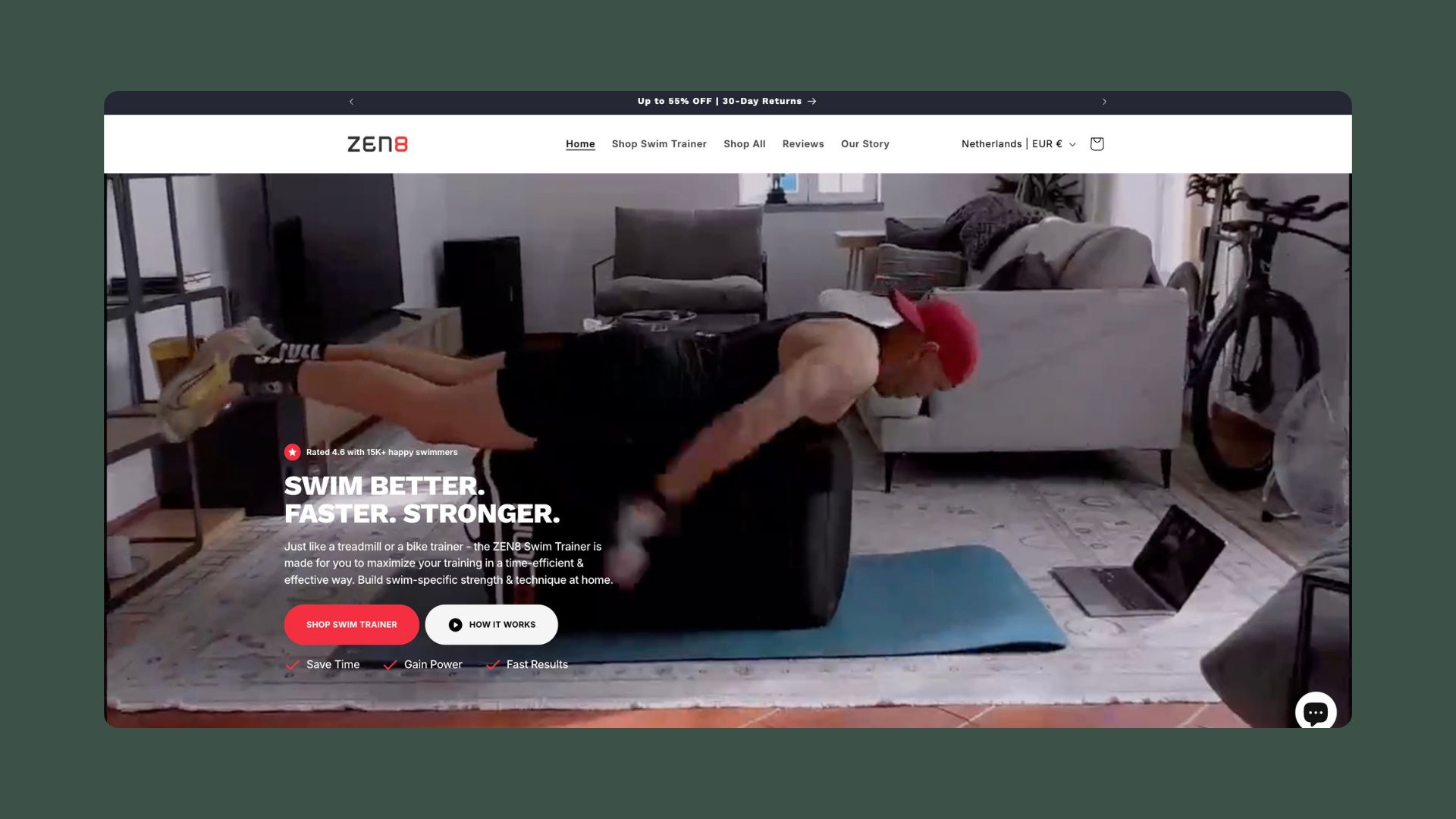
Paired with bold, straightforward copy, this hero section is all about clarity and impact. The headline reads, "SWIM BETTER. FASTER. STRONGER." This attention-grabbing promise speaks directly to anyone looking to improve their swimming performance. Directly below this, two call-to-action (CTA) buttons invite visitors to "Shop Swim Trainer" or learn "How It Works,”; this is a clever way to cater to two types of customers: those ready to buy and those who want to do more research.
Zen8 also leverages social proof early on by displaying a star icon with the text "Rated 4.6 with 15K+ happy swimmers," giving visitors immediate credibility and confidence in the brand.
Social proof and educational content: Building trust
Right after the hero section, Zen8 strategically places a moving ticker of logos, highlighting recognizable brands and customers who use the product.
This subtle but effective touch builds trust by associating Zen8 with established, reputable organizations.
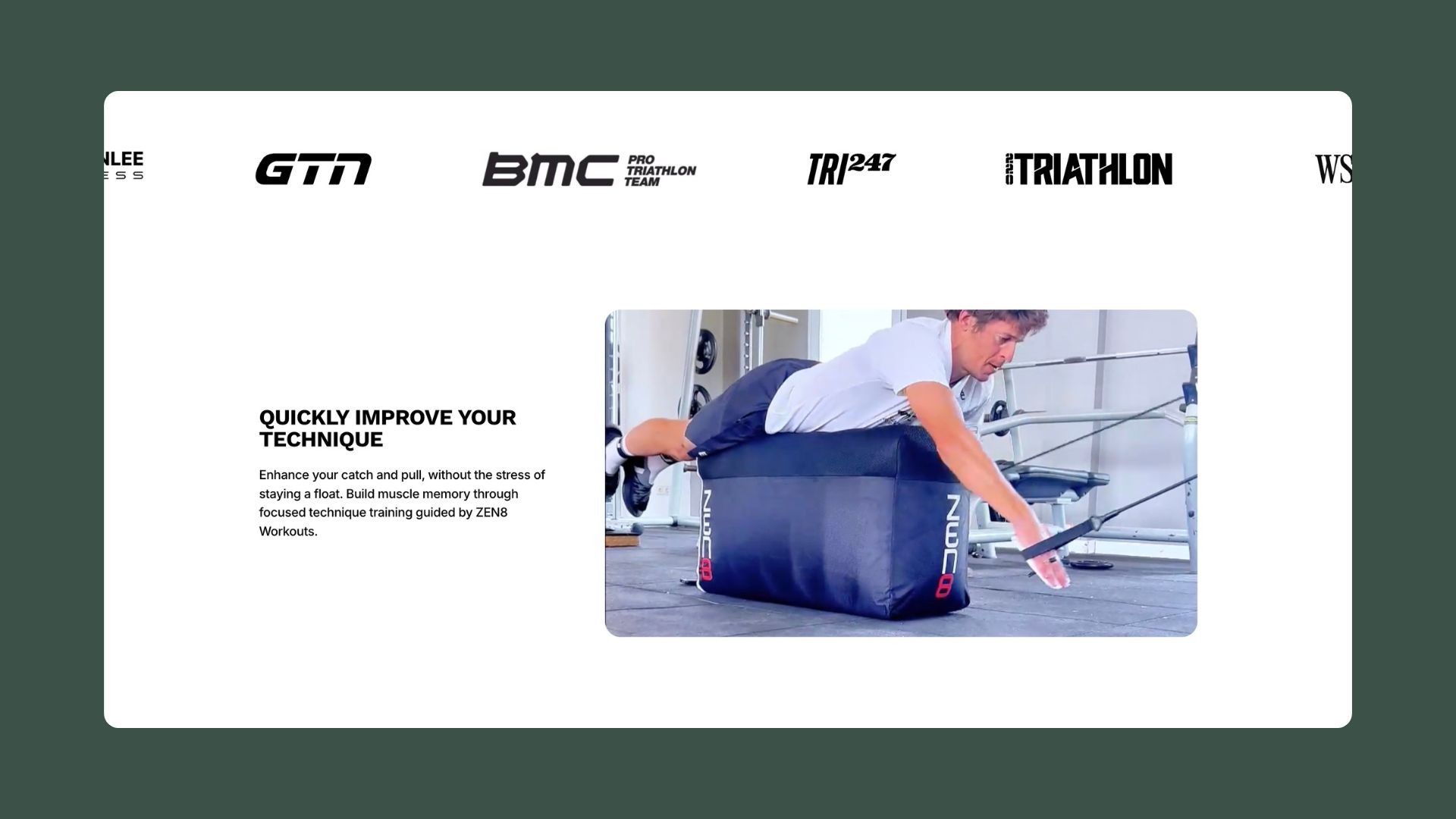
Next to the ticker, Zen8 includes a video of their Swim Trainer in action, paired with text addressing common swimming challenges like technique and muscle memory. By framing their product as the solution, Zen8 keeps the messaging customer-focused while educating potential buyers without being overly salesy.
Customer testimonials: The power of results
Following the educational section, Zen8 introduces a testimonial slider featuring customer names, achievements, and video testimonials.
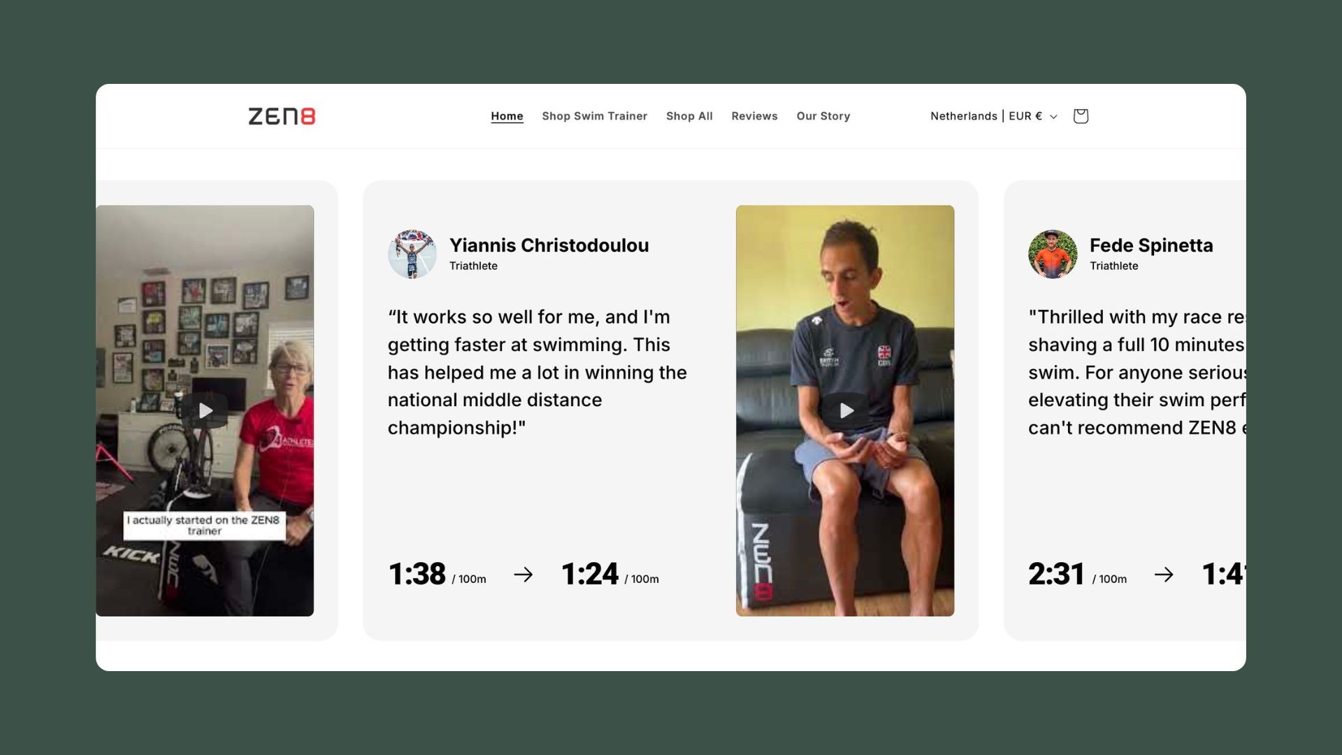
These testimonials highlight real, tangible improvements in swim times, such as going from 1:38/100m to 1:24/100m. This clear display of customer success reinforces the value of the product and adds an extra layer of authenticity through video content.
For eCommerce brands, testimonials that showcase real, quantifiable results go a long way in convincing hesitant buyers to make a purchase.
Limited-time offers: Creating urgency
Next, Zen8 skillfully creates a sense of urgency with their "4 Year Anniversary Sale" section, featuring three bundle offers: Starter, Power, and Ultimate.
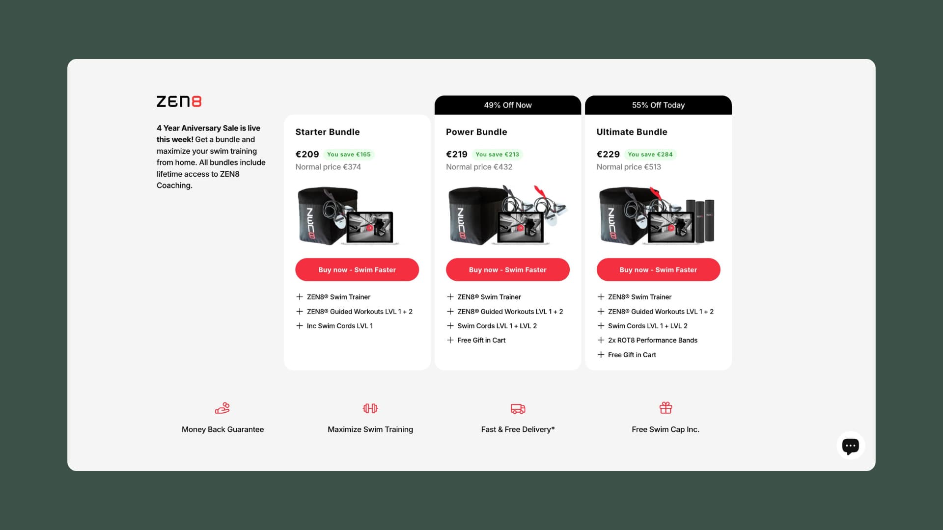
Each bundle presents clear savings and details on what’s included, helping customers feel informed and in control of their purchase.
The transparent pricing strategy, combined with bold CTAs like "Buy now - Swim Faster," encourages customers to act quickly. For store owners, offering bundle deals like these can significantly increase average order value (AOV) by presenting high-value options at a discount.
Detailed bundle breakdown: Building transparency and value
One standout section of Zen8’s home page is the “What’s Inside: Ultimate Bundle” slider.
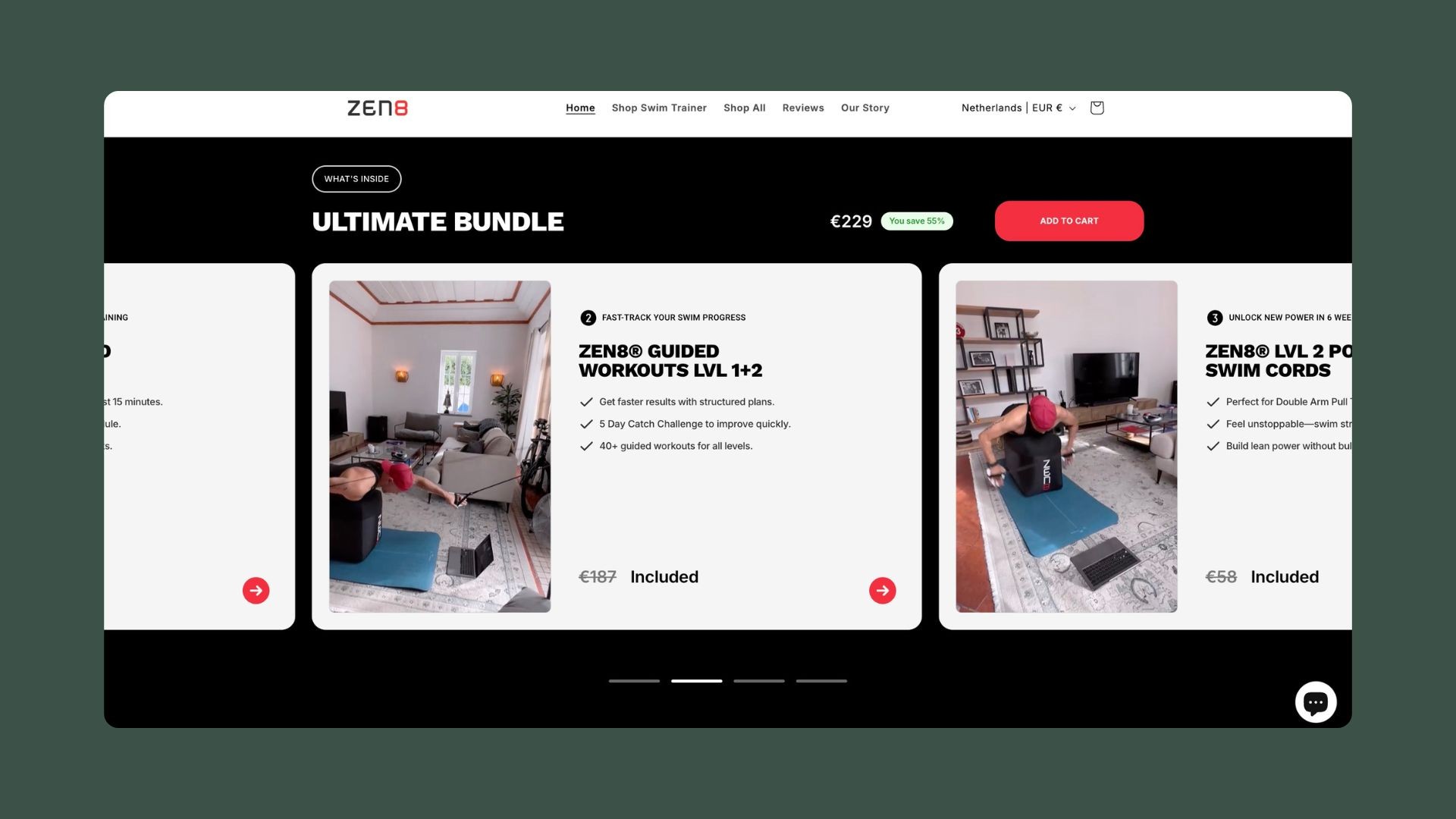
By breaking down each item in the bundle, including its individual cost when bought separately, Zen8 demonstrates the value of purchasing the bundle. This level of transparency helps prevent decision fatigue and ensures customers feel confident in their purchase.
Addressing customer pain points with the “No Limits” section
Zen8 continues by addressing specific customer pain points, such as limited pool access and crowded swim lanes.
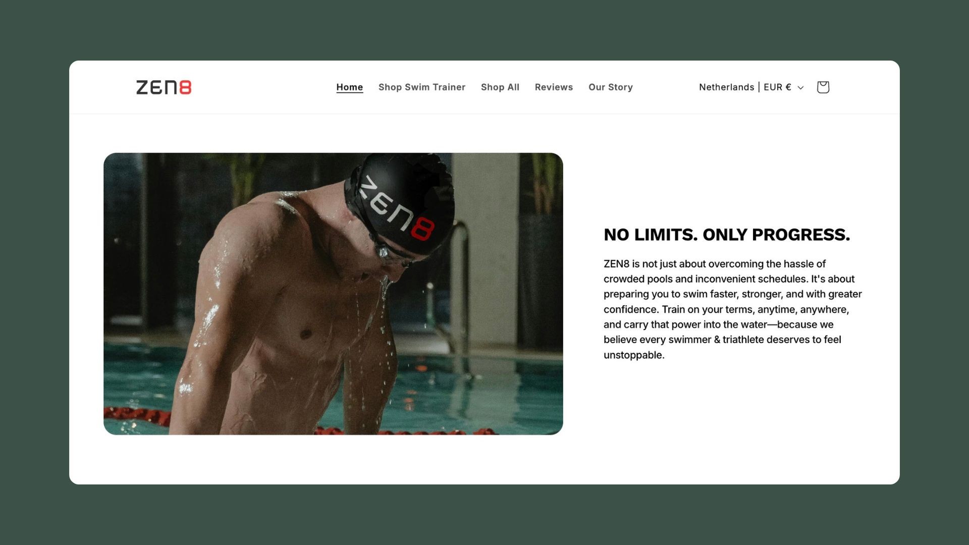
The messaging here emphasizes how Zen8 can help athletes overcome these barriers by allowing them to train effectively at home. This section does a great job of making the product feel like a personalized solution, directly connecting with the audience’s challenges.
Interactive elements: Keeping users engaged
The next few sections utilize interactive content to keep users engaged.
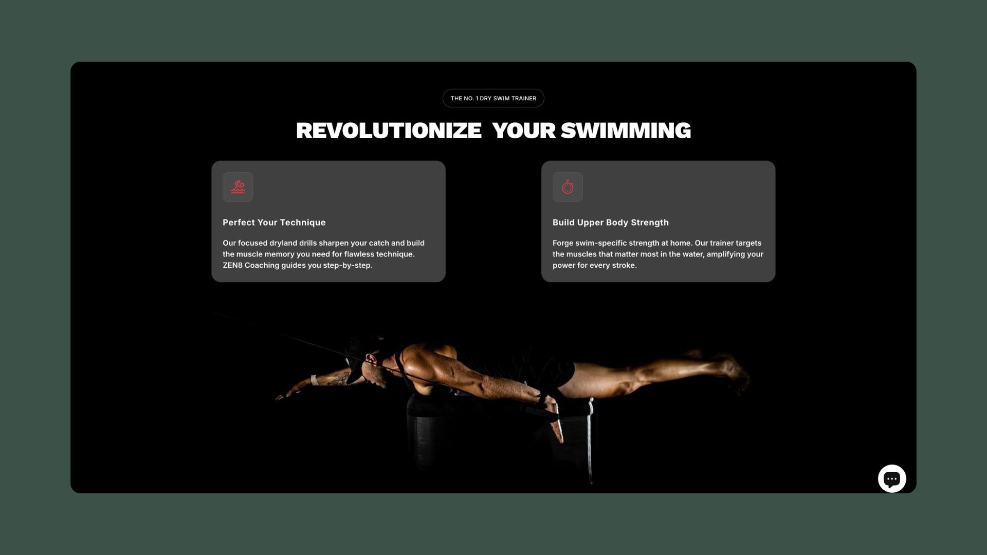
First, a background GIF showcases the product in action, and content blocks explain key benefits like "Perfect your technique," "Build upper-body strength," and "Save time training."
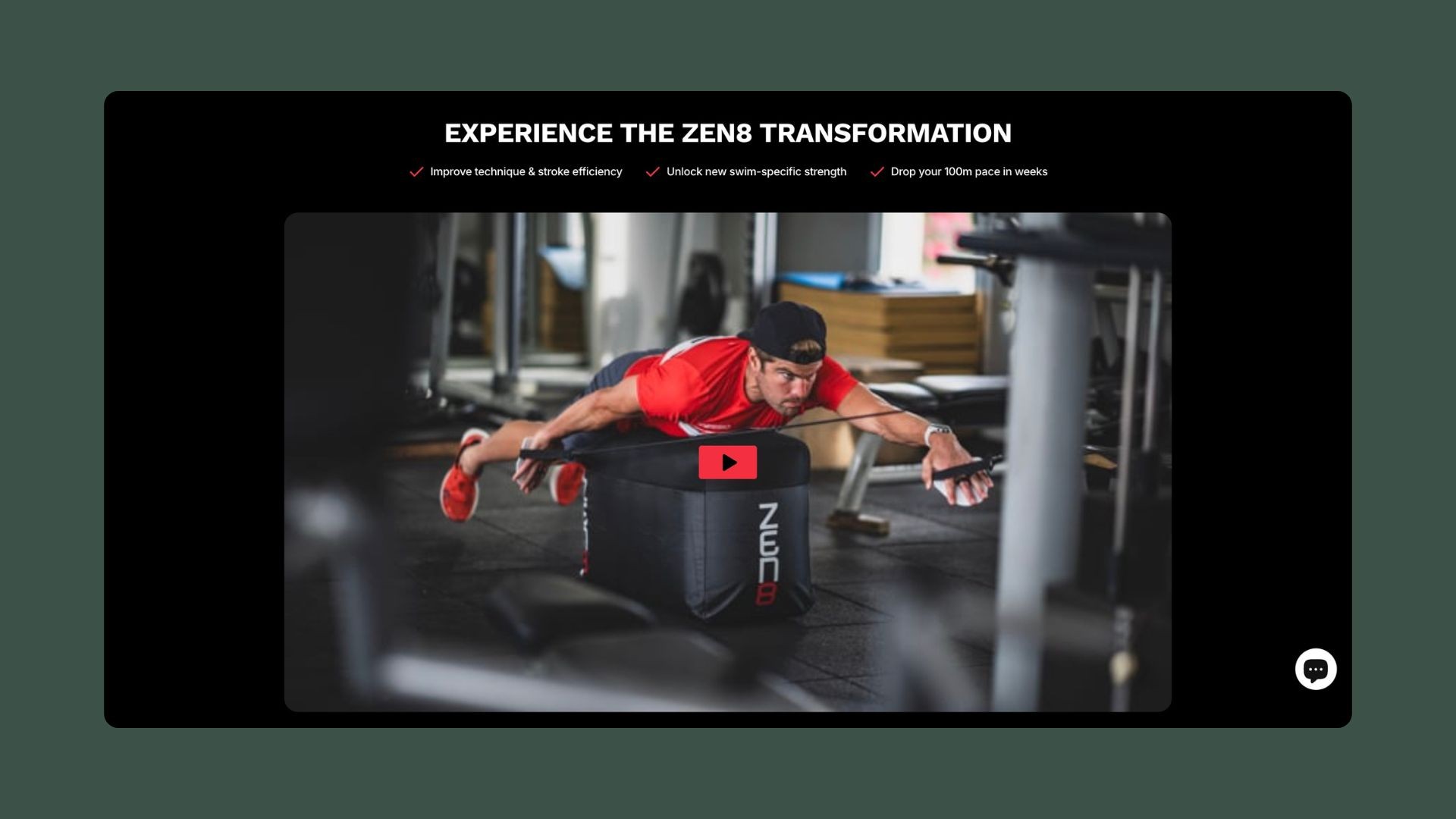
Under this is an embedded video that offers a quick explanation of the Zen8 Trainer, guiding customers toward informed purchasing decisions.
Below the video, is a moving ticker with customer quotes like: “People notice I swim faster” and “A game-changer for any level!. ”
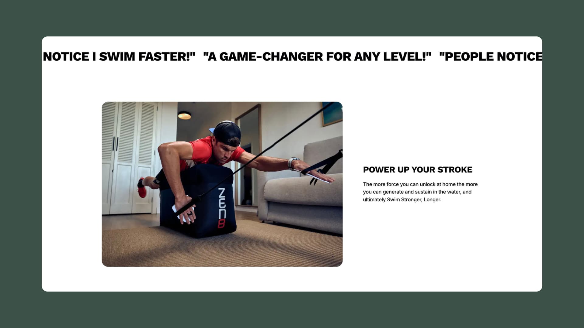
A ticker like this is a great way to grab attention while visitors scroll through the home page.
By incorporating GIFs, videos, and a ticker of customer quotes into their homepage design, Zen8 ensures that its homepage doesn’t feel static or boring—key considerations for any eCommerce site.
Increasing customer retention with Zen8 Coaching
Zen8’s coaching section acts as the final push for customers to not just purchase but also invest in their swim journey.
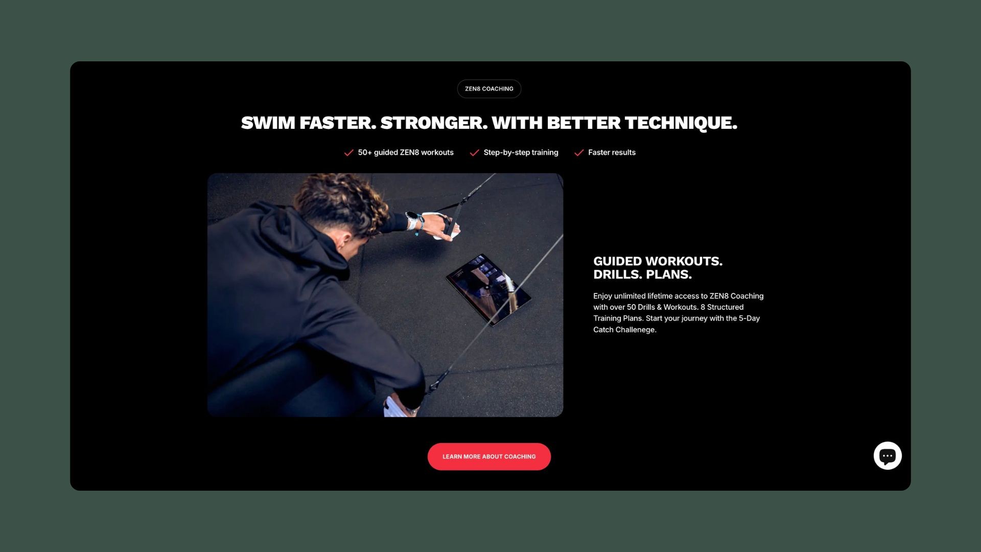
The section highlights the benefits of their coaching program with over 50 guided workouts, drills, and plans. A key CTA, “Learn More About Coaching,” encourages users to explore further. This adds value beyond the product itself, turning Zen8 into a training partner rather than just a product seller.
For eCommerce brands, offering an ongoing service or support—like coaching—keeps customers engaged and increases retention. Zen8’s strategy of combining a physical product with virtual training shows its commitment to customer success, creating a holistic experience for buyers.
Overcoming objections with risk-free trials and FAQs
Finally, Zen8 closes its homepage with a section that addresses common concerns. Their 30-day risk-free trial removes the last barrier to purchase, encouraging hesitant customers to try the swim trainer with no strings attached.
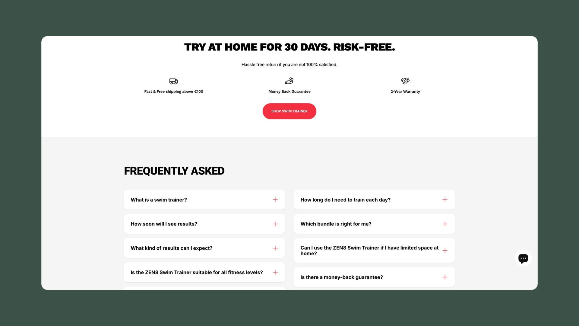
They also include an FAQ section that answers common customer concerns, such as durability, training recommendations, and expected results. This not only helps preemptively address questions but also shows that Zen8 understands its audience's needs in detail.

Why Zen8 chose Instant Page Builder
Zen8’s homepage is a masterclass in balancing visual appeal with clear, concise messaging. They’ve created a layout that walks potential customers through a seamless journey—from piquing interest with dynamic video content to addressing pain points and finally overcoming objections with social proof and a risk-free trial.
Zen8’s success in creating a high-converting, engaging homepage wasn’t by chance—it was made possible through the flexibility and ease of Instant Page Builder.
The ability to build and launch custom sections with ease made Instant a perfect fit for Zen8's needs.
To better understand the impact Instant had on their business, we asked Victor Jarland, Founder of Zen8, why he chose Instant over the page builder he had used previously (PageFly).
Here’s what Victor had to say:
1. Simplicity for non-developers
"The simplicity for a non-developer like myself to create beautiful sections was a game-changer. The ready templates gave me inspiration, and it is so easy to use."
Victor highlighted how Instant’s user-friendly interface allowed him to build and customize his site without needing technical expertise. Instant’s Template Library provided a great starting point and made the entire design process faster and more accessible.
2. Improved speed and performance
"Previously, our website was slow, we lost a lot of traffic because of it, and sales as a result. From the day we launched our new website with Instant, our conversion rate jumped by 50%+ and has remained that way. So much that we sold out all of our stock earlier than expected."
For Zen8, switching to Instant had a direct impact on their sales. The improved site speed not only enhanced user experience but also led to a dramatic increase in their conversion rate—over 50%—and resulted in faster stock sellouts.
3. Exceptional customer support
"On top of that, the customer support is next level, from people who are up to date with design and how websites should look in 2024."
Victor also praised Instant’s customer support, noting how their expert team ensured Zen8’s site remained cutting-edge. This high level of support helped Zen8 maintain a modern, high-performing website.
For Zen8, these factors made Instant not just a tool for building their home page but a vital part of their success in increasing conversions and improving overall user experience.
If you’re looking for a page builder that offers ease of use, speed, and top-tier support, start building with Instant today and take your Shopify store to the next level—just like Zen8 did.


