
You spend on an ad, the click lands on your standard product page, and the visitor gets a navigation bar, a dozen related products, and four footer columns of escape routes. Most of them take one. A product landing page closes those exits. It's a standalone, campaign-specific page with one job: turn the visitor who clicked your ad into a buyer.
Below are 11 product landing page examples worth copying, grouped by the format they use, plus what makes each one work and how to build your own on Shopify. If you run paid traffic to a regular product page, this is the upgrade that lifts the conversion rate on spend you're already making.
What is a product landing page?
A product landing page is a standalone web page built for one campaign and one product, designed to drive a single action: usually "add to cart" or "buy now." It strips out site navigation and competing links so the visitor has one path forward. Marketers call this the 1:1 conversion ratio: one page, one goal, one call to action.
It looks like a product page at a glance, but it works differently, which is the next question everyone asks.
Product landing page vs product page: what's the difference?
A product page is part of your store. It sits in your navigation, links to related products and collections, and serves shoppers who are already browsing your catalog. A product landing page is a campaign destination. It has no navigation, no exits, and one offer, built to convert cold traffic from a specific ad.
The simple rule: send organic and returning shoppers to product pages, and send paid ad traffic to dedicated product landing pages. The same product often needs both.
What makes a product landing page convert?
Before the examples, here's the checklist they all share. Keep it nearby when you build yours.
One goal, one CTA. Every element points to a single action. Extra links and choices lower conversion, so remove them.
Message match. The headline, image, and offer mirror the ad that brought the visitor in, so they know they're in the right place.
A benefit-led hero. Above the fold: a clear value statement, a strong product image or video, the price, a trust signal, and the button.
Benefits over features. "Keeps you dry in heavy rain" beats "Gore-Tex membrane." Translate every spec into what it does for the buyer.
Social proof at the decision point. Reviews, ratings, and customer photos placed right where doubt creeps in.
A fast, mobile-first page. Most paid traffic is on a phone. A slow page loses visitors before the headline loads.
Now the examples.
11 product landing page examples that convert
Single-product hero pages
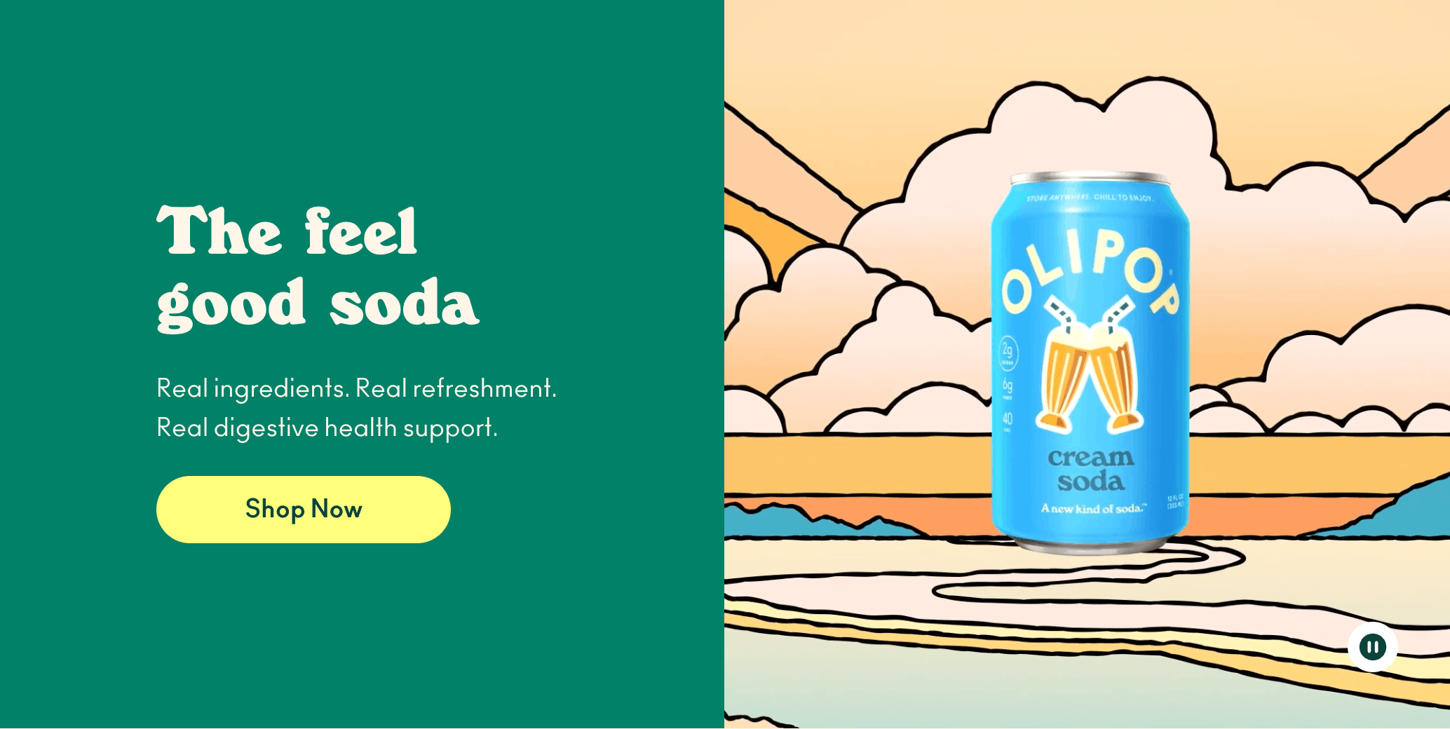
1. The benefit-led hero page, Olipop. Lead with the outcome, not the ingredient list. The hero states the value in plain words ("a new kind of soda, high fiber, less sugar"), backs it with a rating and review count near the product name, and runs a banner of specific benefits. It works because it answers "what's in it for me" before asking for the sale.
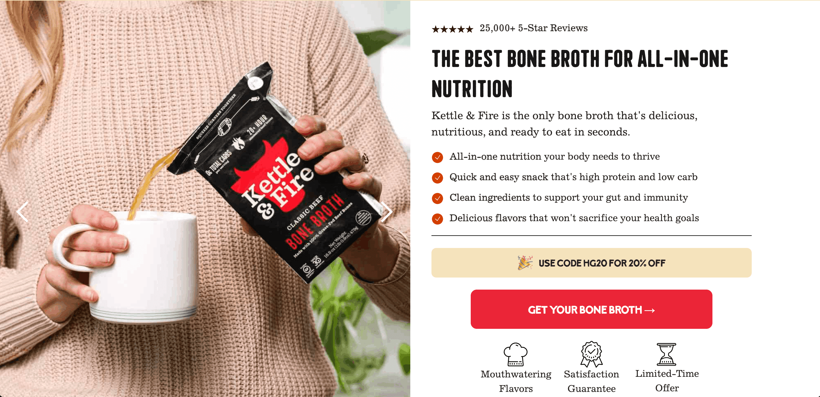
2. The "what's included" bundle page, Kettle & Fire. Best for kits, multipacks, and sets. A dedicated section visually breaks down every item in the bundle, so the buyer sees exactly what they get and why it's worth the price. Clear value math reduces hesitation on a higher-priced cart.
3. The interactive build-your-own page, Tower 28. The visitor customizes or matches the product on the page (a shade finder, a color or size picker, add-ons) before buying. The interaction increases engagement and makes the product feel tailored to them, which lifts both conversion and average order value.

Problem-solution product pages
4. The nutrition problem-solver, Ka'Chava. Health and nutrition brands open on the problem (poor sleep, low energy, a nutrition gap), explain why it happens, then position the product as the fix. A clean, minimal layout with plenty of white space keeps a complex or anxiety-heavy purchase from feeling overwhelming.
5. The "fixes what your current product can't" page, Ridge. Common for category challengers. The page contrasts the everyday frustration with the old solution (a bulky wallet, say) and shows how this product removes it. By the time the buyer reaches the CTA, they want the upgrade.
Comparison and proof-led pages
6. The honest comparison page, Maev. A side-by-side that shows your product against the alternative on the criteria that matter. Including a weakness or two builds more trust than a one-sided pitch, and it helps buyers entering a crowded market decide quickly.

7. The social-proof wall, Owala. Built around evidence: verified star ratings, thousands of reviews, customer photos, and press logos. For brands with real traction, the proof does the selling. Numbers ("over 50,000 reviews") carry more weight than adjectives.
Launch and offer pages
8. The launch and drop page, Rumpl. Built to create anticipation around a release or collaboration. A bold hero, a countdown or "drop" framing, and an email opt-in or waitlist capture demand so you have a ready audience the moment you go live. Multiple CTAs as the visitor scrolls mean they can act without scrolling back up.
9. The subscription page, Dr. Squatch. Built to turn a one-time buyer into a recurring one. The page makes the case for subscribing right at the buy box: a clear discount versus one-time pricing, the convenience of auto-ship, and easy control over frequency. Great for consumable products people reorder.

10. The limited-time offer page, L'ange. Anchored on a clear, prominent deal (a sale or anniversary promo) with the offer and any code visible at the top and a sticky banner reinforcing it. The offer is the hook, so it leads. Tie it to a real milestone and it converts better than a generic "sale."
Minimalist premium pages
11. The minimalist premium page, Cuts Clothing. A premium product with rich photography and a lot of restraint: calm layout, generous space, and a single clear "add to cart." The styling signals quality and puts one product in the spotlight. Best when the brand and the visuals do the persuading.
The thread across all 11: discipline, not decoration. One goal, message match with the ad, benefits over features, proof at the moment of decision, and a page that loads fast enough to keep the visitor.
How to build a product landing page on Shopify
You don't need a developer. You need a page that loads fast, matches your ad, and connects cleanly to checkout. Here's the build.
Pick the product and the one action. Decide the single conversion goal: buy now, pre-order, or join a waitlist. Everything else serves it.
Match the ad. Reuse the ad's headline, hero image, and offer so the page confirms the visitor is in the right place.
Lead with the benefit. Put the value statement, product visual, price, a trust signal, and the CTA above the fold.
Translate features into benefits. For each spec, write the outcome the buyer cares about.
Add proof at the decision points. Drop reviews, ratings, and customer photos near the CTA and after any big claim. Pull live product data from your store so prices and images stay accurate.
Remove the exits. Strip navigation and competing links so the only way forward is the CTA.
Connect it to checkout. Link to a fast cart and offer express payment like Shop Pay or Apple Pay. Add a cart drawer with upsells to lift average order value once they're in.
Test and iterate. Run an A/B test on the headline, hero, and offer. Change one element at a time and let the data pick the winner.
This is where building on Shopify used to mean a developer ticket or a theme that won't bend. Instant handles the whole flow without code. Describe the page you want and the AI drafts it, or start from a template and edit in a visual editor. You pull in live product data, build the matching landing page and cart drawer in the same tool, run native A/B tests that track revenue and AOV, and publish native Shopify pages that stay fast, which matters because a slow page leaks the traffic you paid for. For the deeper optimization playbook, see our guide to optimizing landing pages to boost ad conversion rates.
Still choosing the tool to build in? Compare your options in our guide to the best page builders for Shopify.
A product landing page is the highest-impact upgrade you can make to paid traffic that currently lands on a busy product page. Pick one product and one action, match the ad, lead with the benefit, prove the claim, remove the exits, and connect it to a fast checkout. Then test your way to a winner.
If you'd rather build your first product landing page today than wait on a developer, start with Instant for free and have a page live by this afternoon.


