Unpacking Mushie’s Shopify store design (and why it drives engagement)

Rebecca Anderson
Unpacking Mushie’s Shopify store design (and why it drives engagement)
Mushie, a beloved brand known for its high-quality, thoughtfully designed baby products, set out to enhance its Shopify store with a focus on customer trust and user-friendly navigation. To achieve this, they hired designer and developer TK Spandhla, who used Instant Page Builder to create a visually appealing, dynamic experience that deeply resonates with their core audience—parents.
Rather than a standard Shopify layout, Mushie wanted their site to feel like a seamless extension of their brand, engaging customers from the moment they land on the homepage.
The goal was simple: make it easier for customers to navigate, shop, and connect with Mushie’s mission of providing safe, beautiful products for little ones. Using Instant’s flexible design tools, Mushie was able to build a website that not only showcased its product range but also enhanced trust and engagement with every visitor interaction.
Here’s a closer look at how TK leveraged Instant to achieve this transformation for Mushie and what other store owners can learn from this approach.
Building trust through testimonials: The "For Parents, By Parents" slider
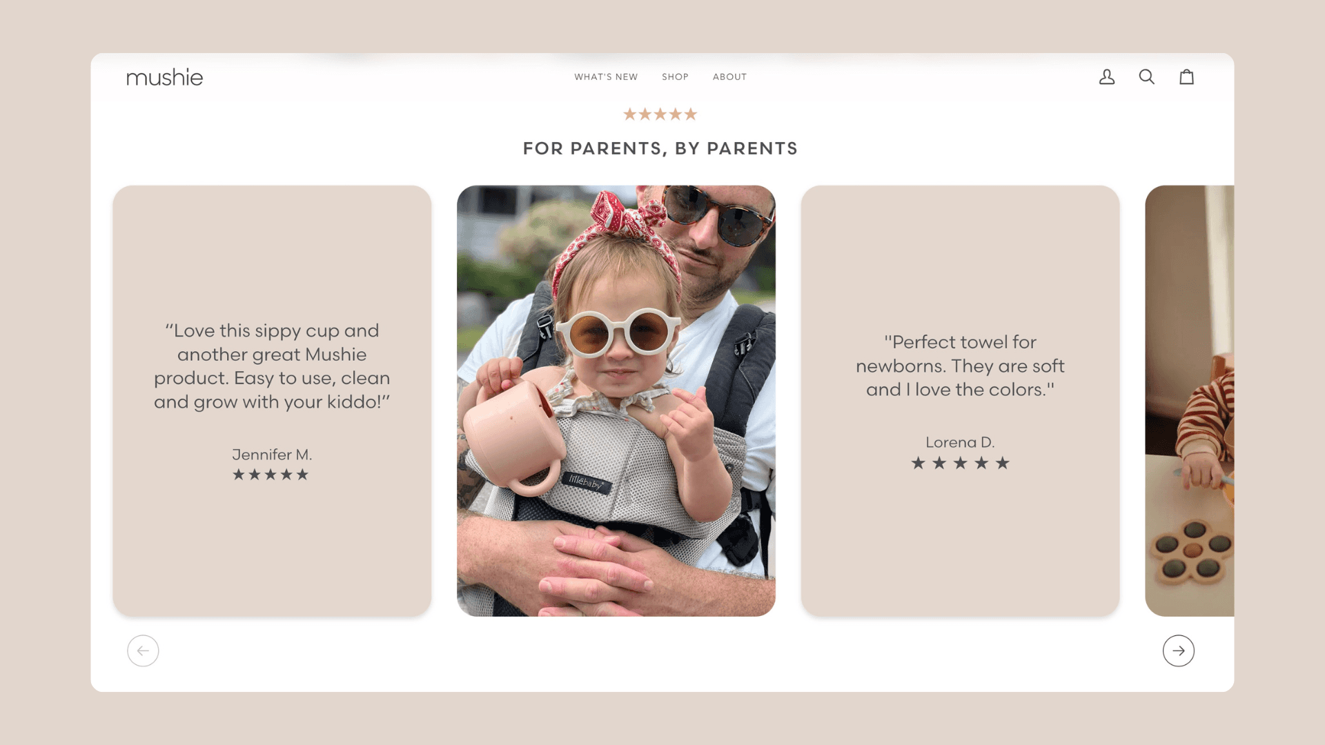
One of the most impactful elements Mushie added to their Shopify home page was a testimonial slider titled "For Parents, By Parents."
Mushie understood that their target audience—parents—heavily relies on recommendations from other parents when choosing products for their children. The testimonial slider embodies that community-driven trust.

The slider features two types of content: customer quotes with their names and star ratings and images of Mushie’s products in real-life use. It’s not just a visual feature; it’s a storytelling tool. Every other card in the slider shows a parent’s review of Mushie's products, creating a personal connection with new visitors. The remaining cards feature Mushie products in action, reinforcing that these are real items used and loved by families.
This testimonial slider didn’t just add a dynamic design feature—it gave a voice to Mushie’s customers and allowed the brand to showcase real-world use cases of their products. For new parents, seeing other parents’ satisfaction with Mushie’s products provided both emotional reassurance and the practical proof they needed to confidently make a purchase.
This design choice achieved several important outcomes:
Trust-building: The reviews, paired with authentic product images, gave credibility to Mushie’s claims about quality and reliability.
Increased engagement: The arrows at the bottom of the slider invited visitors to actively engage with the content, leading to a longer time spent on the page.
Conversion-focused: By showcasing both product images and user testimonials, the slider simultaneously worked to draw in both emotional and rational decision-makers.
Spotlighting the Frigg pacifier: Combining storytelling and sales
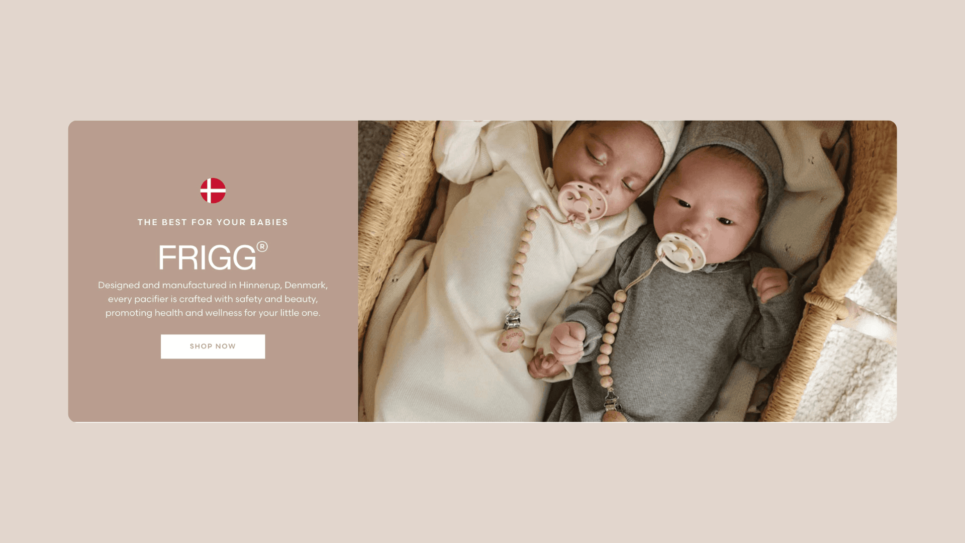
Another standout feature Mushie introduced on its homepage is the dedicated product section for their Frigg pacifiers. Mushie designed this section to highlight the pacifiers as a flagship product, with compelling copy that spoke to both the quality and emotional benefits of the item.

The section featured a bold headline: "THE BEST FOR YOUR BABIES." This was followed by a beautifully written product description that emphasized where the pacifiers are made (Denmark) and how they are designed with both safety and aesthetics in mind.
On the left, this powerful copy is paired with a clear call-to-action button, "Shop Now," which leads to the collection page for Frigg pacifiers. On the right, a warm and inviting image of two babies using the pacifiers brings the product to life for parents.
This section wasn’t just about selling a pacifier—it was about telling a story. Mushie successfully combined emotional appeal (the safety and beauty of the pacifier) with practical information (where it was made and its purpose). This struck the perfect balance for parents, who are often looking for products that are both functional and aesthetically pleasing.
Easy navigation with dynamic collection buttons
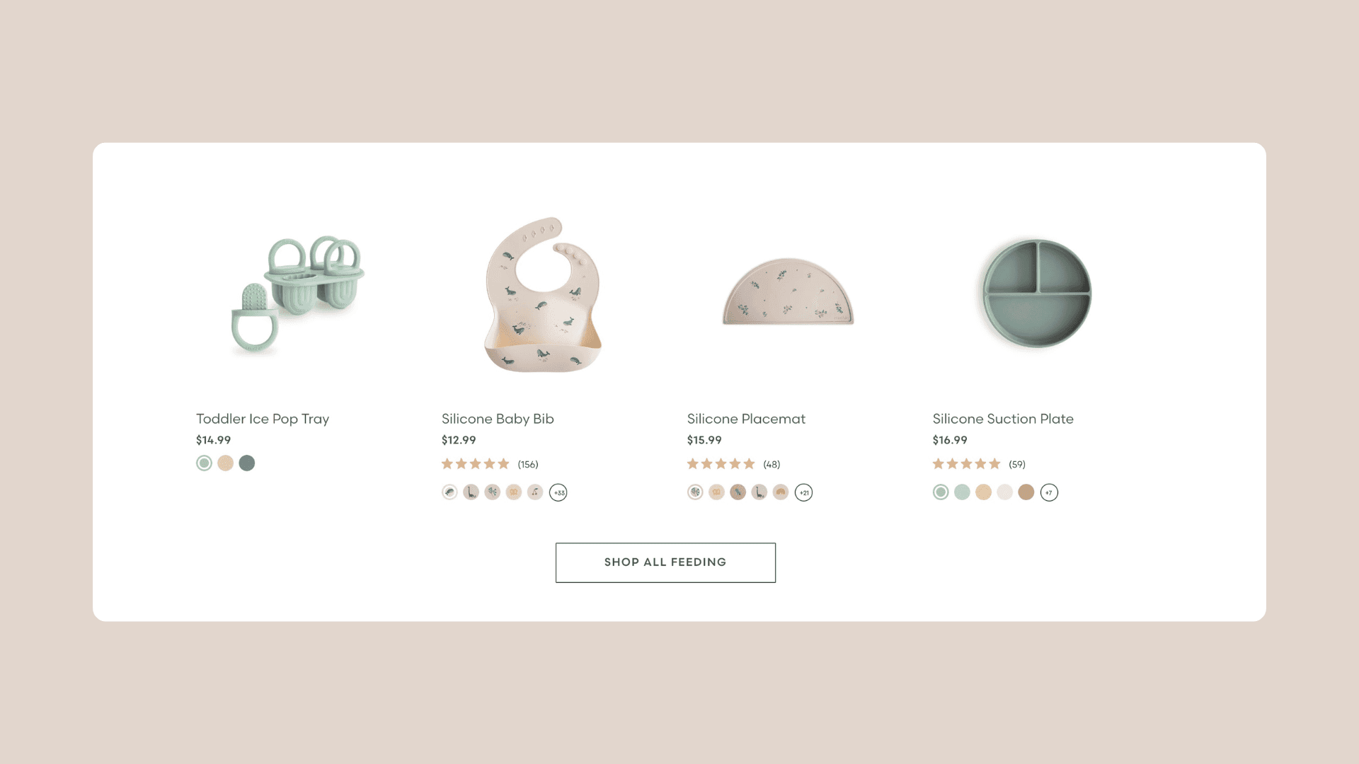
To make the customer journey even smoother, Mushie used Instant to add dynamic collections buttons across their homepage. These buttons invite users to "Shop all [collection name]" with a single click, providing quick access to key product categories.

This reusable feature keeps the shopping experience fluid, allowing parents to explore different collections without the need for complicated menu structures or excessive scrolling. The button was placed strategically throughout the homepage, gently reminding visitors of the scope of Mushie’s offerings.
Adding collections buttons to their homepage has several key goals:
Streamlined navigation: These buttons reduce the number of clicks needed to explore multiple collections, making it faster and easier to shop.
Boosted product discovery: Customers are encouraged to browse more, leading to the potential for larger basket sizes and increased cross-sells.
Consistency & convenience: The repetition of the button throughout the homepage reinforced Mushie’s broad product offering without feeling pushy.
Simplifying collection navigation: Custom sliders
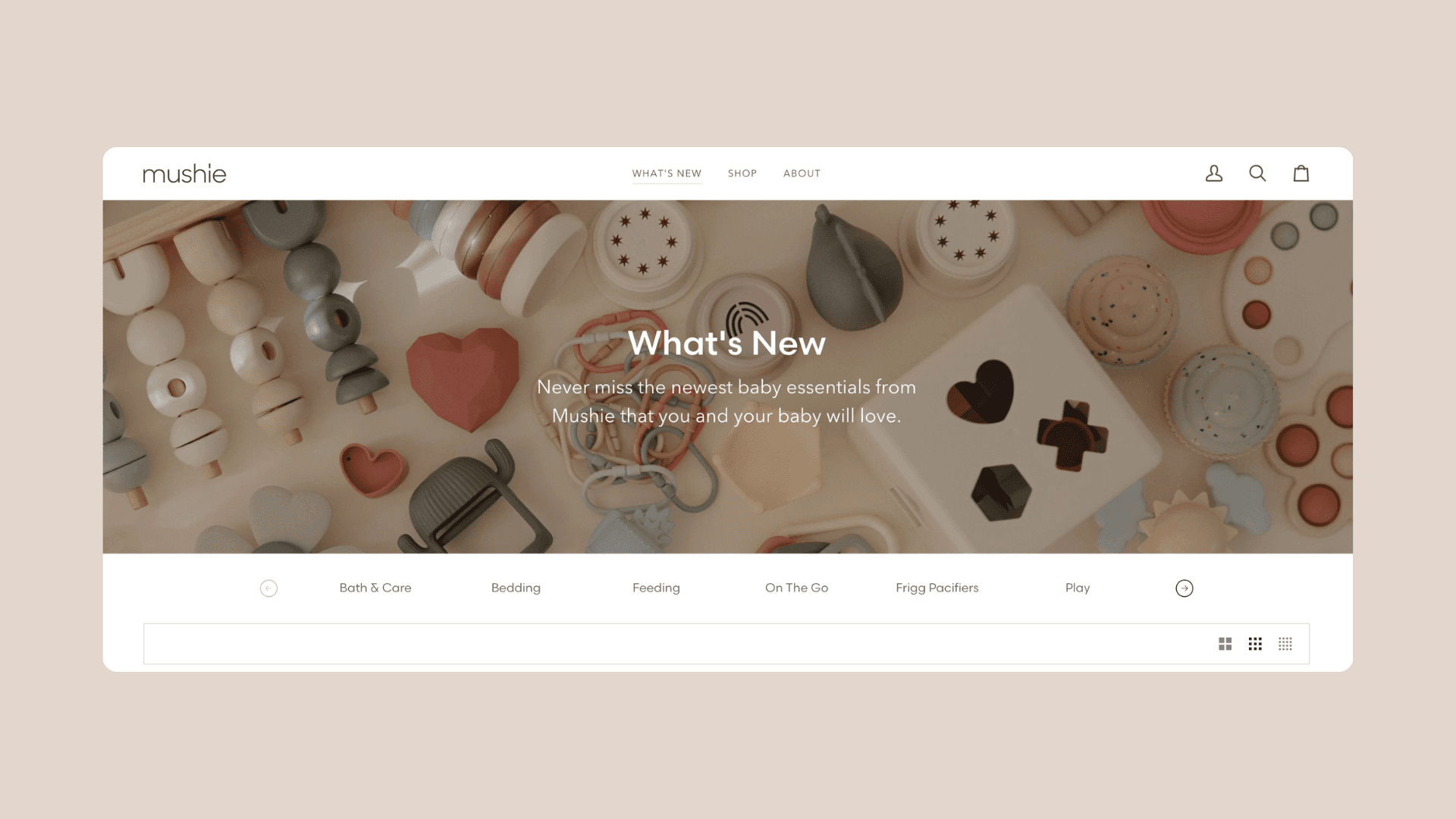
Mushie took it a step further with custom sliders on their collection pages, allowing customers to easily browse through different product categories. Built with Instant, these sliders featured collections such as “Bath & Care,” “Bedding,” “Feeding,” and “Frigg pacifiers,” and give visitors the ability to navigate between categories without having to leave the page or open the navigation menu. This section effectively enhances the overall shopping experience by keeping everything intuitive and easy to explore.

With the custom sliders, Mushie made it possible for their customers to discover more of their product range, even if they hadn’t initially planned on browsing beyond a single category. This added layer of convenience kept customers engaged, reducing friction in the shopping experience and making it easier to explore all the offerings without interruption.
By adding a smart navigation element like this, they achieved:
User-friendly navigation: The custom slider improved the browsing experience by reducing the number of clicks and simplifying how visitors could explore different categories.
Increased browsing time: By making it easier to move between collections, the slider helped increase the time customers spent on the site, potentially leading to more purchases.
Encouraging cross-category shopping: The slider prompted customers to explore beyond their initial interest, promoting product discovery across categories.
Takeaways for other Shopify store owners
Mushie’s enhancements to their Shopify store go beyond just aesthetic improvements—they represent strategic moves to create a smoother, more engaging shopping experience for parents. Their designer focused on enhancing trust, clear storytelling, and intuitive navigation to craft a store that resonates with their core audience: busy parents who need a simple, reliable, and welcoming place to shop for their little ones.
For brand owners looking to elevate their own stores, Mushie’s approach with Instant offers a roadmap for success:
Leverage customer testimonials: Showcasing real customers’ experiences can build trust and credibility.
Use visual storytelling: Pair product descriptions with lifestyle images to help customers visualize their purchases.
Simplify navigation: Make it easy for customers to find what they need quickly by using dynamic buttons and intuitive design.
Promote exploration: Encourage visitors to discover more of your product range through tools like sliders and collection buttons.
By focusing on these principles, any brand can create an online experience that not only looks great but also drives conversions and builds lasting customer relationships. Brand owners looking to elevate their Shopify store can take inspiration from Mushie’s success, knowing that with the right tools, creating a seamless and engaging experience is well within reach.
For more information about the award-winning designer and developer who brought this build to life, click here to learn more about TK Spandhla.
And, if you want to boost your Shopify store’s engagement and sales, try Instant today for free. See how it can elevate your store design, just like it did for Mushie.


