



Headers & Hero design
A visual benchmark of hero formats, messaging strategies, conversion patterns and design conventions.
By the
Instant Team

Your homepage has one job to do quickly:
Help shoppers understand what you sell, why it matters, and what they should do next.
But beauty brands also use this space to launch products, build brand identity, promote offers, and create an emotional connection.
That creates a constant trade-off between clarity and creativity.
How much should you show?
Should your hero use a static image, video, or slider?
How many CTAs are too many?
Should you lead with the product, a person, or the result?
And, most importantly: what are other ecommerce brands actually doing?
Throughout this research, we use real ecommerce homepage examples from brands like Gisou, Rhode, Curology, Jones Road, Kosas, and Salt & Stone to show how these patterns look in practice.
Behind the research:
We analyzed 312 desktop ecommerce homepages across beauty, skincare, haircare, personal care, oral care, and fragrance in July 2026.
Around 95% of the brands in our sample use Shopify, making the findings particularly useful as a benchmark for Shopify homepage design.
Each homepage was reviewed across the same dimensions, including hero format, hero content, messaging, CTA usage, copy placement, announcement bars, and visual treatment.
One important reminder: this is a visual benchmark, not a performance test.
It shows what brands in our sample are doing not which individual design choice generated more revenue or conversions.
Ecommerce homepage design examples & benchmarks for beauty brands (2026)
Key Findings:
75% use a static hero — a single image is still the clear default.
42% lead with people — people-led creative appears more often than products alone.
29% feature a product launch or hero product — specific product campaigns are the most common job for the hero.
27% use product-first headlines — product messaging slightly leads benefit-led copy.
70% use one CTA — most brands focus the first screen around one primary action.
57% place their copy on the left — left alignment is the dominant layout choice.
38% use the announcement bar for delivery perks — practical purchase incentives often sit outside the hero.
46% use light or neutral visual treatments — nearly half keep the first screen visually restrained.
Hero format: Static, video, or slider?
The hero is the first main section shoppers see when they land on your homepage. It typically combines imagery or video with a headline, supporting copy, and a call to action.
It has a lot of work to do in very little space: grab attention, introduce the product or campaign, communicate value, and give shoppers a clear next step.
Beauty brands generally approach it in three ways: static imagery, video, or sliders.
Static | Video | Slider |
|---|---|---|
 | 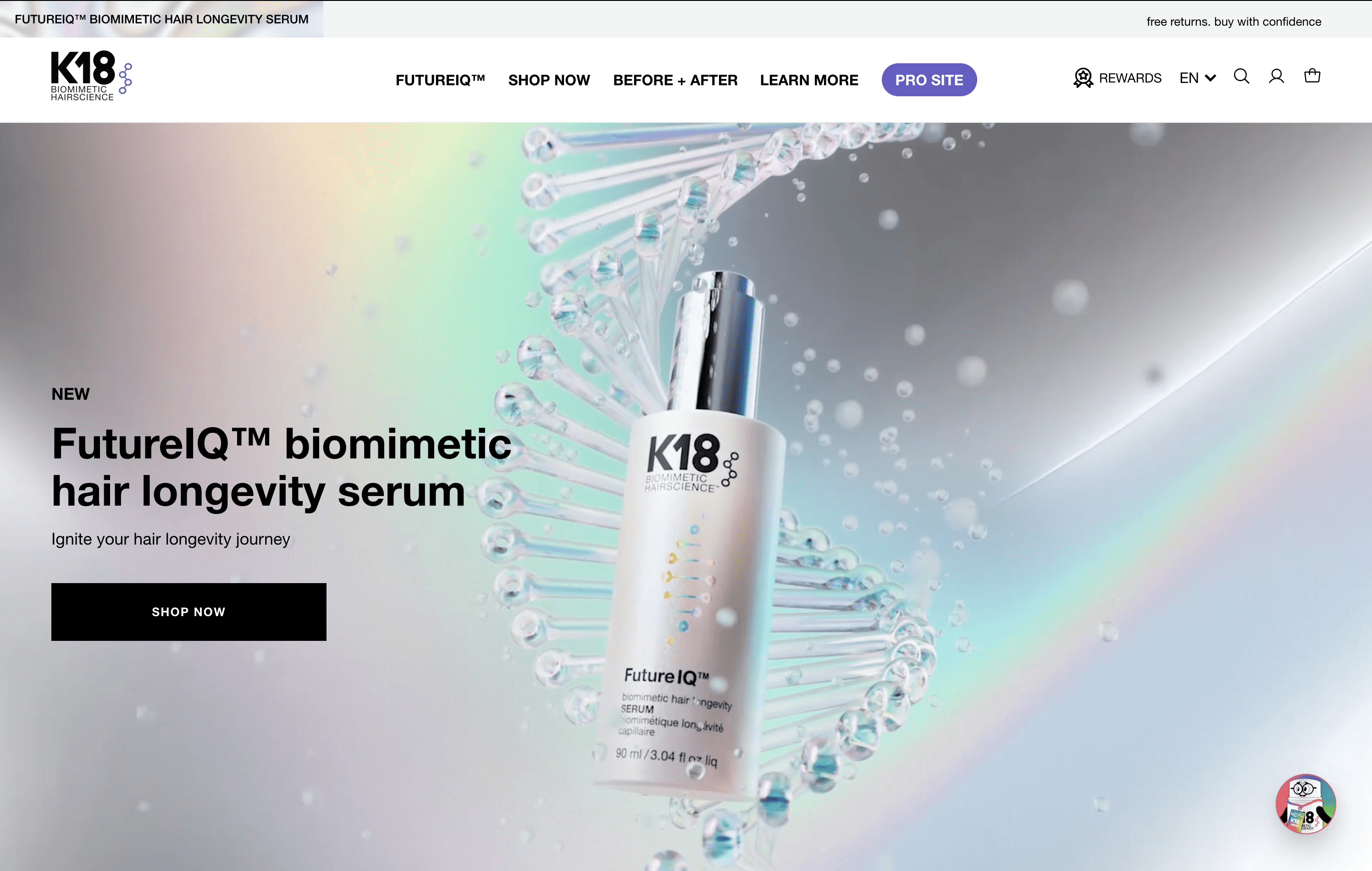 | 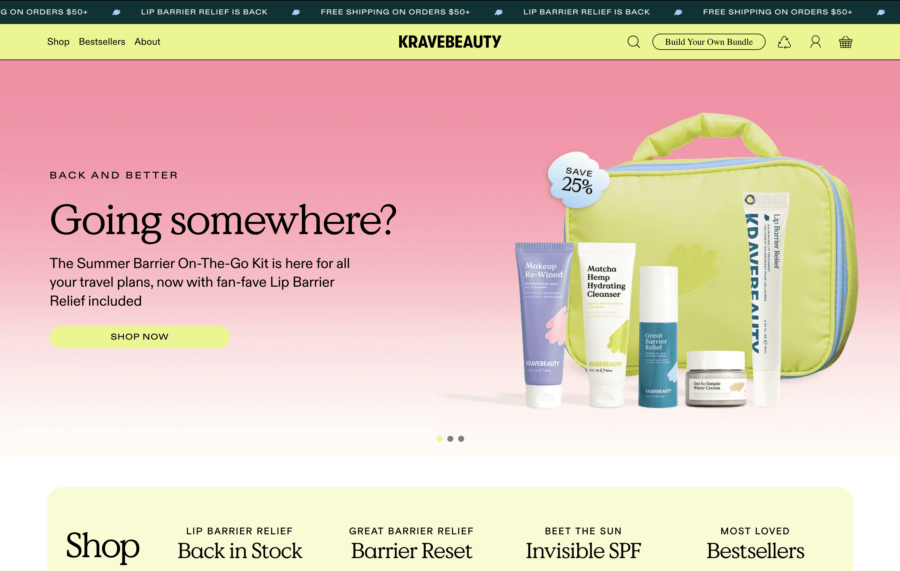 |
Brand: Gisou | Brand: K18 | Brand: Kravebeauty |
Best for: One clear product, campaign, or offer | Best for: Products that benefit from being seen in action | Best for: Multiple campaigns that genuinely need equal visibility |
Advantages: Maximum control over one clear first impression | Advantages: Adds movement, demonstration, and storytelling | Advantages: Fits several messages into the same space |
Trade-offs: Less room to tell a broader story | Trade-offs: More production and resources needed | Trade-offs: Later messages may receive less attention and add UX complexity |
Static is the default. Sliders are becoming the exception.
The clearest pattern in our research is how strongly beauty brands have converged around a single visual experience.
Of the 312 homepages we analyzed, 75% use a static hero, while 19% use video. Only 5% rely on a slider.
That doesn't necessarily mean static imagery converts better.
It does suggest that most brands prefer to give one campaign, product, or message control of the first screen rather than asking several messages to compete for the same space.
Video tends to appear when movement contributes to the story.
For beauty brands, that could mean showing texture, product application, hair movement, skin finish, or how a product behaves in use.
Sliders are now the exception.
Only 17 of the 312 brands we analyzed 5% use one as their primary hero format.
What can you take from this?
Start with one clear message, then choose the format that communicates it best.
Static is the most common choice in our research, but that doesn't mean video should be dismissed.
In a 2025 homepage A/B test by Ramify, a video hero reached a 15.01% CTA conversion rate compared with 9.37% for the static version.
While Ramify operates in financial services rather than ecommerce, the result isn’t universal proof that video performs better.
It does, however, highlight why hero formats are worth testing rather than relying on assumptions.
Recent ecommerce research also suggests that video can positively influence trust and purchase intention when it helps shoppers understand or experience the product.
For beauty brands, that could mean showing texture, application, movement, finish, or product results that are harder to communicate through a single image.
We’d be more cautious with sliders.
Only 5% of the brands in our research use one, while Baymard's 2025 ecommerce UX research found usability issues in 46% of homepage carousel implementations.
The takeaway isn't “never use a slider.”
It's simpler:
Use static when one strong visual can communicate the message clearly.
Test video when motion adds useful product information or strengthens the experience.
Use a slider only when multiple messages genuinely need to share the first screen.
Hero content: People, product, or both?
Hero format determines how the first screen is delivered.
Hero content determines what shoppers actually see.
Whether you use a static image or video, the visual still needs to do a job: show the product, help shoppers imagine the outcome, build a feeling around the brand, or combine several of those things.
Across beauty and skincare, most hero content falls into three main approaches: people-led, product-led, or a combination of both.
People-led | Product-led | People+Product |
|---|---|---|
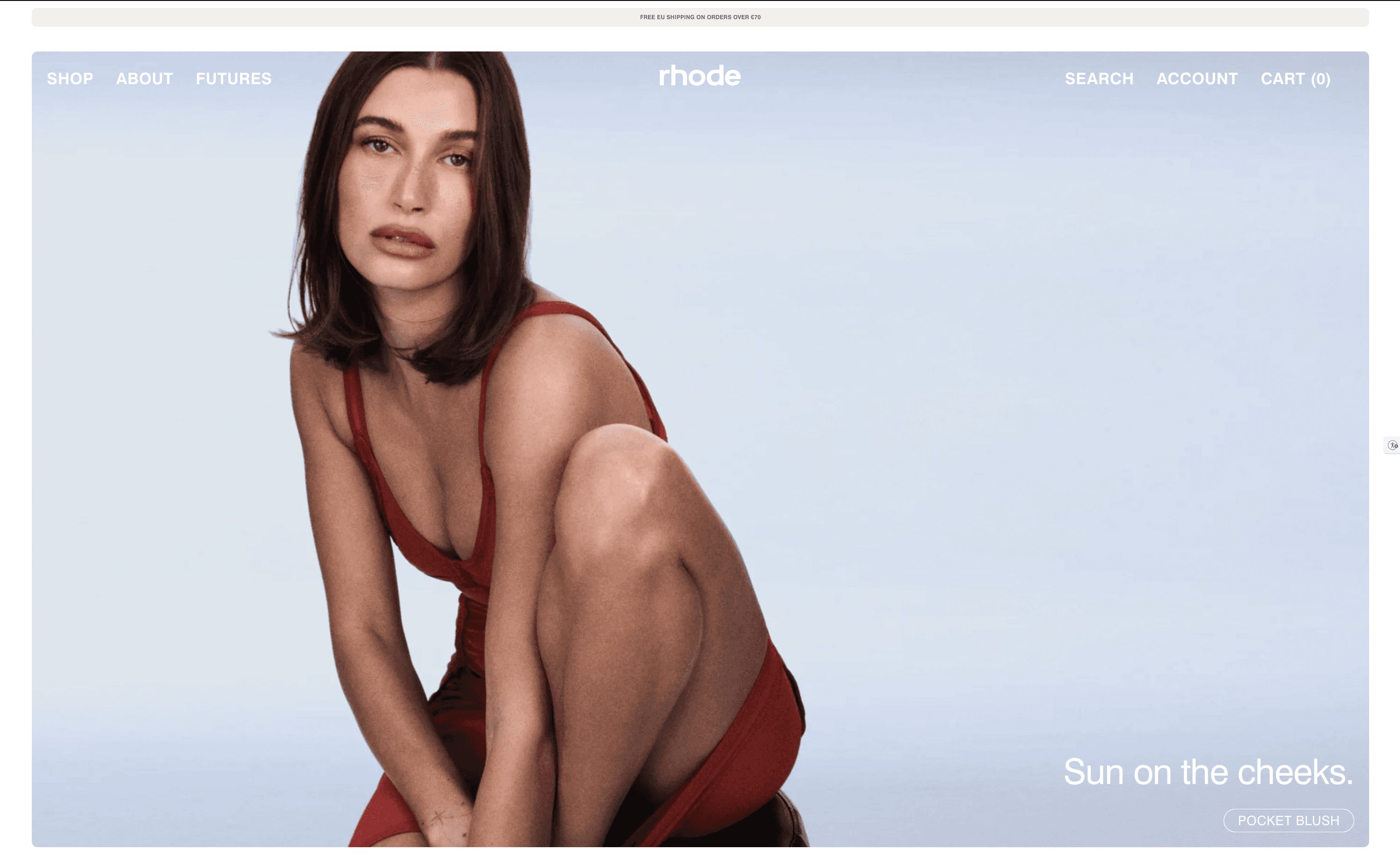 | 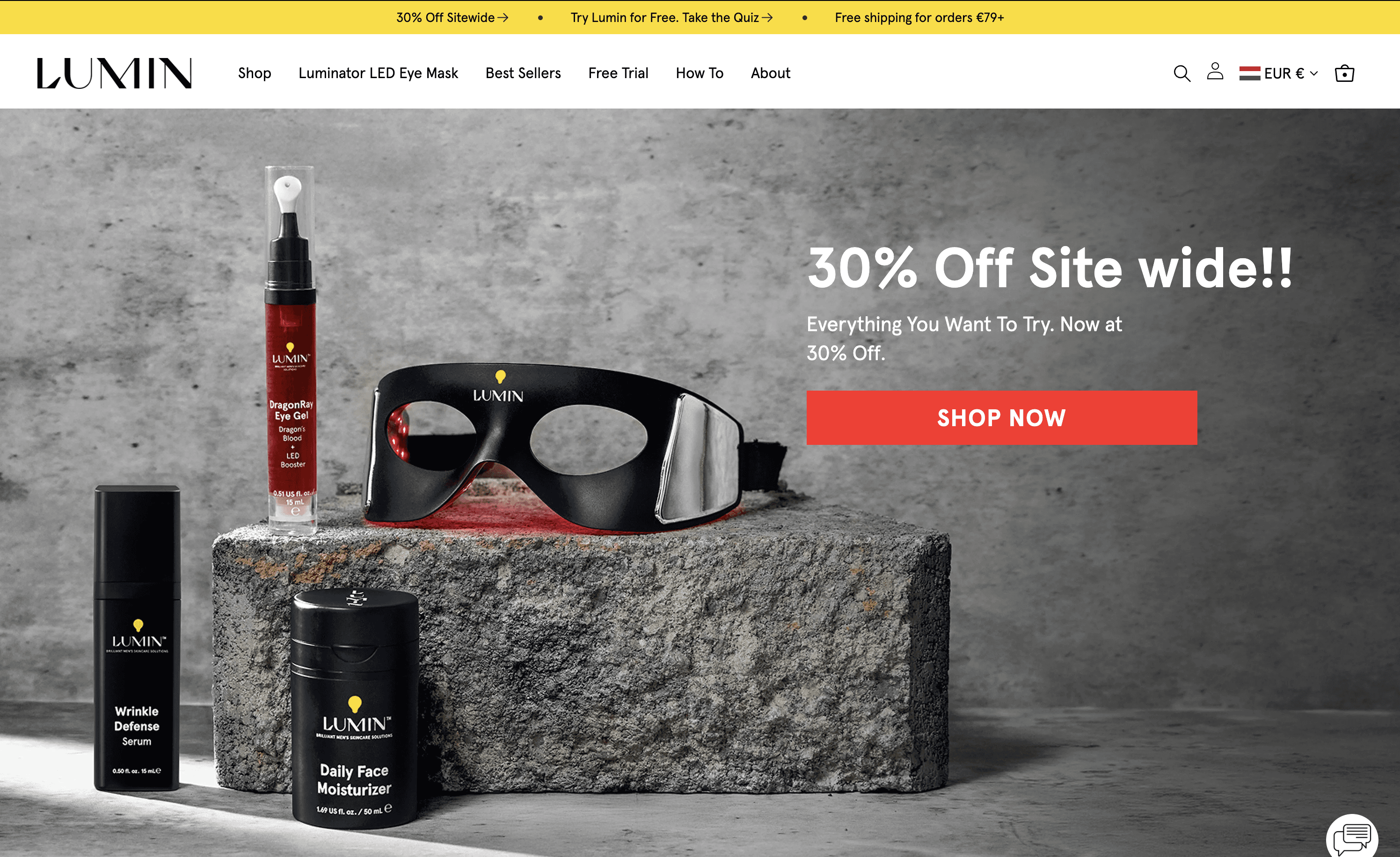 |  |
Brand: Rhode | Brand: Lumin | Brand: Curology |
Best for: Lifestyle, results, routines, and aspirational campaigns | Best for: Product launches, hero products, and clear offers | Best for: Showing the product in use or connecting the product directly to an outcome |
Advantages: Adds human context and helps shoppers picture the result | Advantages: Makes the product immediately recognizable and keeps the message concrete | Advantages: Combines human context with clear product recognition |
Trade-offs: The product can get lost if the creative becomes too focused on mood or the model | Trade-offs: Can feel more functional if there’s little lifestyle or emotional context | Trade-offs: More visual elements can make the hero harder to keep focused |
People sell desire. Products sell clarity.
There isn’t one dominant visual formula across beauty.
42% of the brands we analyzed use a people-led hero, while 35% put the product itself first.
Another 16% combine people and product, with the remaining 7% using graphic or multi-tile approaches.
That close split is interesting.
People-led imagery gives brands space to show skin, hair, application, lifestyle, the outcome the shopper wants, or an aspirational identity around the product.
Product-led imagery does something different: it makes what is being sold immediately recognizable.
Some brands combine both jobs.
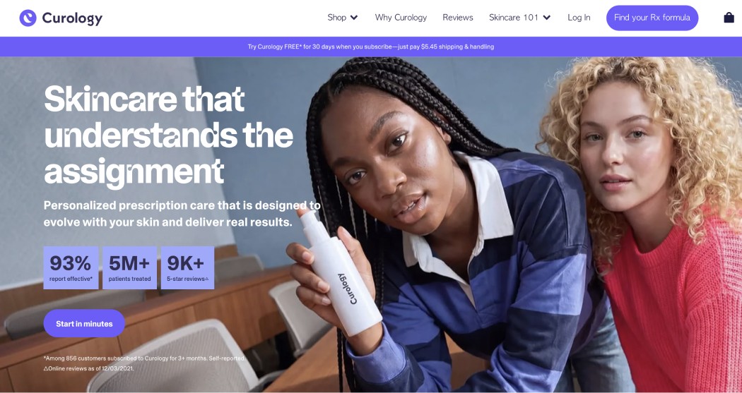
Curology, for example, shows people with healthy-looking skin alongside a clearly visible product. The shopper gets the human context without having to work out what the campaign is actually selling.
Lumin takes the opposite approach, putting the product front and center to make the offer immediately clear.
Rhode leans heavily into founder-led and people-led creative, using Hailey Bieber's recognizability and aspirational lifestyle to build desire around the brand.
What can you take from this?
Choose the visual based on what the shopper needs to understand first.
If the product itself is unfamiliar, distinctive, or the focus of a launch, putting it clearly in the hero can reduce ambiguity.
If the value is easier to understand through use, transformation, texture, skin finish, or lifestyle, people and contextual imagery can add information that a standalone packshot cannot.
Recent ecommerce research supports the value of this context.
A 2026 eye-tracking experiment found that contextual product imagery can influence image appeal, product perception, and willingness to pay, with the strength of the effect varying by product type.
The important point is that context works when it helps the shopper evaluate or imagine the product not simply because the image looks more aspirational.
There’s also a practical UX consideration: if you show a product prominently inside lifestyle or people-led imagery, shoppers should still be able to clearly identify what they’re looking at and where the CTA will take them.
So the takeaway isn’t “people perform better than products.”
It’s simpler:
Use people when the person helps communicate the result, use case, or feeling.
Use product when recognition and clarity matter most.
Use both when the human context adds value without making the product harder to identify.
Most heroes give shoppers a reason to shop, not a brand manifesto
Product launches and featured products are the most common hero strategy, appearing on 29% of the homepages we analyzed.
But the bigger pattern is that most brands use this space to communicate something specific.
Another 22% lead with a seasonal campaign, 21% focus on a benefit or outcome, and 15% lead with a promotion.
By comparison, only 7% use their hero primarily for broad brand positioning, while 4% focus on education or proof.
Put together, 87% of the brands we analyzed use the hero to communicate a product, campaign, benefit, or offer rather than simply introducing the brand.
That doesn’t mean branding disappears.
The strongest examples still communicate brand through photography, tone of voice, typography, product design, and overall art direction while keeping the actual message specific.
The copy follows the same pattern
27% of hero headlines lead with the product itself, while another 24% lead with a benefit or outcome.
Broad brand or proof-led messaging accounts for just 5%.
The strongest examples make the value easy to understand without giving up personality.
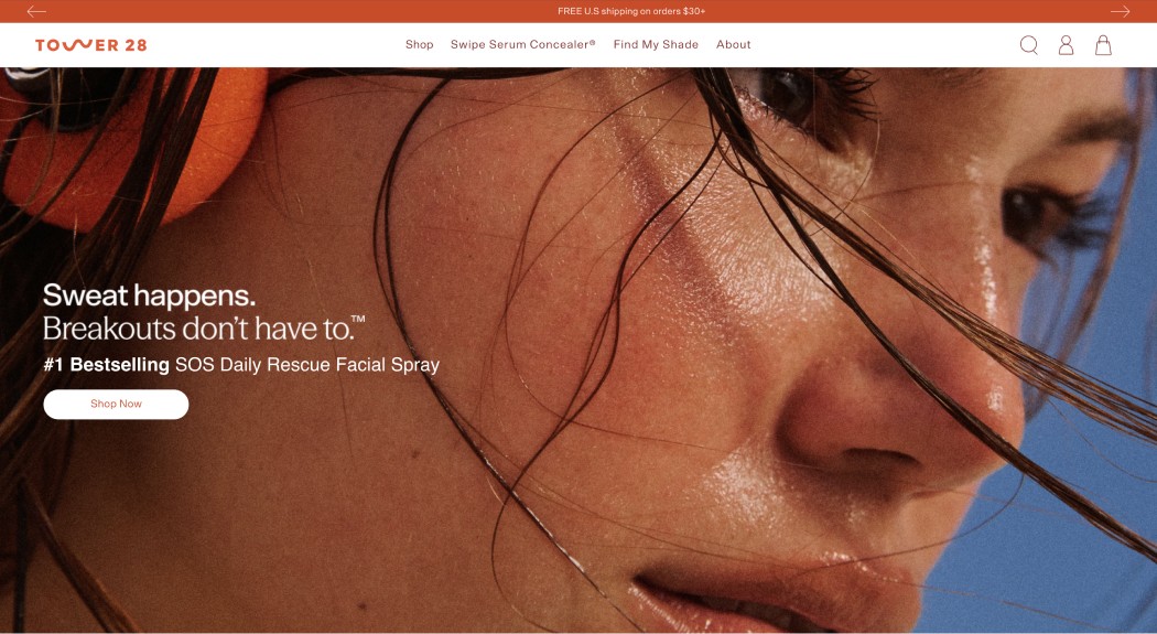
Tower 28 uses “Sweat happens. Breakouts don’t have to.” to start with a familiar problem and immediately connect it to the outcome the product is designed to deliver.
Youth to the People takes a more evidence-led approach, using a specific hydration result “+110%” to make the benefit feel concrete rather than relying on a vague claim like “more hydrated skin.”
Different creative approaches, same principle:
Give shoppers something specific to understand, want, or act on.
Numbers can do the same job even faster.
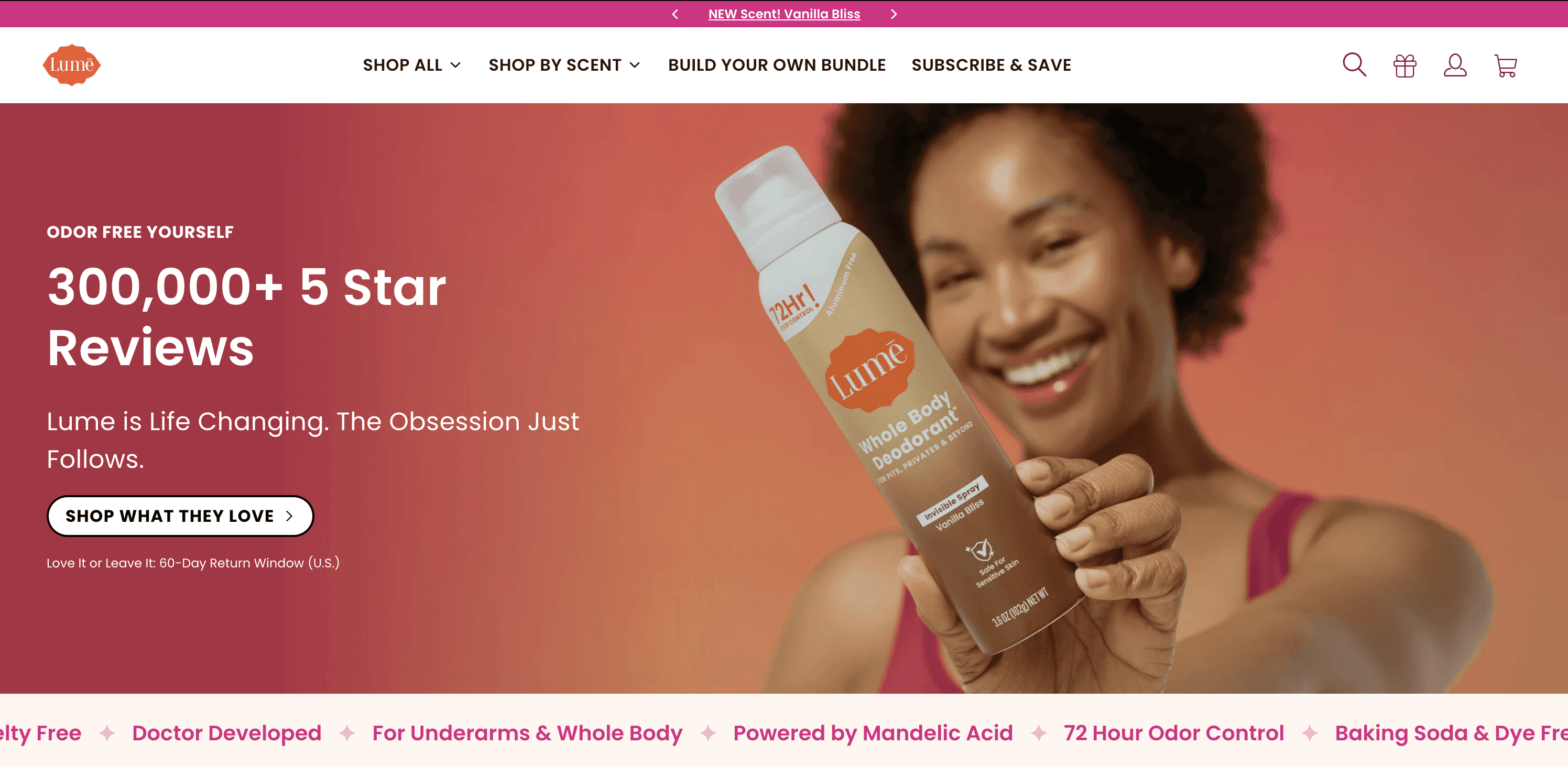
Curology stacks “93% report effective, 5M+ treated, 9K+ reviews” directly into the hero, while Lume leads with “300,000+ 5-star reviews.”
In a category full of broad promises, specific figures can make a claim feel much more concrete and believable.
What can you take from this?
Use your hero to give shoppers a clear reason to care right now.
Our research shows that most beauty brands don’t use the first screen to explain the whole brand.
They focus on something more immediate: a product, a benefit, a campaign, or an offer.
Nielsen Norman Group recommends that homepages communicate a clear value proposition in the hero area and focus on what matters to the user rather than relying on vague or company-focused messaging.
That doesn’t mean brand storytelling disappears.
It means the brand can be expressed through the creative while the message stays useful to the shopper.
So when planning your hero, start with:
What is the most important thing we want someone to understand or want within the first few seconds?
Then make the copy specific:
Launching something new? Lead with the product.
Selling a result? Lead with the benefit or outcome.
Running a campaign? Make the campaign immediately understandable.
Offering a strong incentive? Make the value obvious.
Leading with the brand itself? Give shoppers a clear reason why that brand story matters to them.
The goal isn’t to say everything above the fold.
It’s to make one thing worth paying attention to.
One clear action, usually on the left
Once the hero has something worth saying, it needs to make the next step obvious.
And most beauty brands keep that decision surprisingly simple.
70% of the homepages we analyzed use one clear CTA above the fold.
Another 19% offer two, while only 4% ask shoppers to choose between three or more actions.

That doesn't mean every homepage needs exactly one button.
It does show a strong preference for giving one action visual priority.
Jones Road is a good example.
The hero introduces the idea with “Makeup, Simplified” and gives shoppers one obvious next step: “Shop Now.”
There are plenty of navigation options around it, but the hero itself stays focused on one job.
Most brands keep the copy on the left
57% of brands position their hero copy on the left, compared with 22% centered and 13% on the right.
There’s a good usability reason for that pattern.
In left-to-right languages, users tend to spend more attention on the left side of webpages, and eye-tracking research from Nielsen Norman Group shows that scanning patterns are often concentrated around the top and left of the screen.
Left-aligned text also gives every line a consistent starting point.
Accessibility guidance from the UK Office for National Statistics recommends left alignment as the default because centered and right-aligned text can slow readers down when they need to find the beginning of the next line.
But that doesn’t mean every hero should be left-aligned.
The photography still matters.
In the Jones Road example, the model and product occupy the right side of the image, naturally leaving space on the left for the headline, supporting copy, and CTA.
The better rule is:
Start with readability, then let the composition decide.
Let the announcement bar do the secondary work
Beauty brands also tend to separate the hero message from more practical purchase information.
38% use the announcement bar for free shipping or delivery messaging, while another 23% use it for promotions or sales.
That lets the hero stay focused on the product, campaign, or message without losing useful information like shipping thresholds, discounts, gifts, or launches.
Kosas is a good example of this separation.
The hero focuses on its Cloud Set loose powder with one clear message and action, while free-shipping information and other offers sit quietly above the navigation in an announcement bar.
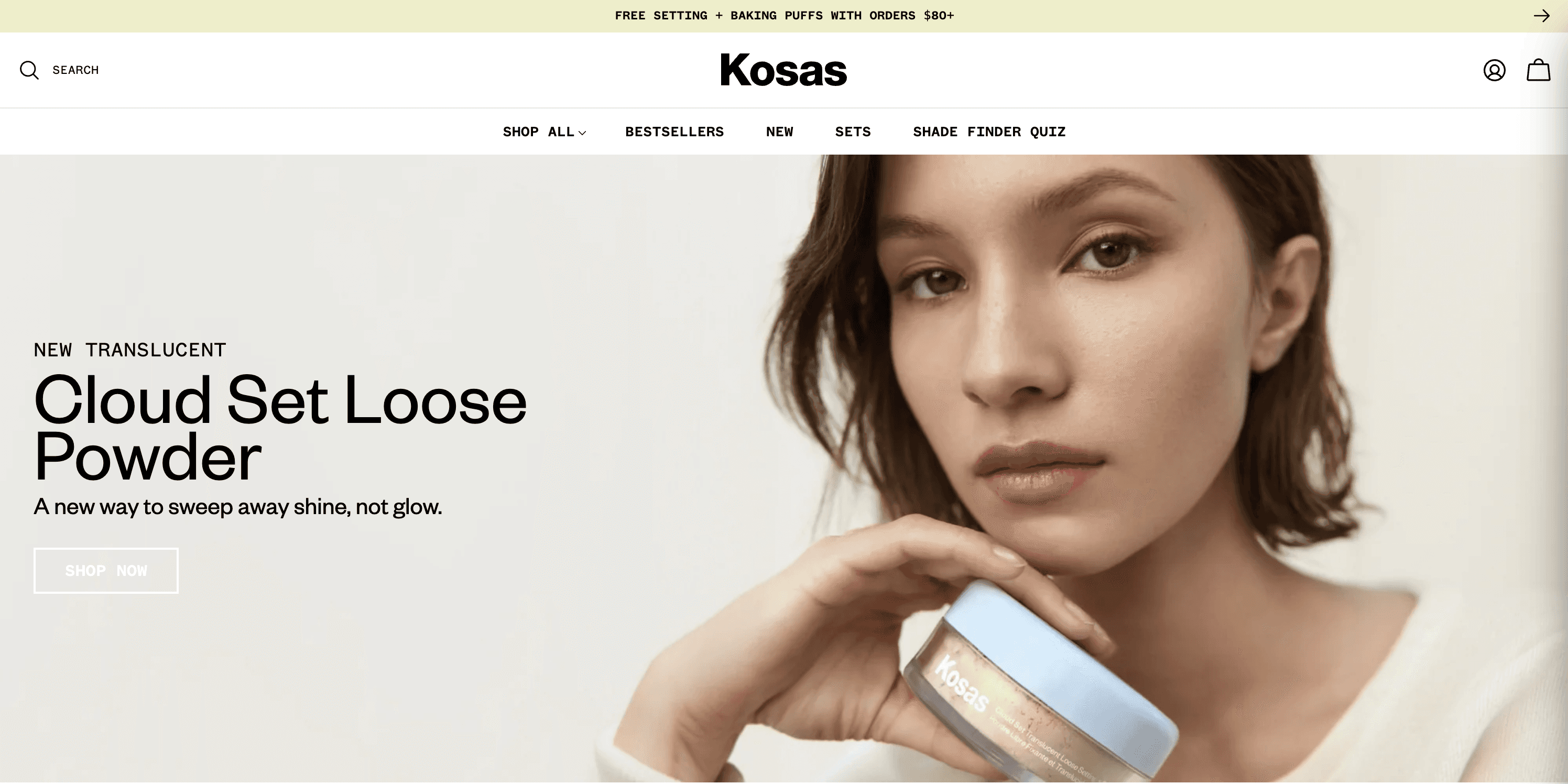
Different parts of the first screen have different jobs.
The hero answers:
“Why this?”
The announcement bar can answer:
“Why buy now?”
What can you take from this?
Build a clear hierarchy instead of giving every message equal weight.
Our research shows that one primary CTA is by far the most common approach.
Broader ecommerce UX research from Baymard points in the same direction: shoppers often rely on visual cues such as prominence and placement to identify the logical next action.
That doesn’t mean secondary actions need to disappear.
They just shouldn’t compete with the thing you most want shoppers to do.
So:
Give the hero one clearly dominant action.
Keep CTA wording clear and predictable.
Start with left-aligned copy for readability, but let the photography and composition guide the final placement.
Use the announcement bar for supporting incentives like free shipping, promotions, gifts, or launches when they don’t need to dominate the hero.
The goal is simple:
One message gets the attention. One action moves the shopper forward. Everything else supports it.
Light, neutral, and camera-real
Beauty is a visually expressive category, but most brands aren’t filling the first screen with color.
46% of the homepages we analyzed use a light or neutral visual treatment, making it the most common approach by a clear margin.
Another 21% lean on natural photography, while 18% use bright or saturated color, 9% go dark and dramatic, and 6% use split or multicolor layouts.
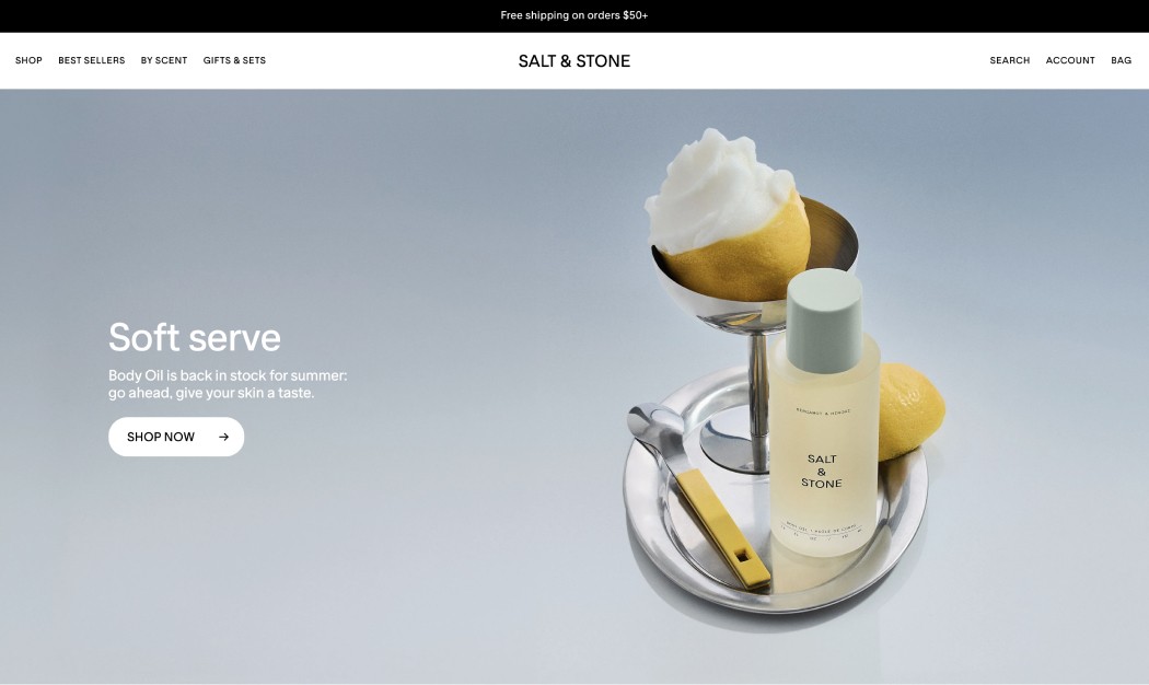
Salt & Stone is a good example of how neutral doesn’t have to mean boring.
The soft blue-grey background keeps the composition calm, while the product, yellow accents, headline, and CTA get room to stand out.
The brand still feels distinctive without every element competing for attention.
Bold color is the exception but there’s plenty of room for it
Light and neutral may lead, but 33% of the brands in our research use bright, dark, or multicolor treatments.
So this isn’t a story about beauty brands all looking the same.
Bold palettes can create a much stronger first impression, particularly when color is already part of the brand identity.
But the more visual elements you introduce, the more deliberate the hierarchy needs to become.
Nielsen Norman Group's visual-design guidance makes a similar point: color and contrast are powerful tools for directing attention, while too many competing colors can weaken visual hierarchy.
That’s the trade-off you can see in more maximalist brands.
A bright hero can be highly memorable, but the navigation, headline, product, CTA, badges, and promotional messages still need to be easy to separate from the creative.
What can you take from this?
Use color to support the hierarchy, not fight it.
Our research suggests that many beauty brands choose light and neutral treatments because they give the product and messaging plenty of visual space.
But popularity doesn’t make neutral the right answer for every brand.
If bold color is part of what makes your brand recognizable, use it.
Just make sure shoppers can still immediately find the product, understand the message, and identify the next action.
Contrast matters here too.
WCAG 2.2 recommends a minimum contrast ratio of 4.5:1 for normal text and 3:1 for large text, which becomes particularly important when copy sits directly over photography or saturated backgrounds.
So:
Use light or neutral when you want the product and message to carry most of the attention.
Use natural photography when context, texture, or lifestyle helps tell the product story.
Use bold color when it strengthens brand recognition but keep the surrounding hierarchy disciplined.
Always check text and CTA contrast, especially when placing them over photography.
The goal isn’t to make the hero quiet.
It’s to make sure the right thing is loudest.
The beauty homepage benchmark at a glance
Across the 312 brands we analyzed, these were the most common choices:
Taken together, the typical beauty homepage hero is static, focused around one clear action, and easy to scan.
But there’s no single formula.
People-led and product-led creative are relatively close.
Messaging ranges from launches to benefits and promotions.
And while light, neutral design is the most common visual treatment, a significant share of brands take a much bolder approach.
So treat these numbers as a benchmark, not a template.
If you're building one
Use the research as a starting point, then make each choice earn its place.
Give the hero one job.
Decide whether you're selling a launch, bestseller, benefit, campaign, offer, or brand idea. Don't make the first screen do all of them at once.Make the visual useful.
Show the product clearly, demonstrate the result, or create context around how it is used. The image should communicate something, not simply fill the space.Make the value easy to understand.
Lead with the product, outcome, or strongest reason to care. Specific usually beats vague.Give shoppers one obvious next step.
One primary CTA is the dominant pattern in our research. Secondary actions can exist, but they shouldn't compete for the same attention.Design for readability first.
Place copy where the visual gives it room to breathe. Left alignment is common, but clarity matters more than following a layout rule.Separate the message from the incentive.
Let the hero explain why this, while the announcement bar handles things like free shipping, discounts, gifts, or urgency.Use color with intention.
Neutral gives products and messaging room to stand out. Bold can make a brand unforgettable. Either way, keep the hierarchy clear.
The goal isn't to copy what 312 other brands are doing.
It's to understand the patterns, decide which ones make sense for your store, and test the choices that matter most to your shoppers.
Be distinctive in the creative, specific in the message, and predictable in the interaction.
Ready to put these learnings into practice?
Running a Shopify store and want to improve your homepage without spending hours designing or writing code?
With Instant AI, you can turn a prompt into a high-converting Shopify home page, customize it to your brand, publish it, and run A/B tests to learn what actually works with your shoppers.
Build faster. Test smarter. Keep improving your store without the usual development headache.
Try Instant AI free for 7 days and start building your next Shopify homepage today.
Best Buy Boxes
Product Page Design
Fashion