



Headers & Hero design
A visual benchmark of hero formats, messaging strategies, conversion patterns and design conventions.
By the
Instant Team

We looked at the homepage hero of 312 beauty and skincare brands. The first screen has quietly become a campaign landing page.
Open almost any beauty homepage and you drop straight into the middle of a campaign. A new launch, a summer edit, a moody model, one big line of copy. It looks great. It also skips the question the brand most needs to answer: what is this, and why should I buy it?
That's the tension every beauty hero has to solve. The homepage wants to feel like a campaign. The shopper still needs to get the product, the reason, and the next click in about five seconds.
The category isn't settling on one look. It's settling on one way of working: a hero that gets refreshed like a campaign and behaves like a landing page. The winning move isn't minimal or maximal. It's high brand expression with low friction.
Here's what the data says, and what's worth copying.
Static still wins, sliders are over
Three in four brands run a static hero. Static gives you control over the crop, the copy, and the exact first impression, and it makes weekly campaign swaps easy. Video shows up when motion is the actual product story: texture, application, water, hair, skin finish. Carousels have quietly died. Only 5% use one, because asking a shopper to wait or swipe is asking them to leave.

The video crowd makes the logic obvious. Vacation, Ultra Violette, ILIA, and K18 reach for motion because the product actually moves: sunscreen going on, hair falling, texture spreading. The handful still running sliders, like KraveBeauty and Farmacy, are the exception that proves the point.
People sell desire. Products sell clarity.
This split is the whole story. Show a person, and shoppers want the product. Show the product, and they understand it. The strongest ones do both: a face or a mood for desire, plus a recognizable product or a result-led line for comprehension. When only one shows up, the model usually takes the frame and the product gets lost.
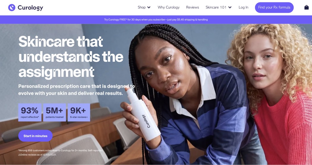
Curology shows the both-at-once version well: two faces mid-routine with the bottle held up to camera, so the desire and the product arrive together. Kosas and Tower 28 make the skin itself the proof. rhode goes the other way with pure mood, “Summer on the skin” over a single model, and leans on its copy and CTA to fill in what the image leaves out.
Most heroes sell a product, not a brand
Beauty homepages are product-led, not “here is who we are.” Launches, seasonal edits, and single-product stories dominate. Broad brand positioning is rare, and pure education is rarer. A good gut check: a first-time visitor should answer three questions in five seconds. What is this? Why should I care? What do I click?
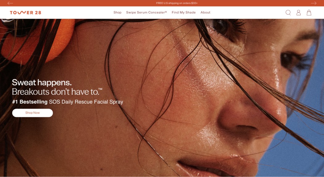
The headlines follow the same order. Product names and outcomes lead, vague campaign lines trail. Each strong one does a single job: name the product, promise the outcome, or frame the problem, like “Sweat happens. Breakouts don’t have to.” The pattern in the data is simple: specific beats poetic. Youth to the People’s “+110%” hydration does more work than “Made for Summer.”
Numbers do the same job even faster. Curology stacks “93% report effective, 5M+ treated, 9K+ reviews” straight into the hero, and Lume leads with “300,000+ 5 star reviews.” In a category drowning in broad promises, a real figure is the cheapest credibility you can buy.
One clear action, usually on the left
70% of heroes commit to a single CTA. That is the right call. The first screen should make one decision, not offer five.

Copy sits on the left more than half the time, which keeps it off busy faces and photography and easy to read.
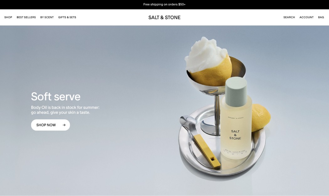
Notice how conservative the CTA wording stays even when the art direction is loud: Shop Now, Shop the Collection, Take the Quiz. The first screen is not the place to be cryptic. And the offer rarely lives inside the hero. The thin announcement bar carries free shipping, sales, and gifts, so the hero can stay editorial.
OSEA is a clean template for this. The hero says “30 Years of Skincare from the Sea” with one action, “Explore our story,” while free shipping sits quietly in the bar above the nav. Treat them as one system: let the bar answer “why buy now,” and the hero answer “why this.”
Light, neutral, and camera-real
Nearly half the sample leans light and neutral, another fifth on natural photography. Bright, maximal color is memorable but a minority sport, and it is the hardest to keep legible once you stack nav, copy, badges, and a chat bubble on top of it.
The maximalists show the trade-off. Starface runs a neon grid of green, pink, and purple tiles you will absolutely remember, but that same hero has to fight its own nav, product shots, and a free-shipping tag for attention. Light and neutral is popular because it loses fewer of those fights. Bright works when one brand owns the color and keeps everything else quiet.
Read together: beauty heroes are usually static, left-aligned, and built around one clear CTA, split between people-led aspiration and product-led comprehension.
If you are building one
Give the hero one job. Launch, bestseller, promo, category, or brand. Not all five.
Show one proof. A result on a person, the product at real scale, or the full routine.
Write the value in one line. A name, an outcome, or a specific claim beats a mood.
Make the CTA literal. “Shop the Serum” or “Take the Quiz,” never a cryptic verb.
Put urgency in the bar. Free shipping and sales live above the nav, not in the hero.
Design mobile as its own crop. Reframe and shorten. Do not just shrink the desktop hero.
None of this asks you to look generic. The best beauty heroes are unmistakably theirs and still dead clear about what is for sale. Be distinctive in the image, specific in the message, and predictable in the interaction. Refresh the hero like it is media, not a brochure, and the homepage starts earning its traffic.
How this was captured
Desktop homepage hero screenshots for 312 beauty, skincare, haircare, personal care, oral care, and fragrance brands, captured July 2026. One primary code per brand per dimension, so each chart totals 312. This is a visual snapshot, not a performance test: it shows what leading brands choose to put first, not which choice made more money. Brands in the set include Glossier, Rare Beauty, Kosas, ILIA, Merit, Curology, Vacation, Youth to the People, Starface, Supergoop, Ultra Violette, rhode, and OSEA.
Best Buy Boxes
Product Page Design
Fashion