
Animations can significantly elevate the user experience of your Shopify store, making it more engaging and visually appealing. While adding complex animations may sound complicated, with the right page builder, adding animations to your store is straightforward and impactful.
This guide will explore the different types of animations available, answer frequently asked questions, and provide step-by-step instructions on how to add animations to your Shopify store using Instant.
Why use animations on your Shopify store?
Animations can transform a static Shopify store into a dynamic, interactive experience. By guiding user attention, improving navigation, and adding visual interest, animations help:
Increase engagement: Animations capture attention, encouraging users to explore more of your store.
Enhance user experience: Smooth transitions and interactive elements make your store more enjoyable to browse.
Boost conversions: By directing attention to key areas, like calls to action or featured products, animations can help improve conversion rates.
Types of animations you can use
There are two primary categories of animations you can implement on your Shopify store using a page builder like Instant:
1. Scroll Animations
Scroll animations activate as the user scrolls down a page, revealing content dynamically. Here are some types of scroll animations you can use:
Fade In: Gradually changes the opacity of an element as it comes into view.
Slide: Elements slide in from the top, bottom, left, or right.
Float: Combines movement and opacity changes for a subtle reveal effect.
Expand and Shrink: Scales an element up or down as it appears.
Flip: Flips an element vertically or horizontally to catch the user's eye.
2. Triggers and Interactive Animations
Trigger animations are activated by user interactions, like hovering or clicking. Common triggers include:
Mouse hover: Activates when a user hovers over an element, such as a product image or button.
Mouse press: Triggers when a user clicks on an element, often used for buttons or interactive components.
Focus: Engages when a specific input field, like a search bar, is selected.
How to add Shopify store animations with Instant
Instant allows you to easily add and customize animations on your Shopify store pages. Here’s a breakdown of the two primary ways to add animations with Instant:
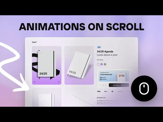
How to add animations on scroll to your Shopify store pages
Adding animations on scroll can make your Shopify store more dynamic and engaging, creating an interactive experience for your visitors. With Instant, you can easily reveal elements on your page as users scroll, using a variety of animations.
Here’s a video tutorial that explains how to implement these animations on your Shopify store pages using Instant:
Keep reading for a further explanation of how this feature works:
Step 1: Access the scroll animations feature
To start, select the element you want to animate (e.g., a row or an image) on your page. Next, go to the Interactions section in Instant and look for the Scroll into View option under the Effects menu. This feature lets you choose from a variety of animations that will trigger when the selected element comes into view as a visitor scrolls down your page.
Step 2: Choose your animation style
Instant offers several animation presets you can use right out of the box or customize for more granular control. Here’s an overview of the available animation styles:
Fade In: This animation reveals the element by gradually changing its opacity. Click on the preview icon to see how the element smoothly fades into view.
Slide: An element can slide in from the top, bottom, left, or right. You can also control the distance it slides, providing flexibility on how dramatic you want the reveal to be.
Float: The float animation combines movement and changes in opacity to reveal the element. You can choose the direction (up, down, left, or right) and adjust the distance of the float.
Expand and Shrink: These animations scale an element up or down, combined with a change in opacity. You can set the scale percentage to determine how much the element grows or shrinks during the reveal.
Flip: This animation flips the element either on the vertical or horizontal axis, adding a playful effect to the reveal.
Step 3: Adjust animation properties
Three critical properties can enhance your animations: Offset, Delay, and Replay.
Offset: Determines when the animation should trigger as the element comes into view. For example, if you set an offset of 150 pixels, the animation will only start after the user scrolls an additional 150 pixels beyond the element’s initial view.
Delay: Allows you to add a delay (in milliseconds) before the animation starts. For instance, you can set a delay of 400 milliseconds to stagger multiple animations, creating a cascading effect as the user scrolls down.
Replay: Controls whether the animation should replay when the element scrolls back into view. For example, you might want a sticky “Add to Cart” bar to reappear when a user scrolls back up.
Step 4: Create a sticky “Add to Cart” bar animation
A popular use case for scroll animations is to reveal a sticky “Add to Cart” bar as users scroll past a certain section, like the buy box on a product page. Here’s how to set it up:
Insert the Section: Under the Insert tab, go to the Template Library, choose Banner, and add it to your page. Ensure it’s connected to the main product of the product detail page.
Set the Animation: With the sticky “Add to Cart” bar selected, go to Interactions and set the Scroll into View effect. Choose the Float animation and set an offset of 400 pixels to make the bar appear only after users scroll down 400 pixels.
Enable Replay: To hide the bar when scrolling back up, enable the Replay option. This setting ensures the animation triggers both when scrolling down and when scrolling up, keeping the interface clean and less distracting.
Step 5: Preview and fine-tune your animations
Always preview your animations to ensure they align with your design goals. Adjust the offset, delay, and replay settings as needed to create the desired effect. The goal is to enhance user experience without overwhelming visitors with too many animations.
Animations on scroll are a fantastic way to engage users and guide their attention to key areas of your Shopify store.
With Instant, you have full control over how and when these animations are triggered, allowing you to create a unique and interactive shopping experience. Whether you’re highlighting new arrivals, encouraging conversions with a sticky “Add to Cart” bar, or simply adding a touch of flair to your pages, scroll animations are a powerful tool at your disposal.
Now let’s dive into another popular way of adding animations to your Shopify store:
How to add triggers and animations to your Shopify store pages using Instant
With Instant, you can easily enable triggers and animations to any element on your page. This guide will walk you through how to implement different triggers and customize their animations to elevate your Shopify store's look and feel.
Here’s a video that breaks down this feature (or keep reading for more info!)

Step 1: Access the Interactions panel
To begin, go to the Interactions panel in Instant. This panel allows you to enable triggers and add animations to any element on your page. You can choose from three different types of triggers: Mouse Hover, Mouse Press, and Focus. Let’s explore each trigger and how to use them effectively.
Step 2: Understanding triggers
Mouse Hover: This trigger activates when a user hovers over a certain element with their mouse. It's great for revealing additional information or creating a dynamic visual effect when a user moves their cursor over a specific part of your page.
Mouse Press: This trigger activates when a user clicks or presses on an element. It can be used to show or hide elements, change styles, or provide feedback when a button is clicked.
Focus: This trigger is activated when an element, such as an input field, gains focus. This is particularly useful for drawing attention to interactive elements like forms or search bars.
Each trigger has properties you can customize to control the animation that occurs when a visitor interacts with the selected element.
Step 3: Customize trigger properties
For this example, we will use the Mouse Hover trigger:
Select the Trigger: Click on the Mouse Hover trigger to start customizing. You will see a range of properties to edit, such as Opacity, Scale, Offset, and Fill.
Add More Properties: Click on Add Property to see additional customization options. This allows you to create more complex and unique animations tailored to your needs.
Example with Mouse Hover:
Select an image element and apply the Mouse Hover effect.
To change the image on hover, go to Fill > Image and select a different image.
Click on the Preview button to see a live preview of the animation. You can also preview the entire page to see how the animation fits within the overall design.
Step 4: Adjust animation properties
When you select a trigger, you can further refine the animation using various options:
Ease In/Out: This transition effect starts slowly, creating a smooth animation that feels more natural.
Linear: This creates a consistent speed throughout the animation, from start to finish.
Speed: Adjust the speed to make the animation faster or slower.
Delay: Set a delay (in milliseconds) to determine how long after the trigger the animation should start.
Step 5: Implement the Mouse Press trigger
Now, let's work with the Mouse Press trigger:
Select the Element: Choose a button or another element you want to animate.
Add the Mouse Press Trigger: For example, set the trigger so that when a user presses the button, its opacity decreases.
Set the opacity to 80%.
Preview the button to see how it looks when pressed.
Step 6: Create Group Triggers
To make more advanced animations, you can use Group Triggers. This feature allows multiple elements to share the same trigger effect, enhancing the overall interaction.
Example with Group Triggers:
Suppose you want an icon to move to the right when someone hovers over a button.
Select the icon element and add the Mouse Hover trigger, setting the offset on the x-axis to 8.
Preview the effect. If it only moves when you hover directly over the icon, you can set a Group
Trigger to apply the same effect when hovering over the entire button.
Set Group Triggers:
Select the button element and go to Interactions.
Add the Mouse Hover effect.
Now, any element within the button that has the Mouse Hover effect will trigger when hovering over any part of the button, not just the individual element.
Preview again, and you will see the icon moves whenever the button is hovered over.
Step 7: Preview and refine your interactions
Always preview your changes to ensure they align with your design goals. Use the live preview to test each trigger and its properties, adjusting them as needed to create the desired effect.
Triggers and animations are a powerful way to enhance user experience on your Shopify store. Whether you’re using simple hover effects or complex group triggers, the possibilities are endless for creating a unique and interactive shopping experience.
Frequently Asked Questions
1. Do animations slow down my Shopify store?
Animations can impact performance if not implemented correctly. However, using lightweight animations and optimizing them with tools like Instant can help ensure your store remains fast and responsive.
2. How do I choose the right animations for my store?
Consider your brand’s aesthetic, the user experience, and the purpose of the animation. For instance, use subtle animations for professional stores or bold, dynamic ones for creative brands.
3. Can I use animations without coding?
Yes! With page builders like Instant, you can add animations without any coding knowledge. Instant provides a user-friendly interface to customize animations with just a few clicks.
4. Are animations compatible with all devices?
Most animations are compatible across devices, but always preview and test your animations on both desktop and mobile to ensure they perform well and look great.
5. How can I make sure my animations enhance rather than distract?
Use animations sparingly and purposefully. Focus on key areas like calls to action, product highlights, or important navigational elements to guide users naturally through your store.
Conclusion
Enhancing your Shopify store with animations can significantly improve the overall user experience, engagement, and conversion rates. By using a page builder like Instant, you can easily add and customize animations without any coding, making your store more dynamic and interactive. Experiment with different types of animations, optimize them for performance, and always keep the user experience in mind to make the most of this powerful tool.
Ready to bring your Shopify store to life? Start adding animations with Instant today and watch your store transform!


