
Every Shopify store has a homepage. But not every Shopify store has a homepage hero section that converts visitors into customers.
What do top-performing Shopify Plus homepages do differently?
To find out, we analyzed the above-the-fold design of 1,000 leading brands, focusing on how they communicate value, display products, and drive action on mobile.
For each brand, we systematically analyzed four key areas:
Hero messaging: Copy, headlines, and value propositions
Visuals: Image format, product visibility, and mobile optimization
CTAs: Button placement, text specificity, and visibility
Conversion drivers: Urgency elements, social proof, and trust signals
This was exclusively a mobile-focused study. Each homepage was evaluated on a mobile device to ensure accuracy in measuring elements like CTA visibility, text readability, and image optimization. The focus on mobile reflects current shopping behavior; desktop analysis provides insights, but mobile analysis drives revenue.
It’s important to note that this analysis was performed during the first 2 weeks of July, a peak summer sales period and Amazon Prime week. The tactics used by brands during this “Black Friday in July” period may relate to similar tactics used during other peak sales periods.
What we found: Trends in hero copy and CTA styles
Our findings in this section include:
Here’s what we found:
Hero messages: Three main categories
The main messaging found in the hero of the brands analyzed could be categorized into three broad themes (26% sales/promotional, 22% new product/launch, & 52% brand/other), each with a specific objective:

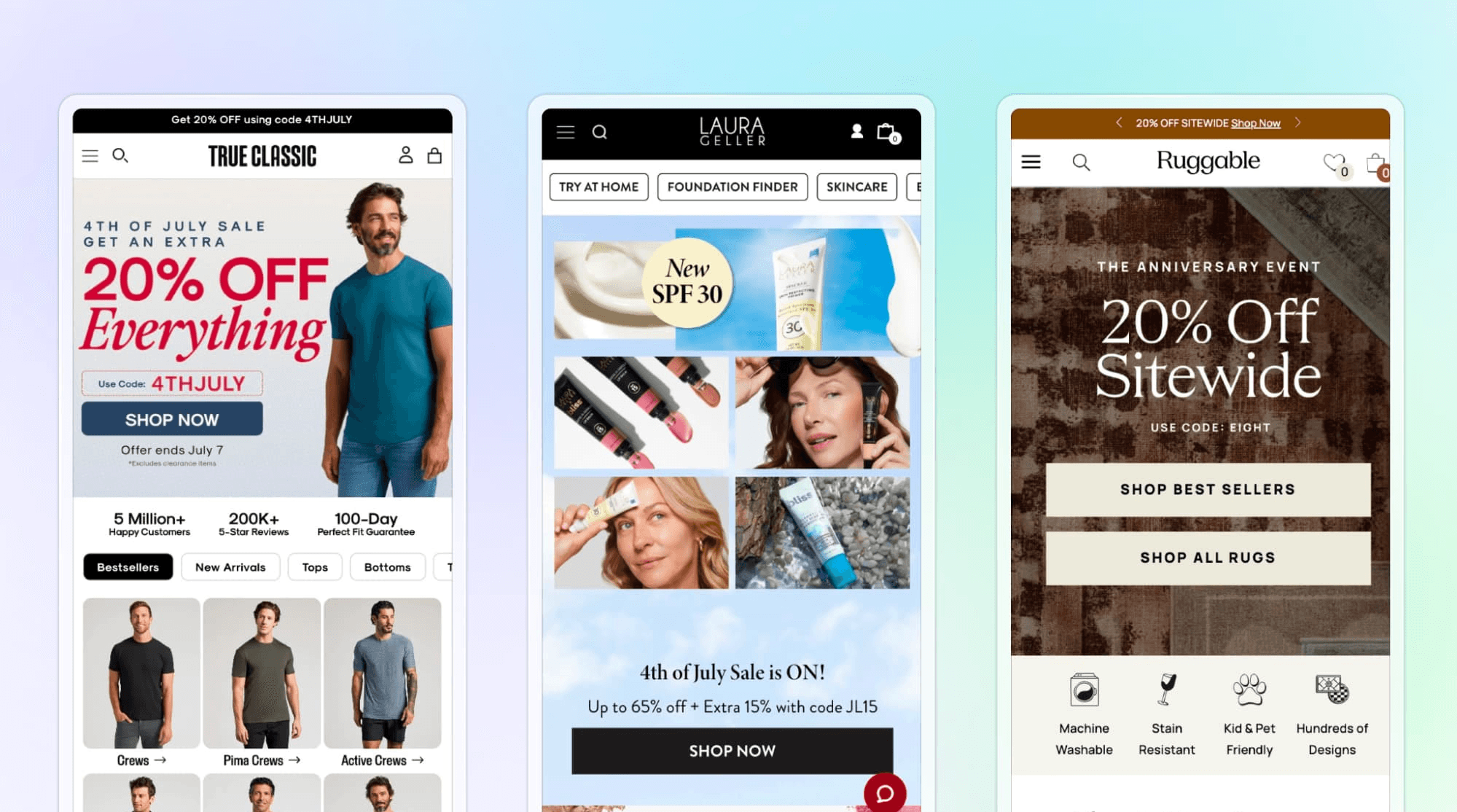
1. Sales & promotional messaging (26%)
Unsurprisingly, a significant portion of brands leverage their hero section to highlight discounts, sales events, and promotions.
These heroes are focused on making a quick sale by making an irresistible offer.
Common messaging tactics found within this category include:
Direct messaging: Often featuring phrases like: “Up to 80% off”, “Limited time only”, or promo codes.
Urgency: Mentioning deadlines like “sale ends July 31” or “extended through today” to create FOMO.
Seasonal tie-ins: Common sales messaging included “Black Friday in July”, “Primetime sale”, and “Christmas in July”.
Deal or discount: All messages in this category mentioned a deal like “45% off everything” or “Buy One Get One”.
Shopping-focused CTAs: Most of the CTAs in this category encouraged quick action with phrases like “Shop now” or “Save now”.
2. New product/launch (22%)
Approximately one in five brands utilized their homepage hero to introduce a new product, collection, or collaboration.
These heroes are focused on making shoppers aware of a new offering, and encourage both quick conversions and sometimes offering a path to learn more.
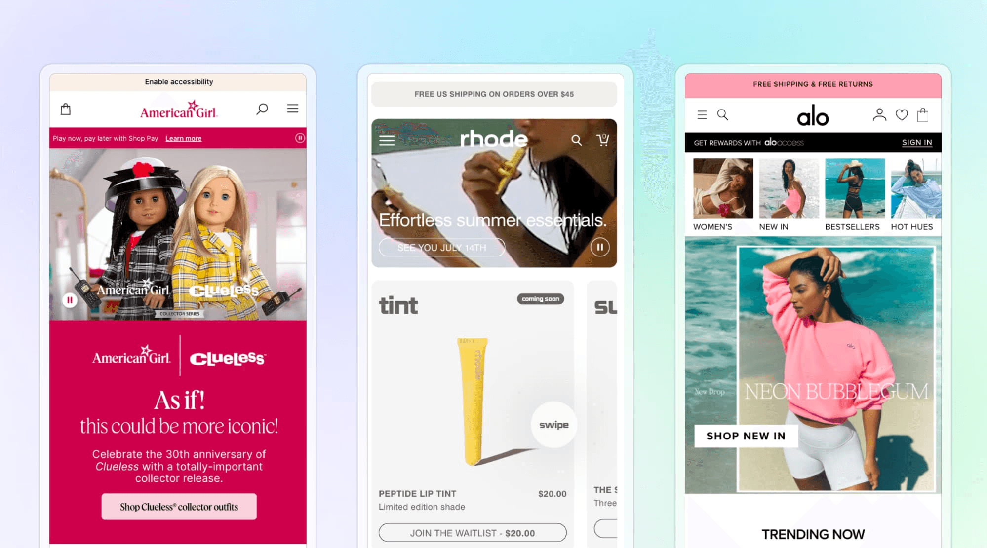
Popular messaging tactics used include:
Common keywords: Most messages included words like “New”, “Introducing”, “Meet”, or “Coming soon”.
Product names & features: Names and features were front and center to make it clear what is being launched, like “four new shades fit for summer” or “special edition…available now!”.
Descriptive or narrative style: This style was used to build excitement and sometimes piggybacking on pop culture moments, for example, “As if!...30th anniversary of Clueless!” for a themed collection.
Secondary CTAs: While most CTAs were still shopping-oriented (e.g., “Shop [New Item]”), some heroes used a second option like “learn more”.
3. Brand/other messaging (52%)
Over half the brands opt for messages beyond immediate sales or new launches, and instead focus on seasonal highlights, category showcases, or brand storytelling.
Many are seasonally themed, aligning with the time of the analysis (mid-summer), with "summer" being mentioned in over 20% of all heroes. These messages focus on inspiration and brand engagement rather than direct deals.
These heroes focus on inspiration and brand engagement rather than direct deals.
Frequent messaging tactics used in this category include:
Seasonal references: Promoting summer staples, vacation essentials, or back-to-school gear without a specific discount attached (e.g., “summer standouts, nothing but the best”).
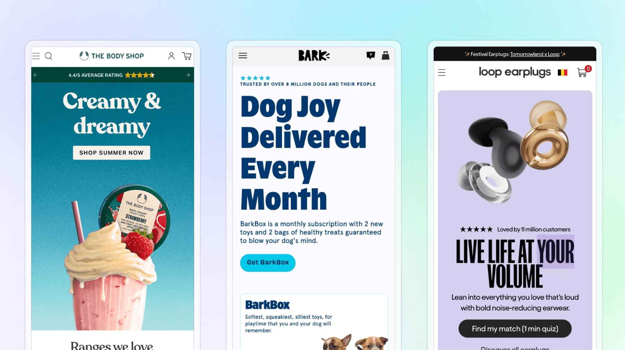
Brand values or lifestyle: Brand values were reinforced with messages like “Highest quality. Honest prices. Handcrafted with integrity,” leading into product categories, or playful on-brand narratives like “Trusted by over 8 Million Dogs… Dog joy delivered every month” for a pet subscription box.
Corporate social responsibility: This category also includes unique content like charity tie-ins (one brand’s hero announced a collection with “100% of profits” to relief funds).
General versus specific Call-to-Action (CTA) patterns:
When it comes to CTAs, the preference for direct shopping language is clear. There were three main findings related to the CTA copy patterns:
1. Prevalence of “Shop” CTAs (70%)
About 70% of all CTAs began with “Shop.” 40% of brands used a generic “Shop Now” button as their primary CTA, making it the single most common phrase. This is unsurprising given its simplicity and effectiveness in e-commerce UX!
Many others used “Shop” plus a specific target, such as:
“Shop Men’s”
“Shop Women’s”
“Shop All”
“Shop Sale”
or “Shop [Product/Collection]”
This highlights a strong bias towards immediate commerce-driven wording.
2. Specific CTAs (30%)
Approximately 30% of CTAs did not start with “Shop,” often using more context-specific action words instead, for example:
Category-specific navigation, like “Womenswear”
Alternative verbs, like “Get”, “Buy”, or “Order Now”
Engagement-focused, like “Learn more”, “Find my match” (paired with a quiz), or “Reserve Now” (for a product pre-order).
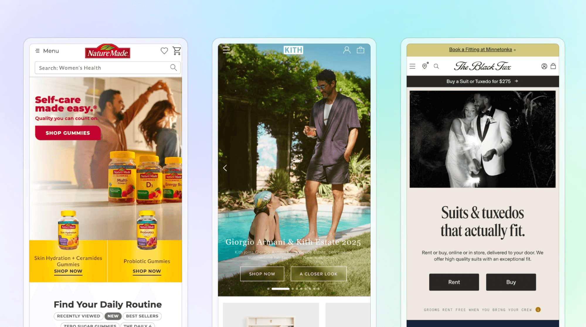
3. Multiple CTAs (16%)
While most brands use a single primary CTA, about one in six brands use at least two (or more) CTAs in their hero banner. This multi-CTA approach is a way to segment user flow from the hero.
Common CTA pairings include:
Splitting traffic by gender (“Shop Women’s” and “Shop Men’s” side by side)
Offering a path to purchase and a path to explore (“Shop now” vs “A closer look”)
Splitting by purchase options (“Rent” vs “Buy” for formalwear service)
Homepage CTAs overwhelmingly aim to drive immediate shopping activity. “Shop Now” remains the go-to CTA for a reason: it’s simple, familiar, and built to convert. When brands deviate from this, it’s usually to better fit the context (like “Learn more” for a complex product) or to offer different navigational options (like Shop [Collection name]). Even when playful messaging is used in the hero copy, the CTA text is simple, action-focused, and commerce-driven.
Message length and copy style
The hero copy length varied, but stayed concise for the most part, with brief phrases and one-liners (occasionally supplemented with short subheadings!):
Here’s the breakdown of message length by word count:
Hero copy length | % of brands |
Very short (≤ 5 words) | 8% of brands (e.g., “Beach bound.”). |
Moderate (6–15 words) | 49% of brands (e.g., “Summer clearance, up to 90% off.”). |
Longer (16+ words) | 43% of brands typically: a headline plus a subheading, two short sentences, or a tagline + subtext. |
Brands that use wordier hero messaging usually have brand/story-oriented heroes. Short copy is more common in sales banners or category spotlights. A handful of brands skipped headlines altogether, relying entirely on a bold CTA to do the talking.
Key takeaways: Trends in Shopify Plus brand hero copy and CTA styles
In general, Shopify Plus brands often use their homepage hero for one of three main purposes: driving sales, introducing new products, or reinforcing brand/seasonal narratives.
Each approach has distinct characteristics that could be categorized in our analysis:
Promotional heroes use the simplest, most urgent language (emphasizing big numbers and “now”), and they almost all employ “Shop Now” CTAs to encourage impulse buys.
New product/collection heroes strike a balance between education and excitement. They highlight what’s new and why it’s special, often in a single compelling line or two. They still convert interest into shopping by inviting users to explore or buy the new arrivals.
Brand/seasonal heroes are more diverse in style, but collectively they aim to keep the site feeling fresh and on-brand even when there’s no specific sale or launch. They leverage timely themes (summer, holidays), showcase core products or values, and use more creative copy. But even with these differences, the default CTA is still usually “Shop X” focused.
Across all categories, a few consistent trends emerged: brevity, seasonality, and a bias toward action.
Hero copy is typically short and punchy, aligning with best practices for quick communication.
Calendar and cultural moments are included in brand messaging.
Clear CTAs are used to drive action, no matter the messaging used.
Successful Shopify Plus brands are experienced in mixing in creativity while maximizing clarity in their messaging.
Of course, great copy only works if it’s paired with a clear, compelling visual.
That’s why, in addition to analyzing the copy and messaging trends, we also analyzed the visual design elements.
What we found: Trends in mobile hero section design
Our findings in this section include:
Here’s what we found:
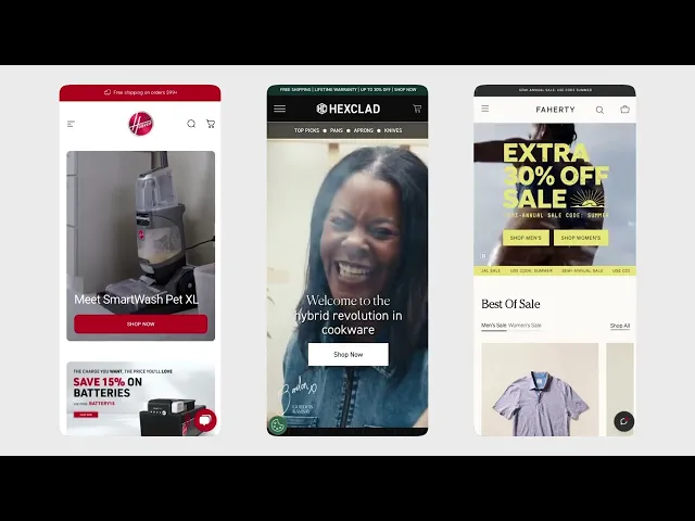
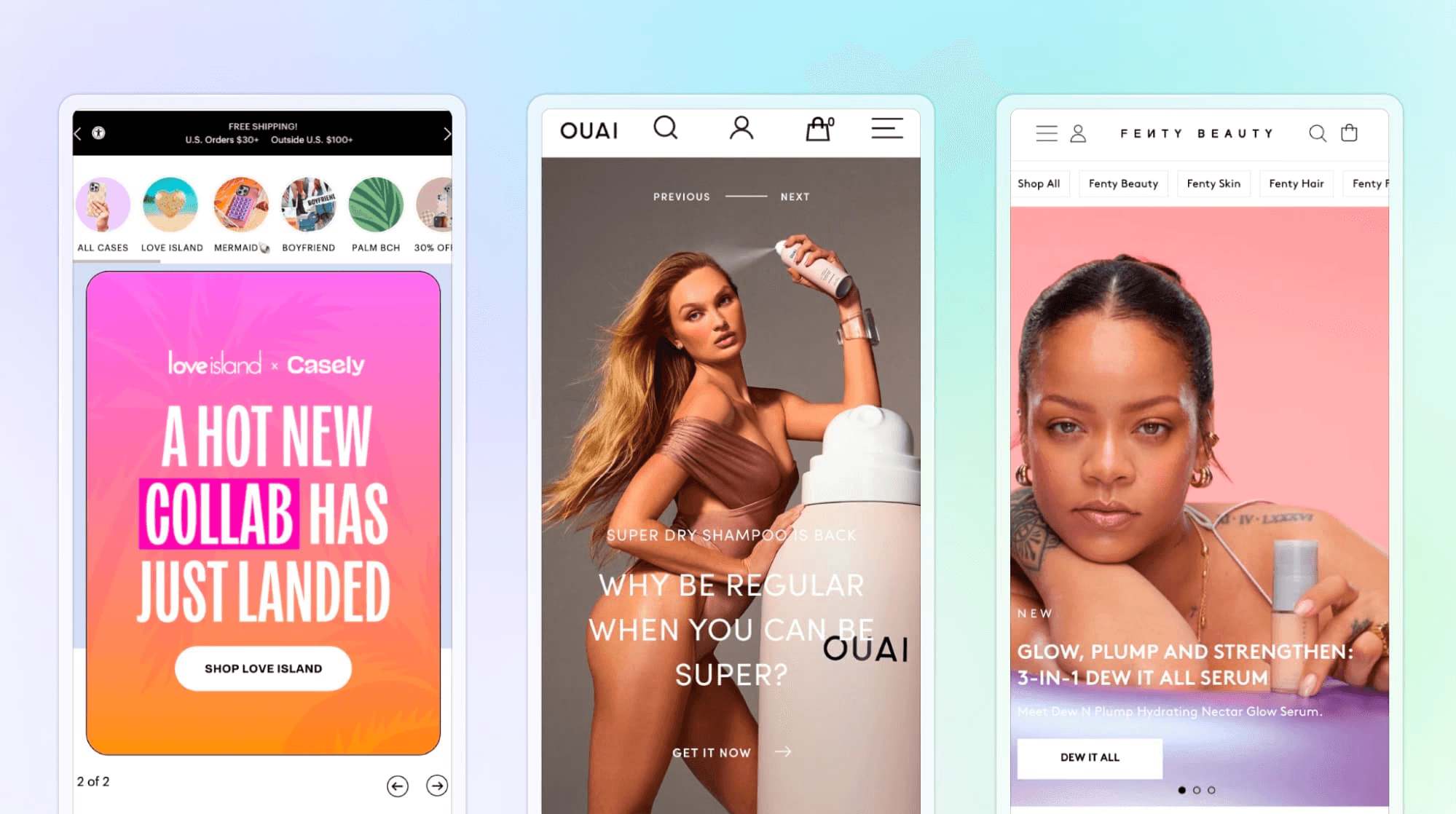
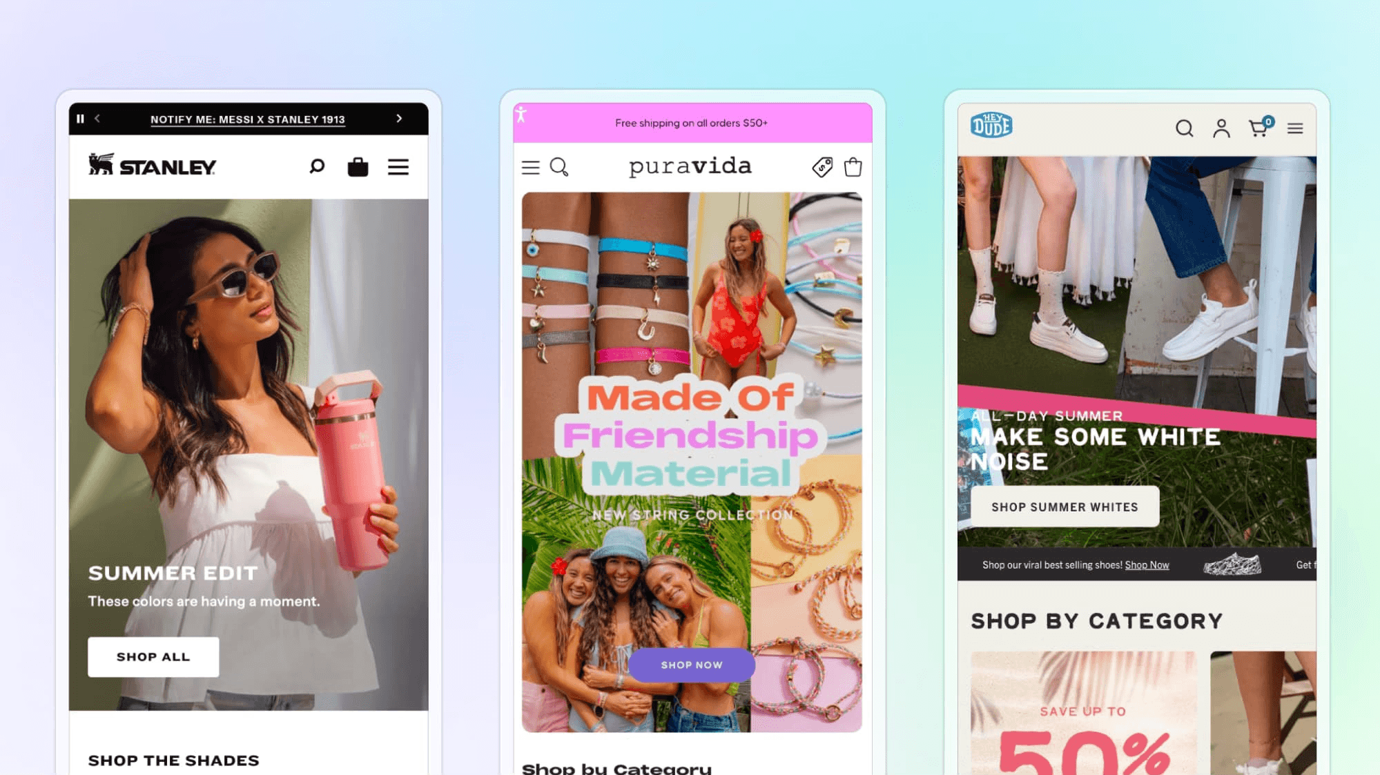
Hero format: static images vs. sliders vs. video

Across the Shopify Plus brand homepages we sampled, static hero images were the most popular format (used by about 58% of sites!). 23% of sites used a slideshow/carousel banner, and about 18% used video backgrounds.
This data suggests a preference for single static images on mobile. This is likely because of performance and user-journey-focused factors.
Static images often load faster, keep the CTA clearly in view, and can help avoid "banner blindness" – a phenomenon where users ignore content that feels like an advertisement. While sliders and videos can slow down page loads and distract from the CTA.
That being said, there are still a decent number of brands that do choose to leverage video for storytelling or engagement value.
These sites likely weigh the richer visual storytelling against potential performance costs.
Additionally, many brands use sliders or carousels to showcase new product/collab drops, highlight specific collections, or spotlight a specific offer.
Brands that did use slideshows tended to have chevrons or other features to help customers click through the different cards.
This is a best practice that is recommended (rather than autorotating carousels) to ensure that shoppers can click through at their own pace rather than completely miss your messaging if the slider moves too fast.
Overall, the trend leans toward simplicity: most brands stick with a single, impactful image, a strategy aligned with conversion best practices that favor clarity and speed on mobile.
Showing the product in the hero
Nearly all brands put their product front and center on their mobile homepage: 91% of analyzed sites show the actual product in their hero section (either the product itself or a person using/wearing the product), versus only 9% that do not.
This makes sense: displaying the product immediately helps answer new visitors’ core question: “Do you have what I need?”.
By seeing the item (or an aspirational use of it) right away, users can more easily envision owning it, which builds desire and trust.
Only a few sites (about 1 in 10) don’t show a product visual in the hero. Instead, they tend to show purely lifestyle imagery or just text promoting an event or brand story. But this is the exception to the rule.
Product-centric hero content is the norm.
Lifestyle imagery vs. product-only shots
Of the 91% of brands that featured the product in their hero, 60% of brands included people or lifestyle context imagery versus 40% of brands that used product-only images.
Imagery type | Percentage of brands |
People/lifestyle context (e.g., models, real-life settings) | 60% |
Product-only images (against a plain background, isolated) | 40% |
This shows a slight preference for lifestyle imagery by Shopify Plus brands.
Why do brands prefer lifestyle imagery?
Lifestyle images (with people or contextual scenes) can create an emotional connection.
Helps customers to visualize the product “in their life”.
Make the experience feel more authentic or relatable.
Why do brands use product-only imagery?

Puts 100% focus on the item’s details and features.
Ensure nothing distracts from the product itself.
Avoids the risk of the product “disappearing into the atmosphere” of a busy scene.
In practice, many sites likely balance both approaches in their marketing, but for the hero, they choose one style based on what fits their brand.
The choice often aligns with the industry and product type; fashion might lean into lifestyle, while electronics prefer pristine product views. Both approaches serve a purpose, either inspiring or providing a clear product focus.
Mobile optimized hero layouts: Media & CTA visibility
Most Shopify Plus brands appear to be consciously creating mobile-specific designs for their hero banners:
82% of the hero visuals are optimized for mobile (meaning no awkward cropping, tiny text, or squished layouts).
92% of sites have a visible CTA button on the hero without scrolling.
This shows that leading brands prioritize mobile-responsive design, often using dedicated mobile-tailored hero layouts.
The few sites that weren’t well-optimized may be cases where a one-size-fits-all design fell short, leading to a model’s face being cut off or text being too small to read.
Issues like these can hurt the user experience and prevent conversions.
Remember, no matter the industry, a well-designed hero that is responsive across screen sizes and devices is crucial for engagement and readability.
Use of customer reviews/testimonials above the fold
Only a small percentage of sites (5%) used customer reviews or ratings in their hero section.
Those who did use the following tactics:
A brief testimonial quote
An average star rating
Or tagline like “Trusted by 10,000 customers”
But these use cases were not common. 95% of the brands analyzed did not have any review content in the hero area. Most brands used that space to show product imagery or promotional messaging instead of social proof.
Although using customer reviews in the hero isn’t a widespread practice (yet), the brands that do this may be doing so to differentiate themselves.
Especially since social proof can be a deciding factor for hesitant shoppers.
However, the majority of brands keep their hero clean and focused, and probably introduce reviews further down the homepage, or rely on their well-known brand name to increase trust.
There’s only so much space in a brand’s hero layout, and balancing persuasion tactics while maintaining an uncluttered design is a challenge many brands face.
That’s why some brands support their hero messaging with a top-of-the-page banner bar.
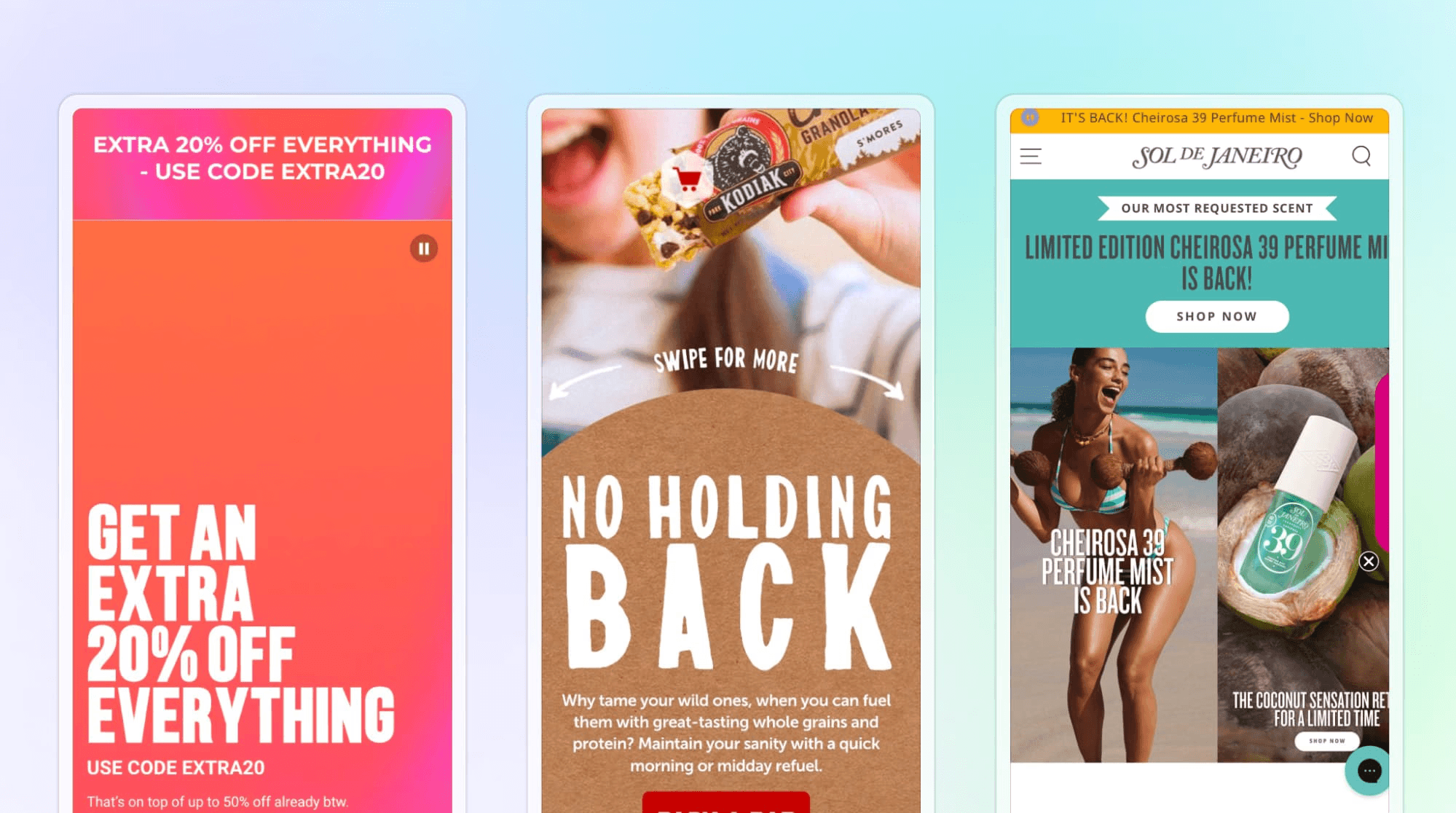
Urgency banner bars and their types
To support hero messaging and visuals, 86% of brands use an announcement bar in their homepage above-the-fold layout. Many banners autorotate to display multiple messages to convey urgency, answer common questions, or offer promotional incentives.
Four main use-cases (and a few less common use-cases) were identified in our research:
Banner message | Percentage of brands | Examples |
Free shipping/delivery offers | 57% of brands | “Free US Shipping on orders $50+” or “Free 2-Day Shipping” |
Time-sensitive offers | 39% of brands | “Ends Sunday! 50% off” or “Summer Sale – Limited Time” |
Discount codes/links | 23% of brands | “Use Code SAVE20” |
New collection or product drop | 23% of brands | “New Arrivals Just Dropped – Shop Now” |
Countdown timer | 2% of brands | “Sale ends in X hours, x minutes” |
Back in stock alerts | 2% of brands | “Popular item back in stock!” |
Customer reviews | 2% of brands | “Over 5,000 ★★★★★ reviews” |
Buy now/pay later information | 2% of brands | “Get it now, pay later with Klarna” |
Retail store location finder | < 1% of brands | “Find a retail location” or “Find a store near you” |
Sign up for to email/mailing list | < 1% of brands | “Join our list for early access + exclusive offers” |
Product finder quiz | < 1% of brands | “Find your perfect match in 60 seconds” |
Nearly all these banners serve one of two goals: reduce friction or create urgency, often both at once.
Here’s how:
Free shipping/delivery messages: By prominently displaying a free shipping deal, sites aim to reduce friction and encourage higher cart values (many customers will add items to meet a free-shipping threshold).
Time-sensitive offers: These create a sense of scarcity and FOMO (fear of missing out), nudging users to act quickly.
Discount codes/links: This not only drives urgency (“use it before it expires”) but also ensures the shopper is aware of the discount upfront.
New collection/product drop: This leverages urgency differently, by announcing fresh products or limited-edition items, it taps into the excitement of newness and scarcity (limited stock).
The few sites with no announcement bar at all (14%) might be relying purely on their hero content or brand power, but they are in the minority.
It’s now almost expected that a retail site greets you with some special offer or note at the top, and our data confirms this is indeed a dominant trend!
Key takeaways: Trends in Shopify Plus brand mobile hero section design
Our analysis of the hero layout on mobile from 1,000 Shopify Plus brands has revealed a few key themes:
Clarity and speed over gimmicks: Brands prefer straightforward, static imagery and simple layouts that load fast and communicate value prop instantly. The data (58% static vs 19% video) shows a conscious move away from heavy or rotating content on mobile, reflecting the understanding that users have little patience for slow or confusing elements. Everything in the hero, from imagery to text to CTA, is geared toward immediate comprehension and action.
Product and people as storytellers: Almost every hero showcases the product (91%); many also set a lifestyle scene (60%). Together, this approach hits two goals: it shows what the product is, and why the customer should care. When a person is in the shot, it’s selling a lifestyle or emotion around the product. When it’s just the product, it’s ensuring the product shines without distraction. Brands seem to choose the approach based on category (e.g., fashion and outdoor gear lean heavily on models and aspirational settings, while tech gadgets or cosmetics might go for clean product shots to highlight features). Both routes aim to connect with the user, either emotionally or through pure product appeal.
Mobile-first design principles: The high rates of mobile optimization (82% with no cut-off content) and above-the-fold CTAs (92%) indicate that these brands are designing with the small screen in mind from the start. They often provide separate hero assets for mobile, ensuring the composition works in vertical orientation. Text is kept minimal and bold, CTAs are large and thumb-friendly, and key info (like the CTA or offer) isn’t hidden below. The few that slipped up here stand out precisely because the norm is so strong. This suggests that at the top-tier level, companies know mobile users won’t tolerate a poor layout, and they execute accordingly.
Urgency and incentives upfront: With 86% using announcement bars, it’s evident that “conversion drivers” are baked into the homepage experience. The data shows that free shipping is the favorite lever (appearing on over half the sites). Scarcity tactics (limited-time, countdowns) are also widely used to drive urgency, playing on FOMO and the impulse to snag a deal before it’s gone.
Selective use of social proof: While trust badges and reviews are acknowledged as important, most brands did not clutter the hero with them, perhaps relying on other cues (like “#1 Bestseller” tags or simply the brand’s reputation). It could also be that on mobile, space is too scarce to include things like customer reviews in the hero without pushing down the CTA or main message.
In conclusion, Shopify Plus brands’ mobile hero sections tend to be highly optimized, conversion-driven, and product-focused. The quantitative breakdown (percentages) we observed reinforces modern UX best practices: use compelling visuals (often lifestyle-driven) to showcase the product, keep messaging concise and relevant, ensure a prominent CTA, and sweeten the deal with offers, all within a design that works seamlessly on a phone screen.
The few brands that deviated from these trends are interesting as well; they remind us that design isn’t a one-size-fits-all; a brand might:
Intentionally omit a CTA if the goal is brand storytelling rather than immediate conversion
Use a video hero for a high-end feel despite slower load
Avoid a promo banner to maintain a clean look if they’re a luxury brand that shuns “sale” messaging
When it comes to what works on mobile homepages, the main consensus is clear: compelling visuals, concise messaging, clear calls to action, and strategic offers.
This customer-centric approach shows how leading e-commerce brands carefully leverage every pixel of their hero section to attract, convince, and guide shoppers toward conversion.
Ready to build your own high-converting homepage?
Our analysis of 1,000 leading Shopify Plus brands reveals the blueprint for homepage success. Now it's time to put these insights into action.
While our research shows exactly what works—mobile-optimized heroes, strategic CTAs, compelling product showcases, and urgency-driven messaging—implementing these elements traditionally requires:
Weeks of development time to build custom layouts
Technical expertise to ensure mobile responsiveness across devices
Designer resources to create professional, conversion-focused visuals
Developer dependencies for testing different approaches and seasonal updates
That's where Instant can come in handy.
Instant's no-code Shopify homepage builder
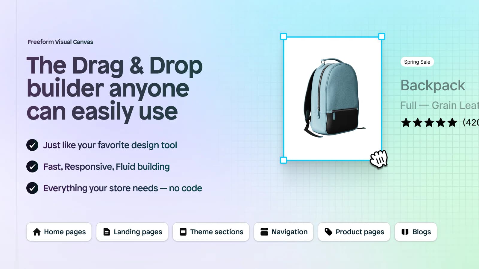
Build like the top 1% of Shopify brands, without the top 1% budget.
Instant transforms the insights from our analysis into actionable, implementable solutions that any Shopify brand can deploy in minutes, not months:
Start with proven templates: Customize one of 100+ professionally designed section templates that already incorporate the best practices identified in our research.
Customize without code: Use our drag-and-drop builder to adapt these templates to your brand, products, and messaging strategy.
Connect your Shopify store: Seamlessly integrate your product catalog, customer data, and checkout process with one-click connections.
Publish Instantly: Deploy your new homepage section directly to your Shopify store and watch it go live in seconds.
Transform your homepage today
Ready to join the ranks of high-converting Shopify Plus brands?
Don't let your homepage be part of the underperforming minority. Use the insights from our comprehensive analysis to build a homepage that converts like the top 1,000 brands—without the complexity, cost, or time investment.
Free to build: Experiment with designs and see results before you pay
$39/month: Publish as homepage feature is available on our Starter plan
Instant publishing: Deploy changes to your live store in seconds
Shopify-native: Seamless integration with your existing store and workflow
Start building your high-converting homepage →
Join 15,157+ Shopify brands who trust Instant to build home pages that convert.


