
Picture this: You're browsing a website, and suddenly, a pop-up appears. It's sleek, intriguing, and irresistible. Before you know it, you're clicking through, eager to see more. That's the magic of well-designed pop-up banners. Whether you're looking into how to add a pop-up on Shopify or simply exploring creative ideas, getting the design right can make all the difference. This blog will provide inspiration and practical tips to craft eye-catching pop-ups that engage your audience and drive conversions.
Consider using a tool like Instant’s Shopify product page builder to bring your vision to life. It simplifies the process, helping you create stunning pop-ups with ease.
Table of Contents
What is pop-up design & why does it matter?

A pop-up is like an unexpected guest. It appears without a direct invitation, making its presence known as soon as you load a page or perform a specific action. While this might sound intrusive, pop-ups are incredibly useful for marketers. They can promote offers, gather leads, or even inform you about cookie usage. Think of them as the digital equivalent of a friendly reminder or a helpful hint.
Various actions can trigger pop-ups. Some appear as soon as a page loads, catching your attention immediately. Others wait until you've scrolled down or are about to close the page. They come in different shapes and sizes, too. A modal pop-up demands your full attention, freezing the rest of the page until you interact with it. A welcome mat takes over the entire screen, while a banner might sit quietly at the top or bottom. Smaller windows let you keep browsing while they display their message.
Why does pop-up design matter so much?
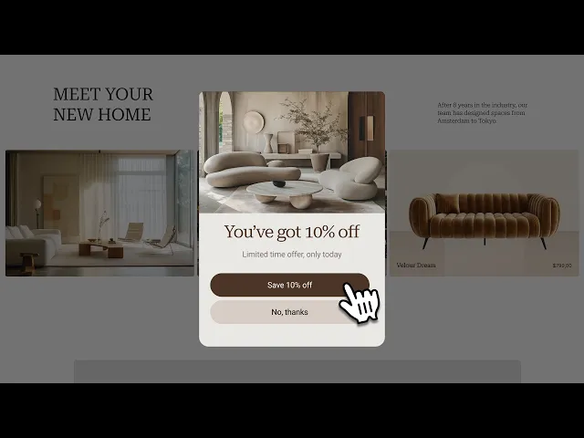
You might think the message is the most important part of a pop-up, but design plays a huge role, too. A well-designed pop-up can make all the difference. A beautiful exit-intent pop-up can boost your conversion rates to 50%. A plain, text-only pop-up might only get a 10% conversion rate.
The average pop-up conversion rate is around 11.09%, but you can do much better with the right design. Using pop-ups strategically can create a more engaging and informative visitor experience. This can help solidify your brand and give you an edge in the competitive world of e-commerce.
5 common types of pop-up design

1. Welcome/entry popups
These popups greet visitors the moment they land on your site. They set the scene and invite potential customers to explore further. They offer something enticing, like discounts or free shipping, to get visitors hooked immediately. It's all about making that first impression count.
2. Timed popups
These popups wait for just the right moment. After a set amount of time on a page, they pop up, usually aligned with the average time a user spends. The delay ensures you’re not jumping the gun, allowing users to get comfortable before you pitch them an offer or invite.
3. Scroll-triggered popups
These popups are smart. They only appear when a user has scrolled down a certain percentage of the page, showing they’re genuinely interested. If someone’s already engaged, they’re more likely to act on your call to action, whether signing up for a newsletter or checking out a new product.
4. Click-through popups
These popups are for users who’ve already shown some interest. They appear when someone clicks a specific element on your page, like a product image or link. By guiding users to take a targeted action, you’re helping them find what they’re looking for and nudging them toward the next step.
5. Exit-intent popups
These popups are last-ditch efforts to retain a visitor. They appear when a user’s about to leave the page, offering a discount or reminding them of something they might’ve missed. Since they don’t interrupt the browsing experience, they can keep visitors around just a bit longer.
Instant: Build high-converting Shopify product pages without coding
Instant is a user-friendly Shopify product page builder that allows eCommerce teams and agencies to create fully customizable and advanced pages without any coding knowledge. With its intuitive drag-and-drop interface, users can quickly design and publish high-converting:
Landing pages
Blog posts
Product pages
Sections
Instant also offers seamless integration with Figma and other eCommerce tools, making it a versatile choice for enhancing online store performance and increasing conversions.
Try Instant's Shopify product page builder today!
Step-by-step guide on how to add a pop up on Shopify with Instant
25 Creative pop up banner design ideas for inspiration

1. Di Bruno bros: Keep it simple and effective
Di Bruno Bros. shows that pop-ups don’t need to be complicated. Their delayed pop-up offers a discount for a newsletter signup. The colorful design catches the eye, while the “Sign me up!” CTA invites action. Simplicity can be powerful.
2. Solo stove: Create excitement with exit-intent
Solo Stove’s exit-intent pop-up stands out with an enthusiastic header: “Wait a Minute!” This approach reduces abandonment by making offers feel irresistible, all while showcasing brand personality.
3. Natori: Informative pop-ups matter
Natori uses a pop-up to share how their products support causes without pulling visitors away from the page. This approach engages without being overly salesy, encouraging action through information.
4. Revelry: Segment your audience
Revelry’s pop-up segments visitors into brides or bridesmaids, allowing for better targeting and personalized recommendations. The playful headline and $200 prize entice opt-ins, proving that giveaways are a top list-building strategy.
5. Flaus: Offer immediate rewards
Flaus keeps it simple with a pop-up highlighting their electric flosser and offering a 10% discount plus free shipping. The straightforward design lets users sign up quickly, saving time and effort.
6. Wild Souls: Subtle yet impactful
Wild Souls’ pop-up in the corner offers a 10% discount and reflects the brand’s cool style. It doesn’t overwhelm users, allowing them to browse with a gentle reminder in view.
7. Elder Statesman: Stay on brand
Elder Statesman’s pop-up uses an elegant design that mirrors the store’s laid-back luxury. The clear and concise copy avoids distractions, focusing on brand consistency.
8. Huda Beauty: Build emotional connections
Huda Beauty uses emotional language, referring to customers as “love” and inviting them to join the Huda family. This approach creates a close rapport and drives sales.
9. Snif: Use urgency to your advantage
Snif’s pop-up offers a fragrance or candle for signing up, with a red scrolling stripe that adds urgency. It’s a simple yet effective strategy that encourages users to act quickly.
10. Partake foods: Emphasize visual appeal
Partake Foods’ pop-up uses bold letters and snack imagery to convey the benefits of signing up. The vibrant design aligns with the site’s aesthetic, making it eye-catching and cohesive.
11. Blume: Go big but keep it simple
Blume’s full-screen pop-up personalizes the experience by allowing users to select their skin concerns. Despite its size, the design remains simple and user-friendly.
12. Chillhouse: Minimize effort for users
Chillhouse’s pop-up requires minimal effort from users to get a discount. Once you click, you’re asked to add your email, and by then, you’re likely already sold on the idea.
13. Luna Nella: Gamify the experience
Luna Nella’s pop-up includes a spin-the-wheel game with potential rewards. This fun and engaging approach attracts new customers and keeps existing ones interested.
14. Marlow: Evoke emotions with imagery
Marlow’s full-screen pop-up uses a simple image of a child with a teddy to evoke emotions. The straightforward design leverages a back-to-school sale to boost sales.
15. Yes you can drinks: Add humor to your cta
Yes You Can Drinks uses humor in their pop-up with the CTA, “I hate discounts, value and fun.” This witty approach engages users and encourages them to sign up.
16. JUST Egg: Seamless transitions
JUST Egg’s full-screen pop-up uses a similar design to the main page, creating a smooth transition. The consistent look makes the pop-up less intrusive and more appealing.
17. Lil Bucks: Match colors for consistency
Lil Bucks’ pop-up uses colors that match the main page, creating a cohesive look. The simple design captures attention and encourages users to explore further.
18. Startward consulting: Connect emotionally
Startward Consulting’s pop-up uses empathetic language to connect with visitors. This approach stands out from the concise norm by offering solutions and understanding.
19. Stumptown coffee roasters: Reflect brand design
Stumptown Coffee Roasters’ welcome message uses a sleek design that matches the main page. The aesthetic resonates with both coffee fanatics and casual drinkers.
20. Moooi: Embrace the futuristic
Moooi’s pop-up complements the website’s ultra-modern feel, offering a digital newsletter without disrupting the user experience. The design aligns with the brand’s avant-garde style.
21. Pipsnacks: Encourage action with style
Pipsnacks’ vibrant pop-up uses style and copy choices to convey their brand voice and encourage users to seize the deal. It’s both inviting and effective.
22. Bonobos: Keep it clean and direct
Bonobos’ clean pop-up gets straight to the point with minimal copy. The “Free Shipping & Returns” line adds value and encourages sign-ups.
23. Wild Souls: Stay unintrusive
Wild Souls’ email form pop-up sticks to the bottom corner, allowing users to browse without interruption. It’s visible enough to capture attention without being intrusive.
24. Absolution Cosmetics: Use subtle illustrations
Absolution Cosmetics’ pop-up presents the offer in the lower corner with a subtle illustration. This design choice makes it eye-catching without completely disrupting browsing.
25. Tommy Hilfiger: Use iconic branding
Tommy Hilfiger’s pop-up uses the brand’s iconic red-blue logo as the background. The clear copy states the benefits of joining the “club,” creating a strong brand connection.
26. Maybell Studio: Bright and playful
Maybell Studio’s simple pop-up engages users with bright colors and a playful photo. The design aims to balance any mild annoyance with visual appeal.
27. Blue Apron: Make the offer irresistible
Blue Apron’s pop-up offers $110 off for providing an email. The savory visuals enhance the appeal, making the offer hard to resist for hungry visitors.
Step-by-step guide on how to add a pop up on Shopify with Instant
8 Best practices for designing & using pop-ups

1. Prioritize the user experience
When designing pop-ups, the user experience should be front and center. Imagine stepping into a store and Instantly getting surrounded by salespeople. That’s how a poorly timed pop-up feels. Think about your visitor’s journey. How can you engage them without annoying them? Tailor messages based on their behavior; don't immediately bombard them with pop-ups. Use what you know about the user to customize their experience. Timing is everything here. You want to catch their attention, not drive them away. Segment your audience based on where they are in the buying process or where they came from to make your pop-ups more effective.
2. Master the art of timing and frequency
Have you ever loaded a page only to get hit with pop-ups before you can even see the content? You don’t want your visitors to feel like pop-ups are attacking them. Timing is key. Aim for three to thirty seconds from when they arrive on the page. But don't just set it and forget it. Check your site metrics to see what works best. Play around with different triggers, like showing the pop-up when a visitor clicks a link or scrolls down. Understanding the visitor’s journey is crucial. You want to enhance their experience, not disrupt it.
3. Craft compelling copy with clear CTAs and engaging images
The timing might be perfect, but if your pop-up doesn't look good or make sense, it won't work. Keep your message short and sweet. Use language that speaks to your ideal customer. Your call to action (CTA) should be crystal clear. Use strong verbs like “Buy” or “Learn” to make the offer obvious. Eye-catching images that fit with your brand can also help. The goal is to hook visitors without confusing them.
4. Keep your design consistent
Design matters. You might be tempted to create loud, flashy pop-ups to grab attention but resist that urge. Over-the-top visuals can scare people away. Your pop-ups should look like they belong on your website. The best tools let you customize the design to match your brand. Minimalism often works best. Calm colors, clean lines, and simple shapes can help visitors trust the offer. Consistency is key here.
5. Ensure mobile responsiveness
Pay attention to mobile users. Pop-ups should look just as good on a phone as on a computer. Mobile design is more than just shrinking down the desktop version. Phones are different, and your pop-ups should be too. Make them taller and narrower, and ensure buttons and form fields are easy to use with a thumb. You should simplify the copy, too. It's all about making the experience seamless for mobile users.
6. Personalize your pop-ups
People like to feel special. Personalization can help build better relationships with your customers. Addressing a user by name or greeting a returning visitor can make a big difference. Personal recommendations can also improve the shopping experience and increase sales. Use what you know about your visitors to make your pop-ups more personal.
7. Keep it short and sweet
Your visitors need more time to read long, complicated messages. They should understand what you're offering in just a few seconds. Avoid long paragraphs or too much information. Share the essentials and use visuals to illustrate your point. The goal is to get your message across quickly and clearly.
8. Test and improve your pop ups
Testing is a good use of time. It's necessary to determine what works best for your audience. It's easy to do. Just launch two types of pop-ups and see which one performs better. A small change in timing, text, or visuals can make a big difference. Keep experimenting to find the best combination for your pop-ups.
Common mistakes to avoid when designing your website pop ups

1. The pop-Up overload: When less is more
Ever visited a site only to be bombarded with pop-ups every few seconds? It’s like trying to enjoy a concert with someone constantly tapping you on the shoulder. Even if your pop-ups are beautifully crafted, only a few can push visitors to bolt rather than browse. Keep them targeted and ensure they appear at the right moment, like when someone’s already interested. The key is to keep users engaged, not overwhelmed.
2. Offering value: Don’t be that annoying salesperson
Imagine walking into a store and being greeted with an offer for something you’d never buy. It’s annoying, right? The same goes for pop-ups. If your pop-up offers are irrelevant, visitors will click away faster than you can say “unsubscribe.”
Make sure you’re offering something genuinely useful and relevant. Think about your audience’s specific needs and tailor your offers accordingly. This is how you create pop-ups that capture interest instead of irritating.
3. Mobile-friendly pop-ups: Because everyone’s on their phone
How often do you browse the web on your phone? Probably a lot. If your pop-ups aren’t optimized for mobile, you leave a huge chunk of your audience in the lurch. Design your pop-ups with mobile users in mind. They should be easy to close and should adapt to different screen sizes. An offer that can’t be accessed is as good as no offer.
Optimize your Shopify store for conversions without breaking the bank with Instant's Shopify product page builder
Pop-ups hold vast potential when designed with a personal touch. Instead of the standard “Join our newsletter” prompt, consider leveraging pop-up templates to create engaging experiences.
Pop-up banner design ideas abound, like offering exclusive discounts to returning customers, promoting personalized product recommendations, or even hosting a mini-quiz that helps guide them to their perfect product match. This makes your pop-up more relevant and enhances the user's sense of connection with your brand.
Timing is everything: When to display your pop-up
A pop-up at the wrong moment can disrupt the user's journey and lead to frustration. To avoid this, consider using a pop-up builder with advanced targeting options. For example, a pop-up that appears when a user is about to leave your website can capture their attention one last time and encourage them to act. A pop-up that appears after a user has been on a page for a specific time can indicate that they are engaged and may be open to further interaction.
Integrating pop-ups with your Shopify store
Integrating pop-ups with your Shopify store is more effortless. Many Shopify pop-up apps offer seamless integration, allowing you to create and manage pop-ups directly from your Shopify dashboard.
This can streamline your workflow and simplify testing different pop-up designs and strategies. Many of these apps offer pre-built templates and customization options, making it simple to create pop-ups that match your store's branding and design.
Designing pop-ups that enhance the user experience
When it comes to pop-up design, less is more. A cluttered pop-up can be overwhelming and lead to users clicking away before they've even had a chance to read your message. To create a pop-up that enhances the user experience, focus on simplicity and clarity.
Use a clear headline, concise text, and a single call-to-action button that tells users exactly what you want them to do. Consider using a pop-up design that matches your store's branding, as this can help create a seamless user experience.
Using pop-ups to gather valuable customer data
Pop-ups can be a valuable tool for gathering customer data, which can help you better understand your audience and improve your marketing efforts. For example, using a pop-up to collect email addresses can give you a way to reach out to potential customers and build relationships with them. A pop-up to gather feedback or ask questions can give you valuable insights into what's working and what's not on your website.


