
Your Shopify cart drawer is more than just a checkout step - it's where you either keep the sale or lose it. This is where excitement can turn into hesitation, or a browsing session can become a purchase.
Think of your cart drawer as what connects browsing to buying. A clear, simple drawer reassures shoppers they're making the right choice. A confusing one sends them back to Google looking for better options.
Cart abandonment is one of the biggest problems in eCommerce. Studies show that around 70% of online shopping carts are abandoned, often because of fixable issues like surprise shipping fees, unclear buttons, or missing trust signals.
That's why optimizing your cart drawer isn't just about design - it's about psychology. You're reducing doubt, reinforcing value, and guiding shoppers to finish their purchase.
Below are 20+ ideas to improve your Shopify cart drawer design, from essential basics to creative ideas that can help you convert more first-time visitors into customers.
Shopify cart drawer design ideas
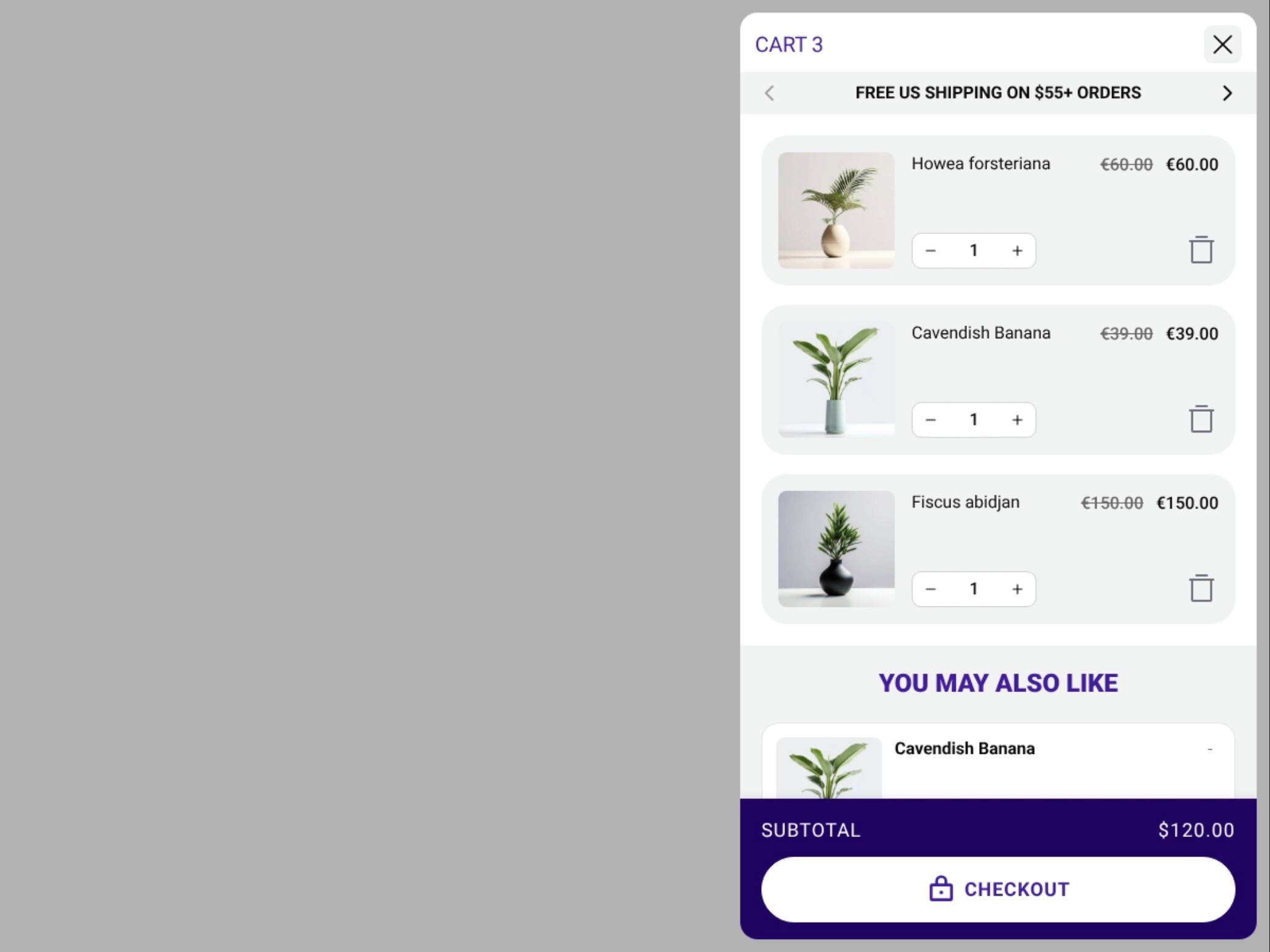
1. Cart drawer essentials
Before you test advanced ideas, make sure you have the basics in place. Every cart drawer should include:
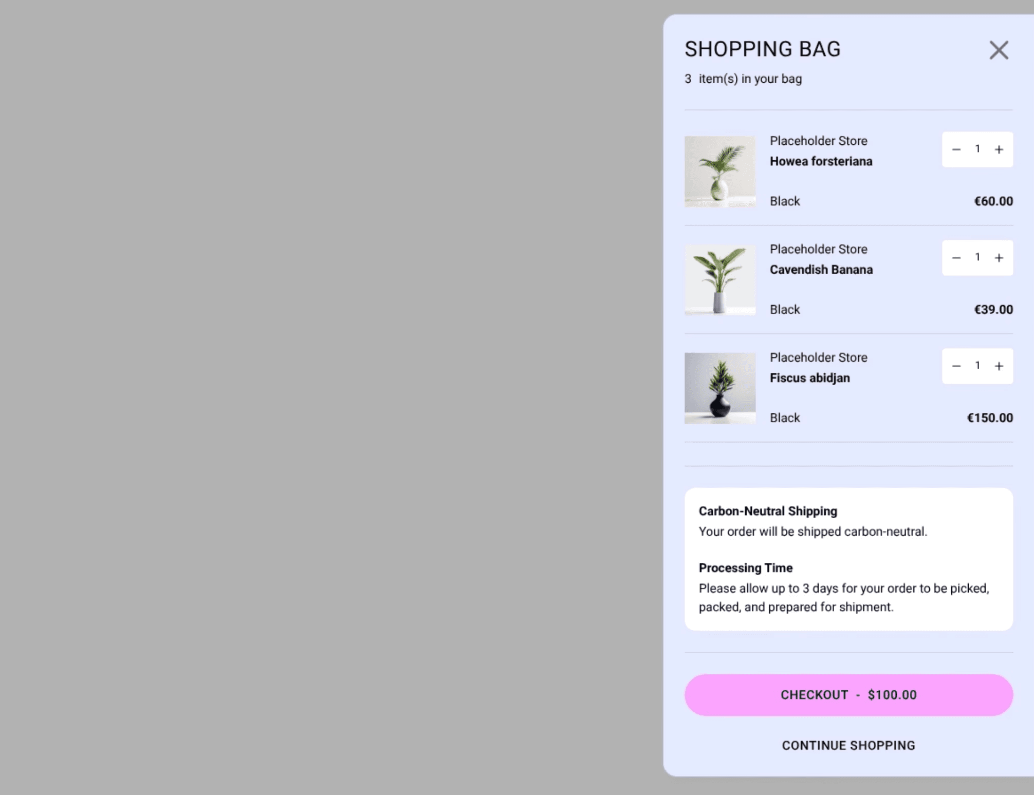
Relevant product information:
Images (thumbnails large enough to recognize quickly in the narrow drawer space)
Titles and line-item pricing (including discounts)
Quantity (with remove/edit options)
Out-of-stock notification
Basic cost information:
Cart subtotal and total
Shipping and tax estimation
Supported payment option icons (Shop Pay, PayPal, etc.)
Buttons and links:
Prominent checkout button
Close/continue shopping option
These design elements set the foundation for a trustworthy shopping experience. Once these are in place, you can test additional UX improvements.
Need a faster way to build your cart drawer?
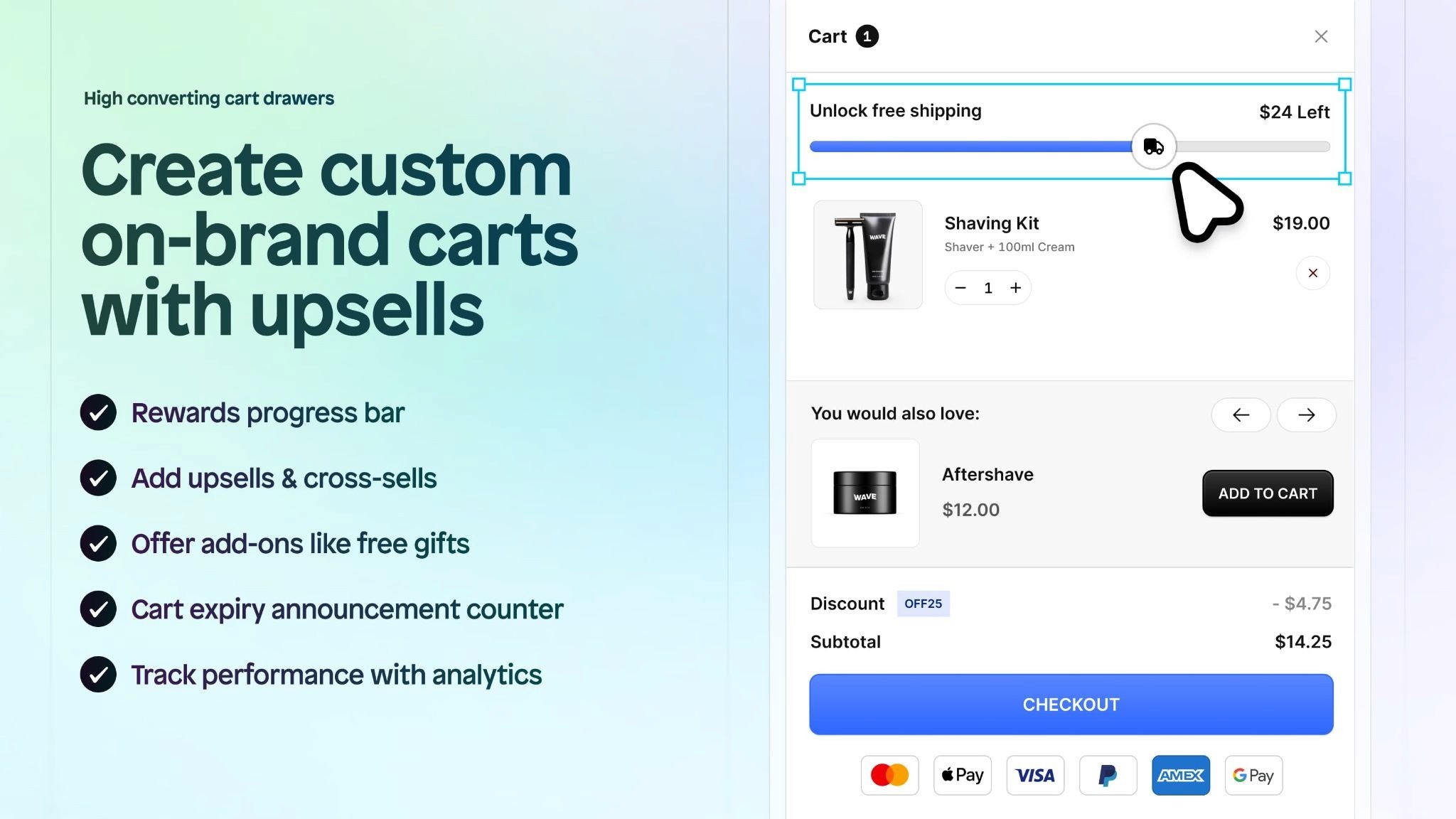
If you want to create a custom, branded cart drawer without coding, try Instant Section & Page Builder. You can build drawers with built-in upsells, cross-sells, rewards bars, add-ons, and animations - all the features covered in this guide. It's a drag-and-drop solution that lets you design and test drawer improvements quickly.
2. Make the drawer easy to close
Don't trap people in the drawer. Include multiple ways to close it:
An obvious X button in the top corner
Clicking outside the drawer overlay
A "Continue Shopping" link at the bottom
Some stores hide the close option to push checkout, but this usually backfires and frustrates shoppers.
3. Keep it scannable with a compact layout
Cart drawers have limited width, so information density matters.
Use compact product cards that show:
Small but clear product images
Short product titles (truncate if needed)
Price and quantity on the same line
Adjusting quantity (use +/- buttons, not a dropdown)
Avoid large blocks of text or oversized product images that require excessive scrolling.
4. Add urgency without being pushy
Encourage shoppers to complete checkout by using urgency messaging, but avoid fake scarcity.
Try adding:
"Items in your cart aren't reserved - complete checkout soon"
Stock notifications like "Only 2 left in stock"
A countdown timer for time-limited offers (like "Sale ends in 05:24:39")
Cart expiration timers ("Your cart expires in 15:00")
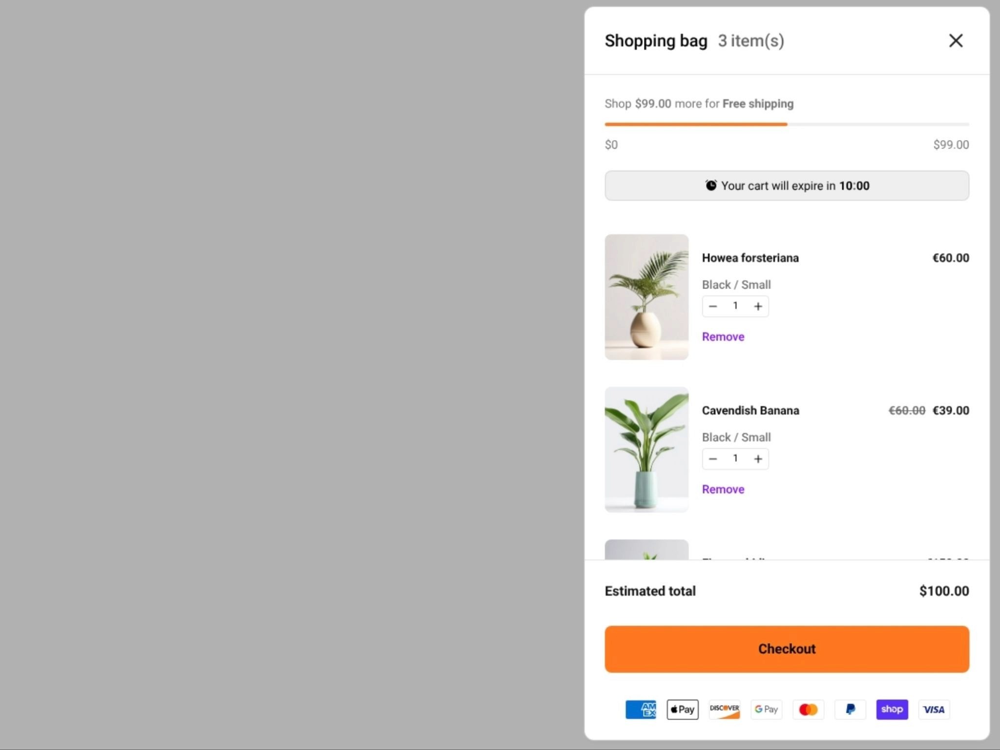
Adding social proof ("12 people bought this today") can make urgency feel real instead of manufactured. Countdown timers work especially well during flash sales or promotional periods.
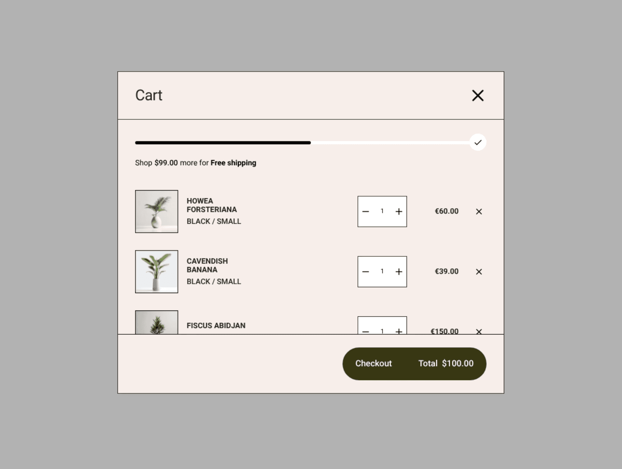
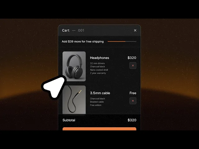
5. Show a free shipping progress bar
A progress bar works well in the drawer's compact space.
Place it near the top and make it update live: "You're $12 away from free shipping".
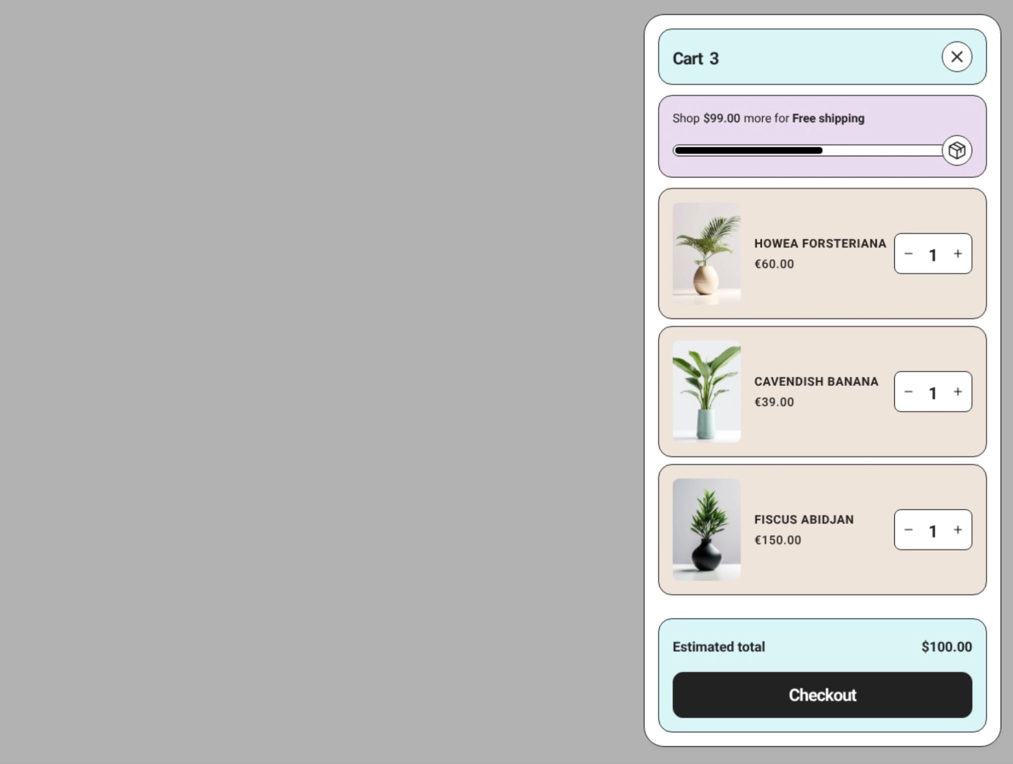
Keep the bar subtle and set the threshold around 1.2x your current average order value. This nudges people to add one more item without feeling pushy.
6. Show what they're saving
In the compact drawer space, a simple savings line works well.
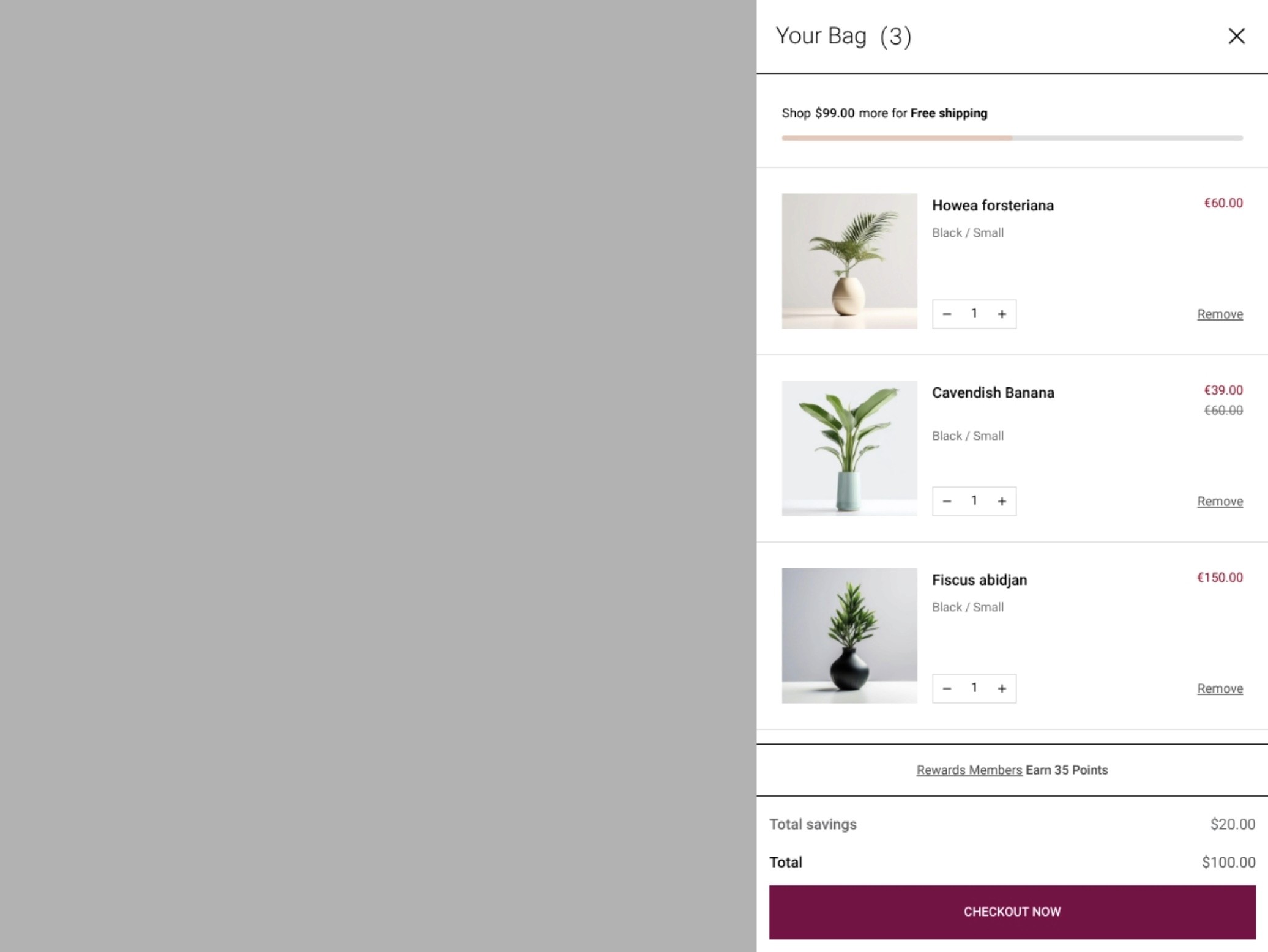
Showing their total savings reinforces the value they're getting before checkout.
7. In-cart shipping info banner
Surprise shipping costs kill conversions.
Show the free shipping threshold right in the drawer:
"You're $12 away from free shipping"
"Free shipping on this order"
Estimated delivery timeframe
Don't make people go to checkout to find out shipping costs. Surface this information early in the drawer.
8. Add a well-placed upsell
Cart drawers have limited space, so keep upsells relevant and impactful.
Try:
One compatible add-on shown below the cart items
A product recommendations slider with "Customers also bought" items
"Complete your look" or "Complete your setup" suggestions (contextual framing works better than generic "You may also like")
"Frequently bought together" bundles
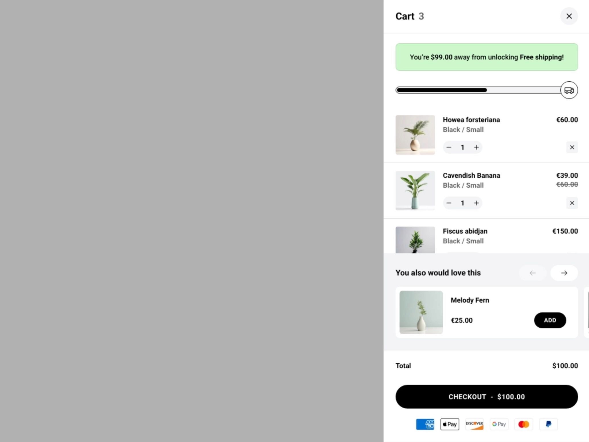
9. Add trust signals near checkout
Give shoppers extra confidence right before they click checkout.
Add small reassurances near your checkout button:
"100% satisfaction guarantee"
"Free returns within 30 days"
Payment security icons (Visa, Mastercard, PayPal, Shop Pay, Apple Pay)
"Secure checkout" badge
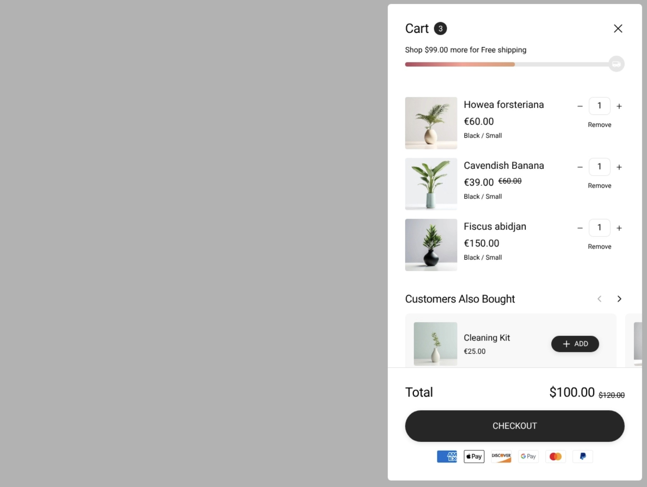
Keep these compact - a single line or small badges work best in drawer space. Payment icons are especially effective because they remind shoppers their preferred method is accepted. You can also add payment options like Shop Pay here.
10. Add gift wrapping add-on
If you offer gift wrapping, let people add it from the drawer.
Use:
A simple checkbox for gift wrapping (like "Add gift wrapping +$5")
Gift options work especially well for beauty, jewelry, and self-care products
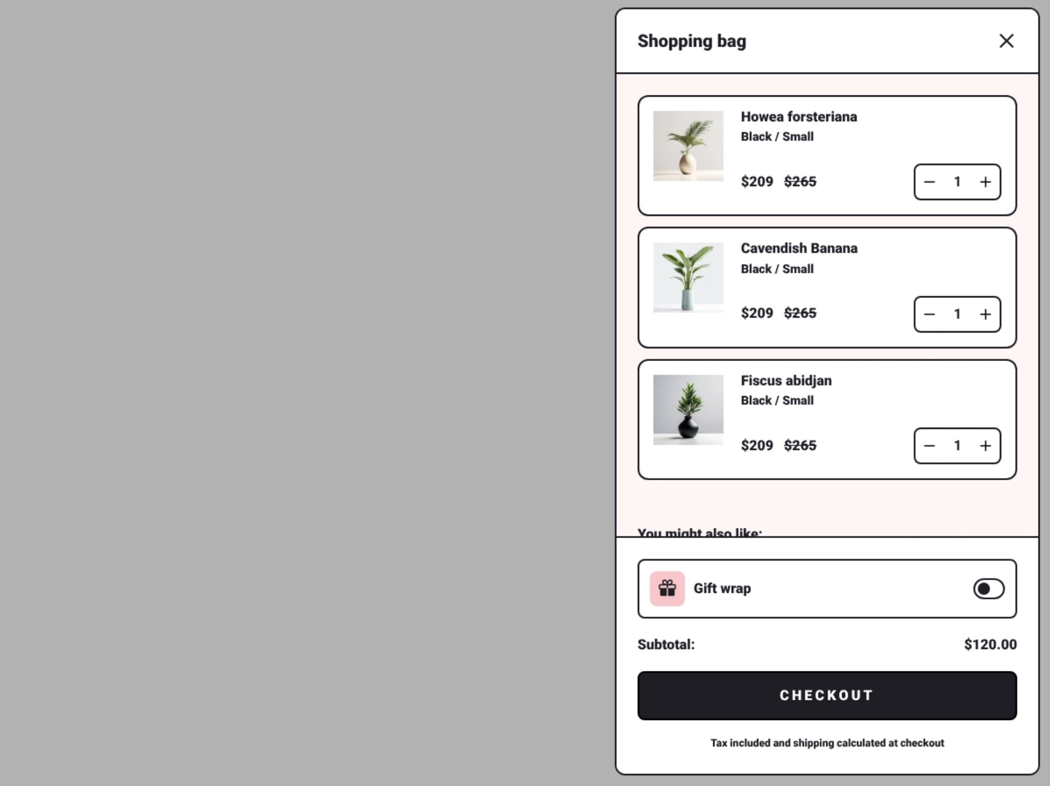
Keep these options minimal and collapsible so they don't clutter the drawer for people who don't need them. A simple toggle or checkbox is cleaner than a full form field.
11. Consider drawer animations and timing
How the drawer appears matters for user experience.
Best practices:
Slide in from the right (standard pattern)
Animate smoothly but quickly (200-300ms)
Auto-open after add-to-cart
Keep the drawer open if they add another item while it's visible
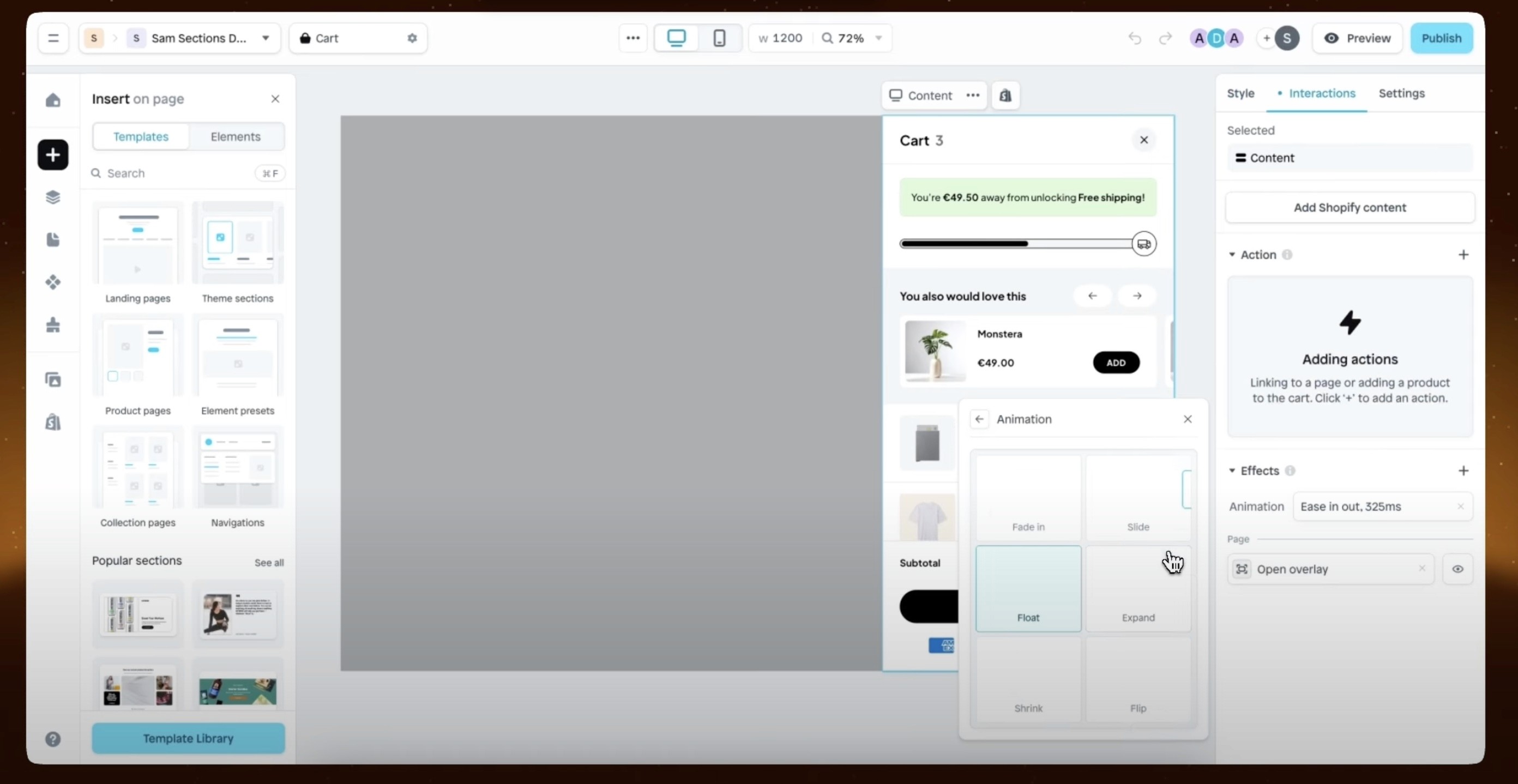
Avoid jarring animations or auto-closing the drawer too quickly.
12. Show item count in the drawer header
Display "Your Bag (3 items)" or "Cart (2)" in the drawer header.
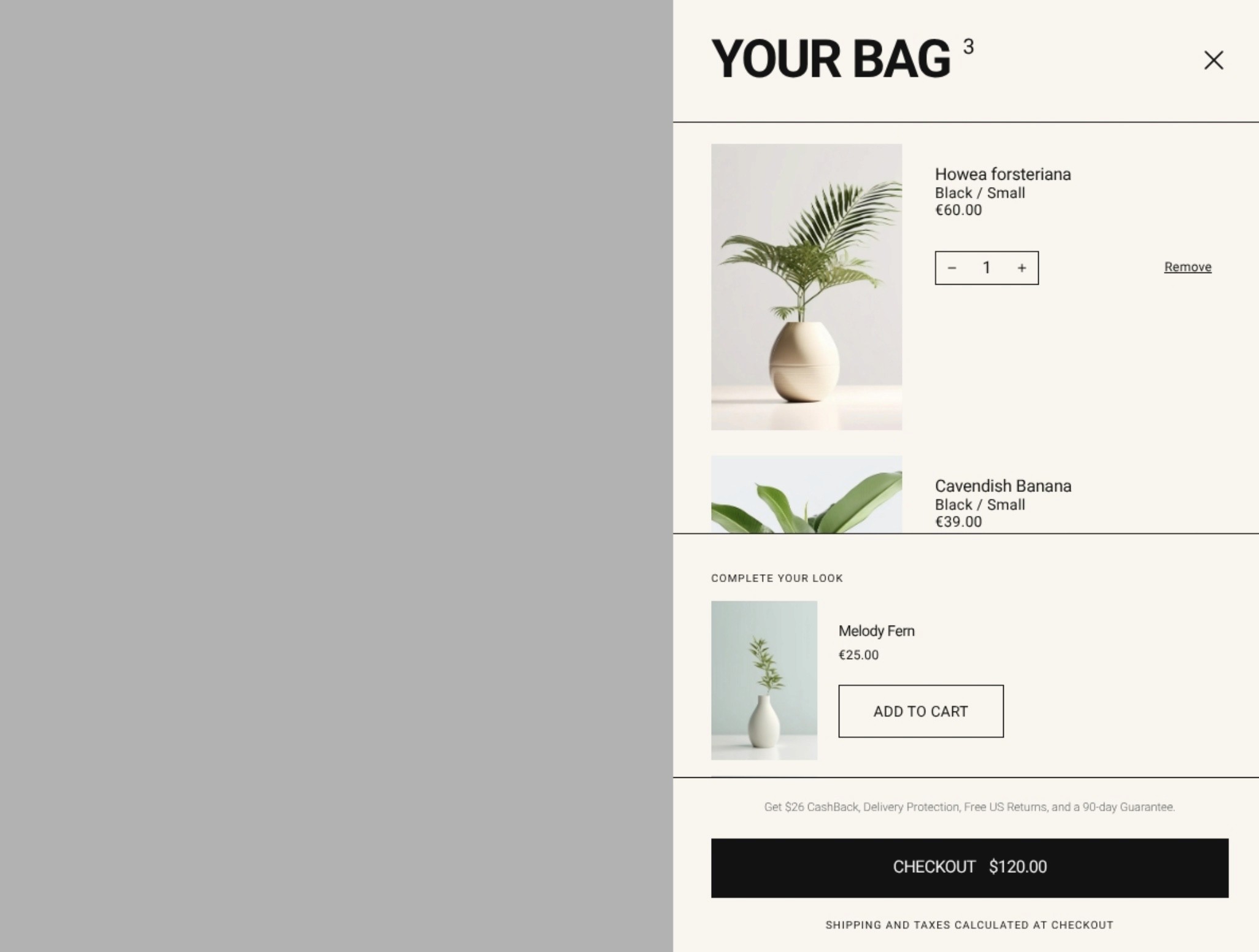
This small detail helps shoppers quickly confirm they added everything they wanted without scrolling through the full list. It's especially helpful on mobile where the drawer takes up most of the screen.
13. Add a carbon-neutral shipping badge
Many shoppers care about sustainability.
Add a small "Carbon neutral shipping" message (powered by Shopify Planet or similar) near your checkout button or in the shipping estimate area.
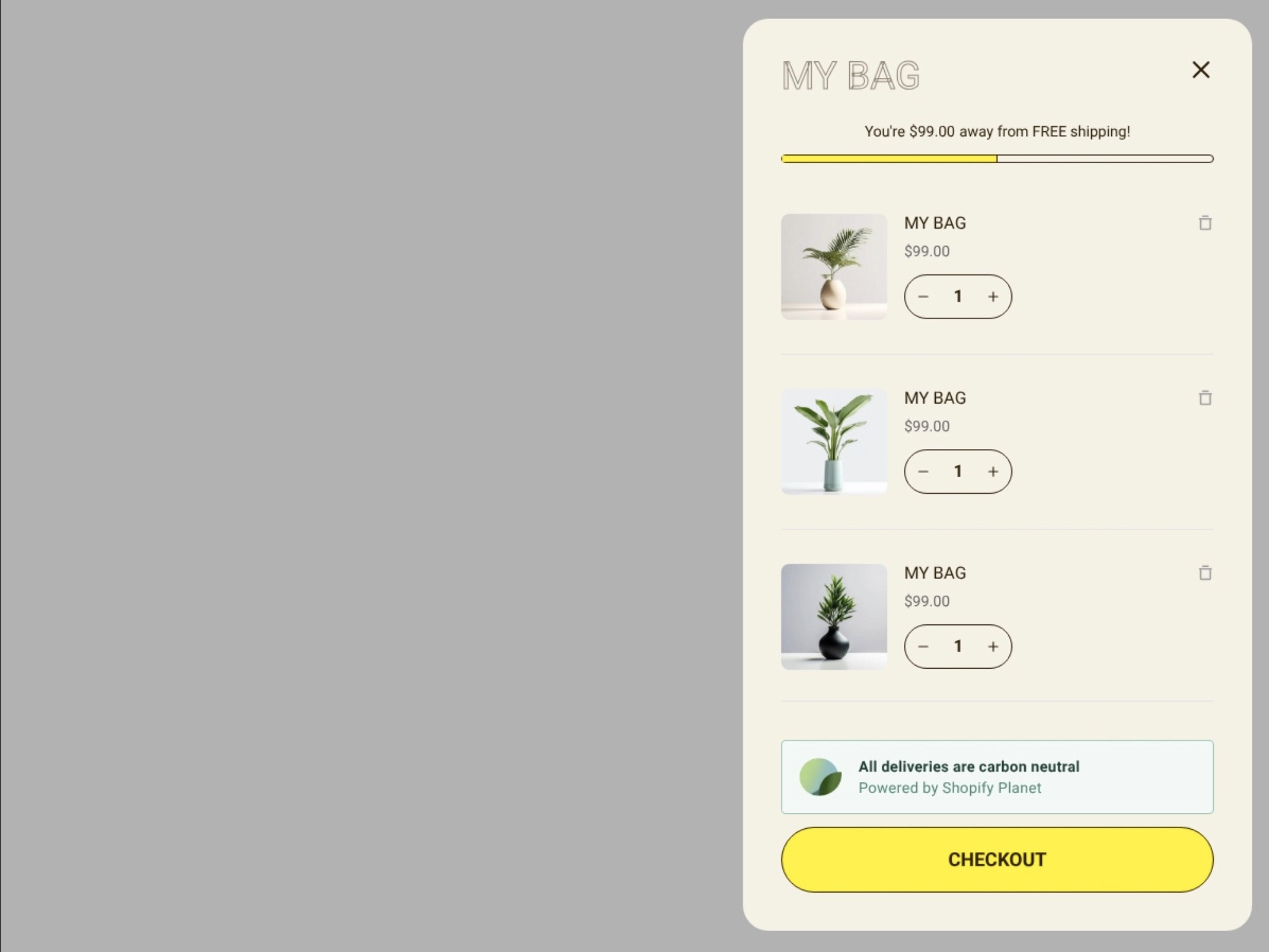
This works especially well for beauty, wellness, and eco-conscious brands. It reinforces your values without cluttering the drawer.
14. Show processing and shipping time expectations
Add a simple line like "Ships within 2-3 business days" near the checkout button or subtotal.
This reduces uncertainty about when orders will arrive and can actually speed up purchase decisions by setting clear expectations upfront. You can also add estimated delivery dates for extra clarity.
15. Add a rewards or loyalty program callout
If you have a loyalty program, add a small callout in the drawer like:
"Rewards members save an extra 10%"
"Earn 200 points with this purchase"
"Join our VIP program for free shipping"
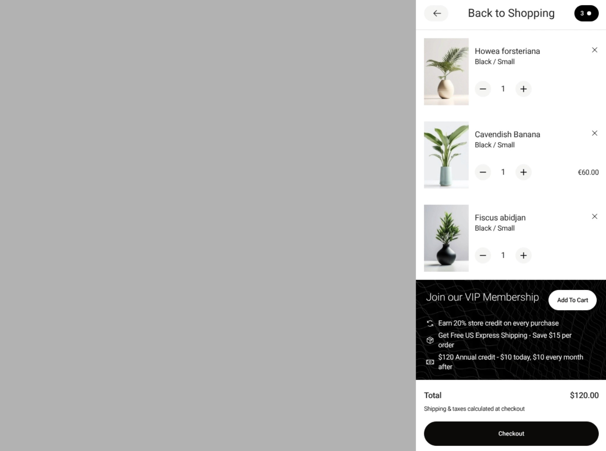
This plants the seed for future purchases without interrupting checkout. Works especially well for apparel and lifestyle brands building repeat customer relationships.
Avoid these common drawer mistakes
Even well-designed drawers can fail if usability suffers.
Avoid:
Making the drawer too narrow to read product names
Hiding the close button
Using too many competing CTAs near checkout
Forcing account creation to see the full cart
Auto-opening the drawer on every add-to-cart (gets annoying)
Making the drawer so tall people can't see the checkout button
Keep it simple, accessible, and easy to exit.
What actually moves the needle
Free shipping thresholds and clear incentives do most of the work in your drawer. Aim for one primary incentive at a time so attention stays on checkout.
Show a progress bar to free shipping: set the threshold around 1.2x your current average order value, and update it live as items change.
Use a bundle discount line item: auto-apply savings and name the bundle clearly in the drawer so the math is obvious.
Place one well-targeted upsell: a compatible add-on under the cart items beats multiple suggestions.
This matters because simple, clear incentives reduce second-guessing right before checkout. Start with the cleanest win and measure one change at a time.
Build a custom cart drawer that converts
Your cart drawer matters. Get the basics right first, then test one or two improvements at a time. Focus on usability, clarity, and making checkout feel easy.
Start by checking your drawer has the essentials, then experiment with one or two advanced ideas. Sometimes it's not the flashy features that convert best - it's the ones that make buying feel effortless in a compact, focused space.
Build your optimized cart drawer faster
Implementing all these cart drawer improvements can take significant development time. Instant Section & Page Builder lets you create a custom, branded cart drawer with upsells, cross-sells, rewards bars, add-ons, and animations - without writing code. You can test different layouts and features from this guide using a drag-and-drop interface.


