
Your Homepage Is Your #1 Salesperson. Is It Working Hard Enough?
A potential customer lands on a store homepage and makes a snap judgment fast. If the page doesn't explain what the brand sells, why it matters, and where to click next, that visitor often drifts into the back button instead of the catalog. That's why strong homepage design best practices matter so much for Shopify and DTC brands. The homepage isn't a decorative layer. It's a commercial page with a job.
The best ecommerce homepages don't try to say everything. They create clarity, reduce friction, and move different types of shoppers toward the next step. Some visitors want to browse a collection. Others want proof the brand is legitimate. Others want search immediately because they already know what they need.
The challenge is that teams often keep adding homepage blocks without deciding what the page should do. The result is familiar. Rotating banners, crowded navigation, weak calls to action, and too many competing messages.
These seven ecommerce homepage design best practices fix that. Each one is prioritized for what usually moves the needle first, includes practical implementation steps, and gives Shopify teams a test idea they can run without turning the homepage into a redesign project.
1. Nail the Above-the-Fold Hero & Value Proposition
A shopper lands on your homepage from Instagram, Google, or an email. In a few seconds, they decide whether your store feels relevant. The hero has to answer three questions fast. What are you selling, who is it for, and why buy from you instead of the next tab.
Brand-led copy often misses that job. "Premium essentials" or "designed for modern living" sounds polished, but it forces the visitor to interpret the message. High-performing Shopify heroes reduce that effort. They make the offer obvious, show the product in context, and point to one clear next click.
Use one message, one visual, one action
A strong hero usually has four parts working together: a clear headline, a short supporting line, one primary CTA, and an image that proves the promise. If any of those elements introduces a second story, the section gets weaker.
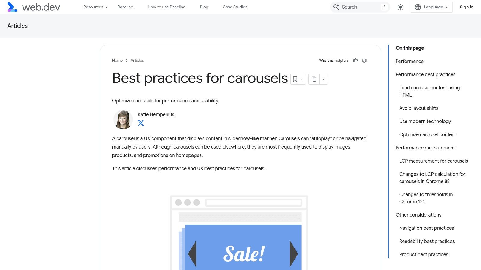
Carousels are a common example. Testing discussed earlier in the article found that rotating hero sliders are often less reliable than teams expect. In practice, I treat a static hero as the default choice unless the brand has clear evidence that multiple frames improve click-through or revenue per session. One sharp image and one focused CTA usually outperform a slider that splits attention.
The image matters as much as the copy. Use product-forward photography that shows scale, use case, or outcome. Lifestyle imagery works best when it still makes the product easy to identify. If the shopper has to study the image to figure out what is being sold, the hero is doing brand work, not conversion work.
Baymard Institute's ecommerce UX research consistently supports clear visual hierarchy and direct paths into shopping. That is why so many effective DTC homepages use a simple structure: plainspoken headline, visible product context, and a CTA tied to shopping intent.
How to write a value proposition that converts
A practical formula is:
[What you sell] + [who it helps] + [why it's better]
Examples:
Organic cotton basics for women who want everyday staples that last.
High-protein snacks for busy parents who need better grab-and-go options.
Modular storage furniture for small apartments, built to fit tight spaces.
Then pair that headline with a CTA that matches shopper intent. "Shop Best-Sellers" often works better than "Learn More" for cold traffic. "Take the Quiz" can win if product selection needs guidance. "Build Your Bundle" is stronger when average order value is a priority.
For Shopify teams looking for a faster build path, this guide on building a high-converting Shopify homepage with Instant shows how to ship and test hero variations without waiting on a full theme development cycle.
What to change first on Shopify
Start with the current hero and cut anything that creates hesitation.
Rewrite the headline so the product category is explicit.
Replace generic lifestyle imagery with a visual that shows the product and outcome.
Reduce CTAs to one primary action above the fold.
Remove auto-rotation unless test data supports it.
Check the mobile version first. The headline, image crop, and CTA need to make sense in the first viewport.
A useful A/B test is static hero versus slider. Another is category-led copy versus benefit-led copy. For example, test "Performance skincare for acne-prone skin" against "Clearer skin without a complicated routine." One anchors on product type. The other anchors on outcome. The better choice depends on shopper awareness level, traffic source, and how much education the product needs.
The goal is not to sound clever. The goal is to get the right visitor into shopping mode fast.
2. Design Intuitive Navigation & Powerful Search
A shopper lands on the homepage with a product in mind, taps the menu, and sees brand terminology instead of buying paths. That is where homepage performance starts to leak. If people cannot tell where to go in a few seconds, they stall, search, or leave.
Good navigation uses customer language, not internal merchandising logic. "Shop All," "New Arrivals," "Best-Sellers," "Skin Concerns," "Bundles," or room-based categories usually beat labels like "Series 02" or "Core." The test is simple. A first-time visitor should understand each top-level item without needing brand context.
Search deserves the same priority, especially for larger catalogs and repeat buyers. On Shopify, that means a visible header search on desktop and an obvious tap target on mobile. Search gets stronger when it includes predictive suggestions, product thumbnails, popular queries, and collection matches. I have seen brands get a bigger conversion lift from improving search relevance than from another round of hero redesigns, because high-intent visitors are already trying to buy.
Baymard's ecommerce UX research consistently shows how quickly unclear category structures and weak search patterns create friction. The practical takeaway is straightforward. Reduce choice at the top level, group products the way shoppers think, and make search useful before the results page loads.
Build a navigation system around shopper tasks
Start with five to seven top-level links. More than that usually pushes teams into vague labels or crowded menus. For DTC brands on Shopify, a strong default structure often looks like this:
Shop or a category-specific equivalent
Best-Sellers
New Arrivals
Bundles or Kits
About only if the brand story materially supports conversion
Help or FAQ if the products need education
The right structure depends on catalog size and buying behavior. A skincare brand may need "Shop by Concern." A furniture brand may need "Shop by Room." A supplements brand may need "Goal" or "Benefit" paths. Organize around how customers decide, not how the catalog is stored in Shopify admin.
This is also where trust cues can support discovery. A menu item like "Best-Sellers" works better when the products behind it carry visible ratings and review volume. If your team is refining that layer, this guide on adding authentic reviews to improve Shopify conversion rates is a practical next step, and it connects directly to the broader role of social proof in marketing.
What to change first on Shopify
Focus on the highest-friction paths first.
Rename navigation labels using shopper language pulled from site search, reviews, and customer support tickets.
Keep top-level items limited and push edge-case categories into the mega menu or search.
Add predictive search with product images, prices, and collection suggestions.
Make the search icon and field easy to spot on mobile.
Feature high-intent shortcuts such as Best-Sellers, Bundles, or Gift Sets in the menu.
Audit zero-result searches and redirect common terms to relevant collections or synonym rules.
For teams using Instant Commerce, these changes are faster to ship because menu layouts, collection tiles, and search entry points can be tested without waiting on a full theme sprint. That matters if the homepage is already live and traffic is expensive.
A/B tests that usually reveal useful answers
Start with labels before redesigning the whole header. Test "Shop by Concern" against "Shop Skincare." Test "Best-Sellers" in the top nav versus inside the menu. Test a search bar in the header against an icon-only treatment on desktop.
Then test the menu content itself. Compare a brand-led menu structure against a task-based structure. For larger assortments, test featured products inside the mega menu versus simple text links. The goal is not a prettier header. The goal is faster product discovery with fewer wrong turns.
3. Design Intuitive Navigation & Powerful Search
A homepage can have strong visuals and still lose shoppers if the path into the catalog feels uncertain. Navigation isn't there to impress a designer. It's there to help a visitor answer, "Where do I go next?"
Many stores often get too internal. They label categories based on merchandising structures instead of customer language. "Core Collection" or "Series 02" may make sense to the team. "Men," "Skin Concerns," "Living Room," or "Bundles" makes sense to the shopper.
Help shoppers find the catalog fast
Orbit Media found that only 38% of the top 50 retail ecommerce sites feature a well-placed search bar on their homepage. That gap matters because search-heavy users often have high purchase intent. If the search bar is hidden, tiny, or absent on mobile, those shoppers have to work harder than they should.
For larger catalogs, search should sit visibly in the header and support auto-suggestions, product thumbnails, and relevant collection prompts. Shopify brands with broad assortments often gain more from improving search behavior than from redesigning the hero.
Navigation choices that usually work
Baymard's guidance, referenced in the same Orbit analysis, recommends showing a broad range of at least 40% of product types on the homepage so visitors don't misread the scope of the store. In practice, that means the homepage should expose enough category breadth to say, "This store sells more than one narrow thing."
A practical structure looks like this:
Use shopper language: Name categories the way customers search and browse.
Keep top-level choices tight: Limit header navigation to the most commercially useful paths.
Use mega menus when needed: Apparel, beauty, and home brands with deeper catalogs benefit from grouped navigation.
Keep search visible on mobile: Don't bury it inside the menu if search matters to discovery.
Navigation should reduce decision fatigue, not display organizational complexity.
A solid A/B test is to reorder navigation links based on commercial value rather than tradition. Many stores leave legacy categories first in the menu even when newer, higher-converting collections deserve that position.
4. Guide Product Discovery Without Overwhelming
A shopper lands on the homepage with partial intent. They may know the category, but not the product. They may want a gift, a refill, or a first purchase. The homepage has to move that person toward a useful next click without dumping the whole catalog in front of them.
This is a merchandising job.
Strong Shopify homepages usually guide discovery through a small set of intent-based paths: best-sellers, new arrivals, category entry points, bundles, routines, or problem-solution collections. Weak ones either stop at brand storytelling or stack six competing product sections with no clear hierarchy. In both cases, shoppers do extra work.
Build the page around shopper intent
Start with the fewest homepage sections that can cover the main buying modes in the business. For a beauty brand, that might be Shop by Concern, Best-Sellers, and a regimen bundle. For home goods, it could be Shop by Room, New Arrivals, and an editor's picks collection. For apparel, best-sellers plus seasonal categories often beat a homepage full of mixed SKUs.
The key trade-off is breadth versus clarity. Showing more products can increase exposure, but it also raises cognitive load. In practice, three to five discovery blocks is usually enough for most DTC brands. Give each block a distinct job and a clear label.
What to feature on the homepage
Use homepage modules that help shoppers self-sort fast:
Best-sellers: Good for first-time visitors who want the safest choice.
New arrivals: Useful for returning shoppers and trend-driven categories.
Shop by use case or goal: Works well for supplements, skincare, food, and wellness.
Shop by category: Helps broader catalogs where people browse by product type.
Bundles or starter kits: Good for increasing AOV and reducing decision friction.
Support links in context: Add visible paths to shipping, returns, sizing, or FAQs for shoppers who need reassurance before browsing deeper.
On Shopify, this structure is easy to implement with featured collection sections, metaobject-powered category cards, and image tiles that link to filtered collections. Instant Commerce helps teams prototype and reorder these sections quickly without waiting on a developer, which matters when merchandising priorities change every month.
Keep hierarchy obvious
Not every homepage section deserves the same visual weight. One discovery path should lead. The rest should support it.
A simple pattern that works well is:
Primary discovery block tied to the main conversion goal
Secondary block for a different buying intent
Social proof or supporting reassurance near featured products
One promotional or educational block if it helps the sale
That order keeps the page useful without turning it into a catalog dump.
A common mistake is mixing editorial content, promos, and product grids with identical card sizes and headings. Shoppers cannot tell what matters first. Use stronger headings, tighter product counts, and more whitespace around the priority section. If every block shouts, none of them leads.
Practical implementation and test ideas
For Shopify and DTC teams, I usually recommend testing discovery before redesigning the entire homepage. Start with the section order and labels.
Good A/B tests include:
Replacing a generic Featured Products grid with Best-Sellers
Testing Shop by Goal against Shop by Category
Reducing a 12-product grid to 4 or 6 products with clearer collection CTAs
Moving bundles above single-product recommendations
Adding support links such as shipping or sizing near the first discovery block
These tests are fast to run and easier to learn from than a full visual overhaul. If a no-code builder like Instant Commerce is in the stack, the team can launch variants without tying every homepage change to a development sprint.
Product discovery should feel curated, not crowded. The homepage does its job when shoppers can say, within a few seconds, "I know where to click next."
5. Prioritize a Flawless, Mobile-First Experience
A shopper lands on your homepage from Instagram, holds the phone in one hand, and tries to figure out what you sell before the next text notification appears. If the headline wraps awkwardly, the menu icon is easy to miss, or the first CTA sits below a giant image, that visit gets wasted fast.
Mobile-first homepage design starts with different constraints, not just a smaller canvas. Attention is shorter. Scrolling is faster. Tap precision is worse than a mouse click. On Shopify stores, I usually find that the desktop version looks polished while the mobile version carries too much baggage from the desktop layout.
Build the mobile version for action
The homepage has one job on mobile. Help shoppers take the next obvious step without friction.
That usually means making a few hard trade-offs:
Cut decorative copy that pushes product or category links down the page
Reduce hero height so the headline, value proposition, and CTA appear quickly
Put search, menu, and cart in familiar positions with clear contrast
Use tap targets with enough spacing to prevent mis-taps
Remove carousels that hide content or create accidental swipes
Reorder sections for mobile if a desktop sequence becomes too long on a phone
These changes sound small. They are often where conversion gains come from.
Common mobile issues that hurt homepage performance
On audit calls, I see the same problems repeatedly. A desktop banner gets scaled down and the text becomes hard to read. Promo bars stack on top of announcement bars, which pushes the hero lower. Product cards keep every badge, variant, and label, so each block turns into visual clutter on a small screen.
The fix is usually restraint. Show fewer elements per module. Tighten the copy. Give each section a clearer purpose.
For example, if the homepage hero already introduces the main offer, the next mobile block should not repeat the same message with a second oversized banner. It should move the shopper forward, often with category shortcuts, best-seller entry points, or a compact trust cue.
What to change first on Shopify
For Shopify and DTC teams, I prioritize mobile fixes in this order:
Header usability: Keep the announcement area compact and make search easy to access.
Hero compression: Shorter copy, one primary CTA, and imagery that still works when cropped vertically.
Section pruning: Remove or collapse low-impact homepage modules on mobile.
Card simplification: Keep product cards scannable with stronger titles, price visibility, and one clear action.
Sticky utilities: Test a sticky add-to-cart prompt, sticky menu access, or sticky search only if it improves speed to action.
No-code tools prove beneficial. With Instant Commerce, teams can adjust mobile-specific spacing, section order, and visibility rules without waiting on a theme deployment. That makes it much easier to ship focused tests instead of debating mobile UX in Figma for two weeks.
A few useful experiments:
Test a shorter hero against the current full-screen banner
Test search in the header versus search below the hero
Test a 2-column product grid against a 1-column list for featured products
Test static promotional tiles against swipeable cards
Test hiding one low-priority section on mobile only
Use a structured CRO testing framework for Shopify experiments so each mobile change ties back to a measurable behavior, such as menu opens, search usage, collection clicks, or revenue per session.
A strong mobile homepage feels obvious. Shoppers know what the brand sells, where to tap, and what to do next within seconds. That is the standard to design for.
6. Obsess Over Performance, SEO & Experimentation
A shopper taps your homepage from Instagram, the hero video stalls, the layout jumps as apps load, and search appears a second too late. The creative may be strong, but the session is already off track.
Homepage performance affects revenue because it shapes the first few seconds of intent. On Shopify, slowdowns usually come from familiar choices: oversized media, too many app scripts, aggressive animations, and sections stacked without a clear priority. Teams often approve these one by one. Shoppers experience the total cost all at once.
Treat speed like a merchandising decision
Every homepage element needs a job. If a widget does not improve product discovery, trust, or clicks into revenue-driving pages, remove it or move it lower.
That trade-off matters. A polished animation can improve brand perception, but not if it delays the hero, search, or primary CTA. A review app can build trust, but not if it injects render-blocking scripts above the fold. Strong homepage design is not about adding more. It is about protecting the fastest path to action.
A practical review on Shopify usually starts here:
Compress hero images and avoid loading desktop-sized assets on mobile
Replace autoplay video with a poster image unless the video clearly improves clicks
Audit installed apps and remove scripts that do not affect conversion
Lazy-load lower page sections, especially editorial blocks and social feeds
Check Core Web Vitals after each major homepage change, not just after a full redesign
SEO starts with structure, not stuffing keywords
Homepages rarely rank because a brand crammed more copy into them. They rank because the page helps search engines understand the brand, the product category, and the paths deeper into the catalog.
Use one clear H1. Write title tags and meta descriptions that match how customers search. Link prominently to key collections. Keep supporting copy concise, but specific enough to reinforce relevance. If the homepage tries to target every keyword, it usually weakens clarity for both SEO and conversion.
This is also where Shopify teams benefit from cleaner section architecture. Homepage modules should follow a logical order in the DOM, not just a visual order that looks good in a design file.
Build experimentation into the homepage workflow
Teams that improve homepages consistently do not rely on redesigns alone. They run smaller tests against clear behaviors, then keep what performs.
Good homepage tests are specific:
Static hero image versus lightweight motion
Category-led hero CTA versus best-seller-led hero CTA
Trust bar above the fold versus below featured collections
Featured products block versus collection shortcuts
Review snippet on the homepage versus product-led proof only
Track one primary metric per test, then add a few supporting signals. For a hero test, that may be collection click-through rate first, with revenue per session and bounce rate as supporting reads. For a navigation test, it may be search usage or menu interaction depth. A disciplined CRO testing framework for Shopify experiments keeps those decisions tied to behavior instead of opinion.
No-code tools help teams ship these tests faster. With Instant Commerce, brands can change section order, hide heavier modules, swap hero variants, and publish test ideas without waiting on theme development for every iteration.
The homepage does not need to impress a room full of stakeholders. It needs to load fast, make sense to search engines, and help customers take the next step.
7. Obsess Over Performance, SEO & Experimentation
A homepage can have strong creative and still underperform because it loads slowly, carries too many scripts, or isn't structured clearly for search engines. Performance problems are easy to normalize because the team sees the site every day. Customers don't. They just feel friction.
Speed should be treated as both a UX issue and a revenue issue. This matters even more on homepage builds that lean heavily on animation, video, app widgets, and oversized imagery.
Speed is a conversion issue
Retailers lose $2.6 billion annually from sluggish sites, according to the source material cited in Inflow's analysis. That should change how teams evaluate homepage features. Every app, autoplay element, tracking script, and oversized asset needs to justify its presence.
Great UX can lift conversion rates by up to 400%, based on the same source context, while average ecommerce conversion rates hover around 2.5-3%. Those numbers don't mean every redesign will create a dramatic jump. They do mean homepage quality has direct commercial impact, and performance is part of that quality.
Build a testing rhythm
SEO basics still matter on the homepage. The page needs a clear H1, meaningful title tag, useful meta description, sensible internal links, and copy that helps search engines understand what the store sells. On Shopify, these are straightforward fixes, but they often get ignored during visual redesigns.
The bigger opportunity is experimentation. The gap identified in ContactPigeon's homepage best practices analysis is dynamic personalization and real-time optimization based on traffic source, visitor type, and behavior. Many stores still treat the homepage like a fixed asset when it should behave more like a controllable system.
For faster testing workflows, Instant's CRO and A/B testing guide is useful for teams that want to iterate without developer bottlenecks.
Audit third-party apps: Remove widgets that don't earn their place.
Optimize images before upload: Don't make Shopify compress a file that starts oversized.
Set homepage SEO fields deliberately: Titles and descriptions should reflect actual search intent.
Test one meaningful variable at a time: Hero offer, section order, CTA copy, and proof placement are all good candidates.
7-Point Ecommerce Homepage Best Practices Comparison
Item | Implementation complexity | Resource requirements | Expected outcomes | Ideal use cases | Key advantages |
|---|---|---|---|---|---|
1. Define a Single, Clear Goal & KPI | Low–Medium, analysis and content alignment | Google Analytics review, copy/design changes, A/B testing time | Clearer conversion funnel; higher primary KPI | Cluttered homepages; CRO initiatives | Focused messaging; easy to measure and iterate |
2. Nail the Above-the-Fold: Hero & Value Proposition | Medium, design, copy, and asset work | Hero image/video production, copywriter, designer, implementation | Reduced bounce; increased CTA clicks and clarity | Product launches; branding refreshes | Immediate value clarity; stronger first impressions |
3. Design Intuitive Navigation & Powerful Search | Medium, IA and search integration | UX design, possible search platform (autocomplete/filtering), dev time | Faster product discovery; higher conversion from search/navigation | Large catalogs; complex product hierarchies | Improved findability; lower user friction |
4. Build Unshakable Trust with Social Proof | Low–Medium, content placement and integrations | Reviews/UGC tools, curated testimonials, badges, content curation | Increased trust; higher conversion and reduced abandonment | New visitors; higher-priced or trust-sensitive products | Credibility boost; persuasive social validation |
5. Guide Product Discovery Without Overwhelming | Medium, merchandising and dynamic content | Merchandiser time, CMS rules or automation for sections, creative assets | Better discovery; higher add-to-cart and session value | Lifestyle brands; seasonal or curated campaigns | Curated journeys; thematic cross-selling |
6. Prioritize a Flawless, Mobile-First Experience | Medium–High, responsive redesign and testing | Mobile UX designer, developers, device testing, image optimization | Improved mobile conversions; lower bounce; faster interactions | Mobile-first traffic stores; on-the-go shoppers | Superior mobile usability; higher engagement on small screens |
7. Obsess Over Performance, SEO & Experimentation | High, technical work and continuous testing | Dev resources, SEO tools, A/B testing platform, analytics | Faster pages; increased organic traffic; data-driven gains | Competitive niches; scaling stores focused on growth | Sustained performance improvements; measurable ROI |
From Homepage to High-Performer
A homepage doesn't need more blocks. It needs more purpose. The strongest ecommerce homepage design best practices all come back to the same principle: reduce uncertainty and move the shopper forward.
That starts with focus. A homepage with one clear goal performs better than a homepage trying to support every team request at once. From there, the highest-impact work is usually straightforward. Sharpen the value proposition, make the first CTA obvious, improve navigation, surface trust earlier, and make product discovery feel guided instead of chaotic.
Mobile experience deserves special scrutiny because that's where clutter and friction become obvious fast. If the page is hard to scan, hard to tap, or slow to load, the homepage is creating resistance before a shopper even reaches a collection or product page. Performance and SEO complete the picture because visibility and speed are part of conversion, not separate concerns.
The most effective teams don't treat these ideas as design trends. They treat them as operating principles. They review heatmaps, analyze click paths, test variants, and keep simplifying what doesn't earn its place. That mindset matters more than any single homepage layout.
For Shopify and DTC brands, the practical path is to pick one issue and fix it this week. Rework the hero. Clean up the navigation. Move proof higher. Remove heavy modules. Launch a cleaner mobile version. Then measure what changed.
Tools can speed that cycle up when they remove implementation bottlenecks. Instant Commerce is useful in that context because it gives teams a way to design, test, and publish homepage improvements without waiting on a full dev sprint. That makes consistent homepage optimization much more realistic, especially for lean growth teams that need to move from idea to live test quickly.
Instant Commerce helps Shopify teams turn these ecommerce homepage design best practices into live storefront changes fast. With Instant, brands can build homepages, test variants, personalize layouts, and ship high-converting experiences without code or developer delays.


Grow your Shopify store with Instant
No credit card required.
Already have an account?

