
Most Shopify teams don't have a traffic problem. They have a conversion problem. The average Shopify store converts 1.4% to 1.8% of visitors, while the top 10% reach 4.7% or higher, according to Envive’s Shopify conversion rate benchmark breakdown. That gap changes how conversion rate optimization shopify should be approached. It isn't a bag of tricks. It's an operating system for turning the traffic already being paid for into more revenue.
The stores that improve consistently don't chase random homepage tweaks or copy rewrites because a competitor did it. They run a repeatable process. They find where users drop, identify why that friction exists, turn insight into hypotheses, test quickly, and keep the learnings in one place so the next test starts smarter than the last.
Why Most Shopify Stores Leak Revenue and How to Fix It
A large share of Shopify traffic now comes from mobile devices, yet many stores still build and review pages as if desktop is the main buying experience. The result is predictable. Plenty of sessions reach the site, but too many shoppers stall before they add to cart, start checkout, or complete a purchase.
The leak usually is not one dramatic problem. It is a stack of small frictions across the journey. A weak first-screen message. Product pages that bury shipping or returns. Variant selectors that are clumsy on mobile. Cart drawers that interrupt rather than support the next step. By the time a team notices revenue lagging behind traffic growth, those issues have already been costing money for weeks or months.
A common response is to redesign high-visibility pages, install another app, or make broad copy changes across the store. That feels productive, but it rarely produces a clean result. If the actual issue sits on a product template, in the cart, or inside the mobile interaction pattern, site-wide edits only add noise.
Practical rule: Random tweaks create random outcomes. A repeatable CRO process creates compounding gains.
Conversion rate optimization shopify works best when the store is managed as a buying path with measurable friction points. The goal is not a prettier theme. The goal is to remove hesitation at the moments that affect revenue.
In practice, four issues show up again and again:
Mobile friction: Navigation, filtering, product media, sticky add-to-cart, and thumb-friendly layout decisions often have more impact than another round of visual polish.
Weak message hierarchy: Shoppers should grasp the product, offer, delivery expectations, and trust signals in seconds.
Late-stage checkout loss: Surprise shipping costs, limited payment methods, coupon distractions, and unnecessary steps kill high-intent sessions.
Heavy pages: Slow-loading templates and cluttered layouts reduce both conversion rate and test quality, because they make every experiment harder to interpret.
Homepage issues still matter, especially for paid and cold traffic. This breakdown of homepage conversion killers for DTC brands covers the patterns that weaken performance before shoppers ever reach a product page.
A system beats a checklist
Strong Shopify CRO programs do not run on generic best practices alone. They run on an operating loop: audit the funnel, turn friction into a hypothesis, prioritize what has real upside, launch the test, review the result, and keep the learning.
That structure matters because store context changes the answer. A single-product brand can often win by tightening one landing page and one product page. A catalog brand may get more from collection-page filtering, search, and merchandising logic. A subscription brand usually needs to reduce anxiety around commitment, delivery cadence, and cancellation terms. The playbook changes. The workflow does not.
What actually fixes the leak
Teams get better results once they stop asking what to improve in general and start identifying where buying intent breaks. That shift cuts opinion out of the process.
It also changes how experiments get shipped. With no-code tools, marketers can test layout, messaging hierarchy, trust blocks, bundles, and landing page structure without waiting on a development sprint. That speed matters. In many Shopify teams, the bottleneck is not ideas. It is the gap between spotting friction and getting a live test into market.
The Foundation Your CRO Program Needs
A serious CRO program starts with diagnosis. Teams need two layers of truth. First, the numbers that show where shoppers are dropping. Second, the behavioral evidence that shows why they're doing it.

Start with the funnel, not the homepage
Shopify Analytics and Google Analytics should be used to map the path from landing page to purchase. The point isn't to admire dashboard trends. The point is to isolate bottlenecks.
Shopify’s enterprise CRO guidance recommends starting with funnel analysis, then reviewing where users drop before the final purchase step, as described in Shopify’s CRO methodology article. That means checking page-level exits, product page progression, cart starts, checkout starts, and purchase completion.
A useful pattern looks like this:
Find the biggest drop-off. If product pages attract clicks but cart starts stay weak, the issue may be offer clarity, trust, or page structure.
Check by segment. Mobile, desktop, new visitors, and returning visitors often behave very differently.
Look for concentration. One poor-performing template can drag down the whole store average.
Numbers tell the team where to investigate. They don't tell the team what to change.
Use behavior tools to explain the drop-off
After the funnel points to the problem area, heatmaps, session recordings, and user feedback reveal the cause. Microsoft Clarity is useful for recordings. Heatmap tools help spot missed clicks, shallow scroll depth, and interaction dead zones. On-page surveys and support transcripts add language customers already use.
A common example is a product page with strong traffic and weak add-to-cart performance. Analytics show the drop. Recordings often reveal the reason. Users may scroll for shipping details, tap size guides repeatedly, hesitate on variant selection, or abandon after opening returns information.
That kind of evidence is stronger than generic advice because it names the exact friction.
If shoppers keep reopening the shipping accordion, the page likely hides critical buying information.
If mobile users rage-click image areas, product media may be hard to interact with or zoom.
If visitors bounce after reading only the top section, the opening value proposition may be too vague.
A related design reference is this practical guide to ecommerce UX design for higher conversions.
What a useful audit output looks like
The audit isn't complete when the team has a list of problems. It's complete when each problem can be written as a testable friction statement.
Audit finding | Likely issue | Better next step |
|---|---|---|
High product page traffic, weak cart starts | Offer or trust gap | Review recordings and customer questions |
Strong cart activity, weak checkout completion | Late-stage friction | Inspect checkout steps, pricing clarity, payment flow |
Good desktop performance, weak mobile results | Mobile UX problem | Review mobile navigation, sticky CTA, form behavior |
At this point, most CRO efforts either become disciplined or drift into redesign theater.
Prioritizing High-Impact Test Ideas
Most testing backlogs are full of weak ideas. They sound plausible, but they aren't tied to observed friction. "Test a new hero." "Try a brighter CTA." "Move reviews higher." None of those are necessarily bad. They're just too vague to deserve priority.
Turn friction into hypotheses
Good hypotheses come directly from the audit. They identify a user segment, a page, a friction point, and the expected behavior change.
Bloomreach notes that merchants often miss the harder but more valuable work of finding unique product selling angles from session recordings and customer feedback, even though personalization is known to lift sales by 20%, as explained in Bloomreach’s Shopify CRO guide. That matters because many Shopify tests stay trapped in cosmetic changes when the bigger win is message-market fit on the page.
Examples of stronger hypotheses:
Homepage: New visitors don't understand why this brand is different within the first screen, so simplifying the hero and sharpening the offer should improve movement into collection pages.
Collection page: Mobile users can't narrow choices fast enough, so surfacing higher-intent filters earlier should reduce dead-end browsing.
Product page: Shoppers hesitate because the page emphasizes features but not the compelling reason to buy, so reframing copy around the primary customer pain point should improve add-to-cart intent.
Checkout entry: Users drop after adding to cart because total cost and delivery expectations aren't clear early enough, so moving that information closer to the decision point should reduce abandonment.
The strongest CRO tests don't ask, "What can be changed?" They ask, "What belief or hesitation is blocking the purchase?"
Mobile navigation deserves special attention here. Teams often treat it as a design clean-up task when it's really a conversion lever. If shoppers can't find categories, filters, or key paths quickly on mobile, every downstream page performs worse.
Score ideas before building anything
A simple ICE framework keeps the backlog honest. Score each idea on Impact, Confidence, and Ease, then average the three numbers. It isn't perfect, but it stops teams from prioritizing whatever the loudest stakeholder prefers.
Example ICE Prioritization Framework
Test Idea | Hypothesis | Page Type | Impact (1-10) | Confidence (1-10) | Ease (1-10) | ICE Score |
|---|---|---|---|---|---|---|
Simplify hero and clarify core offer | Clearer first-screen messaging will push more visitors into shopping paths | Homepage | 8 | 7 | 8 | 7.7 |
Rework mobile collection filters | Faster product discovery will reduce browsing friction on phones | Collection Page | 9 | 8 | 6 | 7.7 |
Test pain-point-led product copy | A sharper selling angle will increase add-to-cart intent | Product Page | 8 | 8 | 7 | 7.7 |
Show shipping and returns earlier | Earlier reassurance will reduce hesitation before checkout | Product Page | 7 | 7 | 8 | 7.3 |
Reorder cart drawer information | Clearer next steps will improve progression into checkout | Checkout entry | 6 | 6 | 9 | 7.0 |
The key is using ICE as a decision tool, not a formality.
Impact asks: If this works, does it affect a major bottleneck?
Confidence asks: Is there evidence from analytics, recordings, or customer feedback?
Ease asks: Can marketing launch this without waiting on a sprint queue?
A practical library of tests by template is this roundup of A/B test ideas for Shopify.
What to test first
Most stores should start with changes that are both visible and easy to ship:
Message hierarchy on landing pages and product pages
Mobile navigation and discovery paths
Trust and reassurance placement
Cart and pre-checkout clarity
Layout changes that remove distraction around the main action
Those tests usually produce better learning than chasing tiny visual changes in isolation.
Building and Launching Experiments Without Code
Traditional A/B testing on Shopify used to be slow for a simple reason. Most page changes required design tickets, theme edits, QA, scheduling, and a developer who had larger priorities than conversion testing.
That model breaks CRO velocity. By the time a variant ships, the context that inspired the test is often stale.
Old testing workflow versus modern no-code workflow
The old workflow usually looked like this:
marketer spots a problem
marketer writes a brief
designer mocks a variant
developer rebuilds it in theme code
QA checks multiple devices
launch gets delayed by other releases
The modern workflow is shorter. A marketer or growth lead duplicates the page, builds a variant visually, assigns traffic, defines success metrics, and launches. That doesn't remove the need for discipline. It removes the dependency that keeps most tests from happening.
One option in this category is Instant Commerce, a Shopify no-code builder that teams can use to create page variants and run layout tests without theme development. That matters most when the test involves structure, navigation, content blocks, popups, or cart drawers rather than a tiny copy change.
Ontap highlights why this matters on mobile in particular. Mobile accounts for over 70% of US eCommerce traffic, and mobile-focused navigation changes have produced a 15% conversion rate increase and 26% revenue growth in cited examples from Ontap’s Shopify CRO article. The takeaway isn't that every nav tweak wins. It's that mobile discovery deserves live testing, not assumptions.
How to launch a clean test
A clean experiment has a tight scope and clear success criteria.
Duplicate the page or template
Build a variant around one core hypothesis. Don't change messaging, layout, trust placement, and media hierarchy all at once unless the test is intentionally a page concept test.Make the variant meaningfully different
A minor visual nudge often doesn't teach much. If the hypothesis is about clarity, the new version should materially improve clarity.Set one primary metric
Product page tests might use add-to-cart or purchase. Navigation tests may use progression into collection or product views. Secondary metrics still matter, but the primary metric should be unambiguous.Track secondary behavior
Watch bounce, cart starts, checkout starts, and behavior by device. A version can lift one metric while hurting the broader funnel.
This walkthrough helps illustrate how visual testing tools fit into the workflow:
What invalidates a test
A lot of teams don't have a testing problem. They have a test quality problem.
According to Shopify’s CRO guidance covered earlier, tests should run long enough to avoid premature conclusions, often in the 2 to 4 week range when needed for statistical reliability. The most common mistakes are familiar:
Stopping early: A few strong days aren't a result.
Changing the variant mid-test: That resets the logic.
Testing without segmentation: Mobile and desktop can mask each other.
Overloading one test with too many ideas: No one knows what caused the lift or drop.
A fast no-code workflow is only valuable when it produces decisions the team can trust.
Analyzing Results and Scaling What Works
A test ending doesn't mean the work is done. It means the useful part starts. The job now is to determine what happened, for whom it happened, and whether the result should be shipped, refined, or retired.
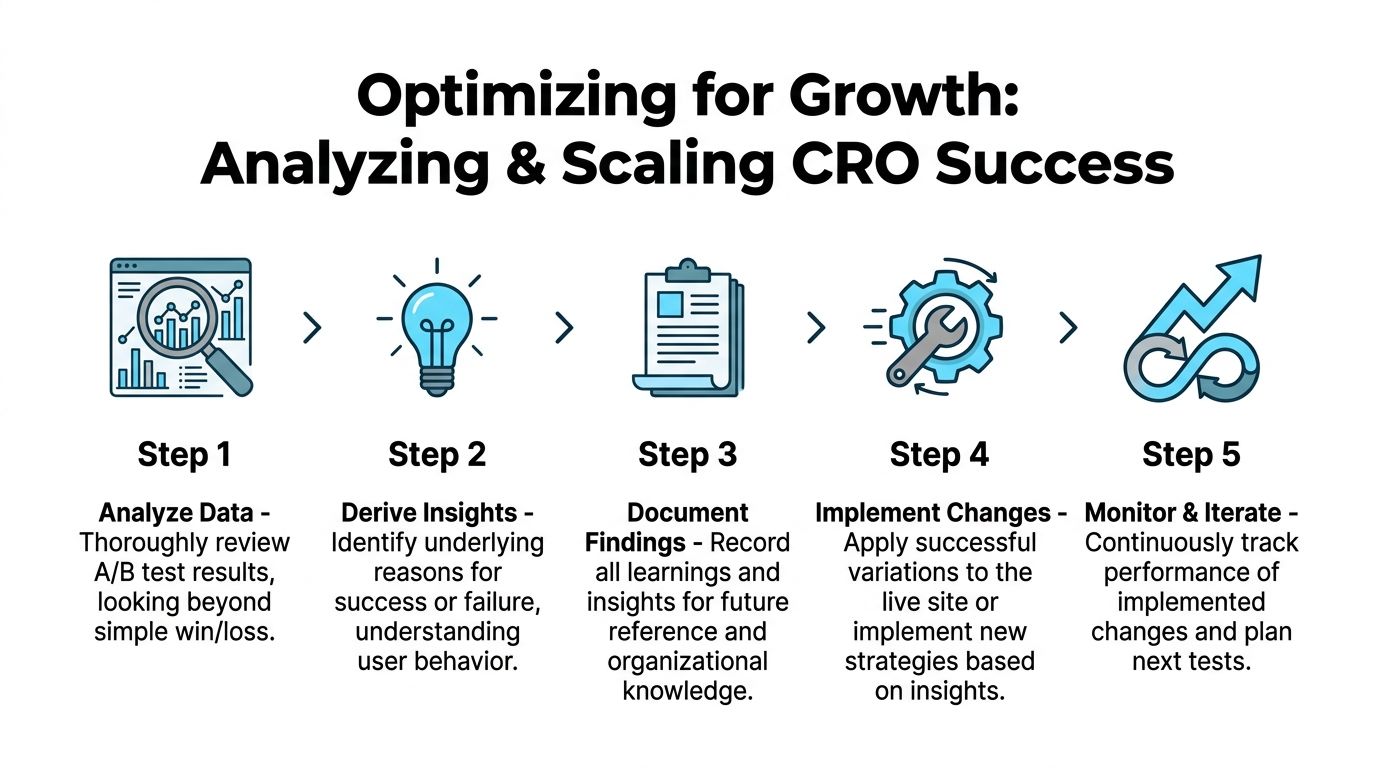
Read the result beyond win or loss
A flat or losing test can still be valuable if it invalidates a bad assumption. A winning test can still be dangerous if it damages an important segment or lowers a secondary metric that matters to the business.
A useful post-test review asks:
Did the result hold by device?
Did new and returning visitors respond differently?
Did the variant improve the primary metric but hurt downstream completion?
Did the page change alter shopper behavior in a way that suggests a better follow-up test?
For example, a collection page variant may drive more product clicks but fewer purchases if it encourages shallow browsing rather than decisive discovery. A product page may lift add-to-cart while creating more returns-related anxiety later if key information was compressed too aggressively.
Some of the best test outcomes are partial wins. They reveal the right direction but the wrong execution.
Build a learning system, not a test archive
Most brands keep a spreadsheet of past experiments. That isn't enough. What matters is whether future tests become smarter because prior evidence is easy to reuse.
Every completed test should record:
Field | What to capture |
|---|---|
Hypothesis | The friction being addressed and expected behavior change |
Variant summary | What changed on the page |
Primary metric | The success metric that determined the result |
Segment notes | Device, traffic source, visitor type, or template differences |
Outcome | Ship, iterate, or abandon |
Learning | What the team now believes with more confidence |
That final line matters most. "Variant B won" isn't a learning. "Mobile shoppers responded better when delivery and returns moved above the fold" is.
What to do next with the result
There are only three useful decisions after analysis:
Ship the winner broadly if it improved the right outcome without introducing meaningful downside.
Iterate on the concept if the direction looks promising but the execution was incomplete.
Drop the hypothesis if the data doesn't support it and the evidence was strong enough.
Teams that scale CRO well don't just collect wins. They reduce repeated mistakes. That's what makes the process compound.
Creating Your Repeatable Shopify CRO Workflow
Stores that improve conversion consistently do not treat CRO as a side project. They run it like an operating system. The goal is simple: keep finding friction, ship focused tests fast, and turn every result into the next better decision.
For Shopify teams without dedicated developers, that matters even more. If every test waits on theme work, the program stalls. A repeatable workflow fixes that by giving marketers a clear sequence they can run each week with analytics tools, session data, and no-code page builders.
A practical weekly cadence
A workable CRO rhythm is lighter than many teams expect. One review block, one planning block, and one live experiment is enough to build momentum.
Use a cycle like this:
Review performance: Check funnel drop-off, landing page behavior, cart exits, and changes in conversion by device or channel.
Identify one friction point: Match the numbers with session recordings, on-site surveys, or support tickets to find the likely cause.
Write one testable hypothesis: Tie the change to a specific audience, page, and expected action.
Choose the best opportunity: Prioritize ideas that have clear upside and low build effort.
Launch one clean experiment: Change the fewest variables needed to test the idea properly.
Record the outcome: Save the result, affected segments, and what the team now believes with more confidence.
That structure keeps the workload realistic. It also prevents a common failure mode: a long backlog of ideas and no shipped tests.
What makes the workflow repeatable
The workflow has to survive busy weeks, merch launches, and campaign pressure. That means reducing dependency on developers wherever possible.
A simple operating model works well:
Marketing or growth owns research and prioritization
Design turns the hypothesis into a clear page variation
The ecommerce lead sets the success metric and guardrails
The team launches with a no-code tool when layout changes are needed
Results go into a shared log that anyone can reuse
The shared log is the part teams skip. Then six weeks later, someone proposes the same test again because the original learning is buried in Slack, Notion, or a deck no one opens.
Keep the process strict, not heavy
Fast teams still need discipline.
Run one primary hypothesis per test. Set the success metric before launch. Give the variant enough traffic to produce a credible read. If a result is mixed, keep the learning and refine the execution instead of forcing a win.
No-code tools help here because they remove waiting time, not because they lower the bar for test quality. Instant Commerce gives Shopify teams a no-code way to build, test, and publish page variants without waiting on theme development. For marketers trying to move from insight to live experiment faster, it fits well into a repeatable CRO workflow. Learn more at Instant.
The payoff is consistency. Teams that follow a fixed workflow do not need a major redesign to improve conversion. They keep shipping smaller, better-informed changes, and those gains stack over time.


Grow your Shopify store with Instant
No credit card required.
Already have an account?

