
A campaign is ready to launch. The ad creative is approved, the email is scheduled, and the traffic plan is locked. Then the weak point shows up. The destination is still a generic product page, a collection page with too many choices, or a homepage trying to serve everyone at once.
That’s where most Shopify teams leak performance. The message in the ad is specific, but the page isn’t. A good shopify landing page builder closes that gap by letting marketers turn one offer into one focused page without waiting on a developer or compromising the storefront.
The work that matters isn’t just dragging blocks onto a canvas. It’s choosing the right page goal, structuring the message, making the page connect to the rest of the Shopify stack, and improving it after launch instead of treating publish as the end.
Why Your Shopify Store Needs Dedicated Landing Pages
A standard Shopify product page has a job. It needs to support browsing, handle returning visitors, and fit inside the broader store structure. That makes it useful, but not focused enough for campaign traffic.
A landing page is different. It removes competing paths, keeps the offer tight, and matches the promise that got the click. That matters because the average conversion rate for Shopify stores is 1.4%, while top-performing landing pages can exceed 10%, and simplifying the offer by removing distractions can increase conversions by up to 12% according to Shopify landing page statistics.

A team running paid social already feels this difference in practice. The ad speaks to one pain point, one product, one angle. Sending that click to a page full of unrelated navigation, competing products, and mixed messages weakens intent.
Practical rule: If the traffic source is specific, the destination should be specific too.
Dedicated pages also create cleaner decision-making. A campaign page can be built around one bundle, one subscription offer, one seasonal launch, or one lead capture flow. That clarity helps the team spot what’s working because the page has a single purpose instead of several.
For merchants comparing whether this extra step is worth it, the operational case is simple. Campaign pages let teams test positioning without redesigning the whole store, which is one reason many brands create landing pages for a Shopify store before increasing ad spend.
Planning Your High-Converting Landing Page Strategy
Most underperforming landing pages don’t fail in the builder. They fail before design starts. The page tries to sell too many things, speak to too many people, or answer too many objections at once.
The fix is discipline. A landing page needs one conversion goal and one audience. If the campaign can’t be summarized in a short sentence, the page strategy probably isn’t ready yet.
Define one goal and keep it narrow
The page goal has to be singular. Not “sell and capture emails and educate and cross-sell.” Just one.
A useful planning filter looks like this:
Purchase goal: Sell one featured product, one bundle, or one curated offer.
Lead goal: Capture an email for a waitlist, quiz result, or early access flow.
Clickthrough goal: Warm up colder traffic before sending it to a product page or checkout.
Each goal creates different page decisions. A purchase page needs friction reduction. A lead page needs a strong exchange of value. A clickthrough page needs education and momentum.
Match the audience to the traffic source
A page built for branded search traffic won’t look the same as one built for Meta prospecting or an influencer mention. Cold traffic usually needs more context. Warm traffic usually needs faster reassurance and a cleaner path to act.
Many teams often make the page too broad at this stage. They reuse one template and swap only the headline. That rarely holds up because traffic sources carry different intent levels, different objections, and different familiarity with the brand.
A practical planning sheet should answer four questions before anyone opens the builder:
Question | What to decide |
|---|---|
Who is this page for | New visitor, returning shopper, subscriber, or campaign-specific audience |
What action matters | Purchase, opt-in, clickthrough, or another single conversion |
Why should they care now | Core benefit, urgency, or problem being solved |
What might stop them | Price concern, trust concern, confusion, shipping, fit, or commitment |
For a broader refresher on message clarity, offer structure, and page focus, this roundup of ecommerce landing page best practices is a useful reference.
Write the page promise before the page
Before layout, the team should write a compact positioning statement. It doesn’t need to be public-facing. It needs to be clear.
A simple formula works well:
For this audience, this offer solves this problem better because of this differentiator.
That sentence prevents clutter. It also keeps copy, imagery, reviews, and CTA aligned. If a section doesn’t support the promise, it probably doesn’t belong on the page.
Designing the Layout and Writing Compelling Copy
A landing page usually fails in the first few seconds, not at the bottom. The visitor lands, scans the hero, tries to understand the offer, and decides whether this looks like a page built for their problem or a generic campaign asset. A shopify landing page builder gives you control over the page structure, but conversion still depends on how clearly the page answers that visitor's questions in the right order.

Start with the hero section
The hero has one job. It needs to confirm message match fast enough that paid traffic does not bounce before the rest of the page gets a chance to work.
That means the hero should be built around the offer, not around visual flair. Strong pages usually keep four elements above the fold:
A direct headline: Say what the product or offer helps the customer do.
A supporting line: Clarify who it is for, what makes it different, or why it matters now.
A primary CTA: Give one obvious next step.
A useful visual: Show the product, the result, or the use case in a way that removes confusion.
Weak headline: “A better way to shop wellness.”
Stronger headline: “Daily hydration support without the sugary aftertaste.”
Specificity carries more weight than brand polish here. Clever copy can work for warm audiences. Cold traffic usually needs clarity first.
Build the page in the order people make decisions
After the hero, the layout should reduce friction section by section. Many Shopify teams get this wrong in one of two ways. They either stack every possible benefit, badge, and testimonial into one long scroll, or they build a visually impressive page that delays basic answers until halfway down.
A better approach is to map the body of the page to the buying decision:
Explain the problem or desired outcome
Show the visitor they are in the right place.Present the offer clearly
Explain what the product, bundle, subscription, or lead magnet includes.Translate features into outcomes
Ingredients, materials, shipping terms, or product specs matter once the customer understands why they matter.Reduce risk
Add returns, delivery timing, compatibility notes, usage guidance, or guarantee language near the point where hesitation tends to show up.Add proof where doubt appears
Reviews, UGC, testimonials, before-and-after visuals, and media mentions work best beside the claims they support, not dumped into a single proof block.
As noted earlier, Shopify data shows that shoppers use reviews to judge trust quickly. That is why review placement matters. A review carousel buried above the footer does less work than a tight testimonial beside pricing, subscription terms, or the add-to-cart CTA.
Here is a practical body structure that works for many ecommerce offers:
Section | Job on the page |
|---|---|
Problem or need | Confirm relevance and intent match |
Product or offer explanation | Make the solution easy to understand |
Benefits stack | Connect features to customer outcomes |
Reviews or testimonials | Lower perceived purchase risk |
FAQ or objection handling | Clear the last points of hesitation |
Teams building custom brand experiences often need more design flexibility than a default theme section can offer. This guide to no-code Shopify brand page building for complex designs is useful if you need stronger visual control without turning every campaign page into a developer task.
Write copy that carries the sale
Layout gets attention. Copy closes gaps in understanding.
The strongest landing page copy is concrete, specific, and close to the customer's language. It does not try to sound expensive. It tries to make the next action feel safe and obvious. In practice, that means cutting vague phrases like “premium quality” or “designed for modern lifestyles” unless the page immediately proves them.
A simple writing sequence works well:
Lead with the main outcome.
Support it with one believable reason.
Add proof.
Ask for action.
For example, “Improve your sleep” is broad. “Fall asleep faster with a weighted blanket designed to reduce nighttime restlessness” gives the visitor something to evaluate. It also sets up the next sections naturally, including material details, customer reviews, and FAQs.
Write CTAs that match intent
CTA copy should reflect what the visitor is agreeing to.
“Shop now” is serviceable, but it is often weaker than “Get the starter bundle,” “Start your subscription,” or “Claim early access.” Those labels reduce ambiguity. They also make A/B testing more useful because you are testing a real value proposition, not just button color and spacing.
This matters even more when pages connect to email platforms, quiz tools, subscription apps, or post-purchase flows. If the CTA promises one thing and the next step feels different, conversion drops and attribution gets messy. That is one of the common roadblocks basic landing page tutorials skip. The copy on the page, the button action, and the downstream app behavior need to match.
AI copy tools can speed up headline drafts, CTA variants, and benefit framing. They are helpful for volume, not judgment. Give them the audience, offer, objection set, and traffic source. Then edit hard. Generic copy is fast to produce and expensive to run.
Building Your Page with a No-Code Shopify Builder
Once the strategy and messaging are settled, build speed starts to matter. Waiting on theme edits for every campaign variation slows testing and turns small page decisions into project management problems.
A modern no-code workflow is modular. The team isn’t designing every element from scratch. It’s assembling proven sections, editing them hard, and publishing fast.
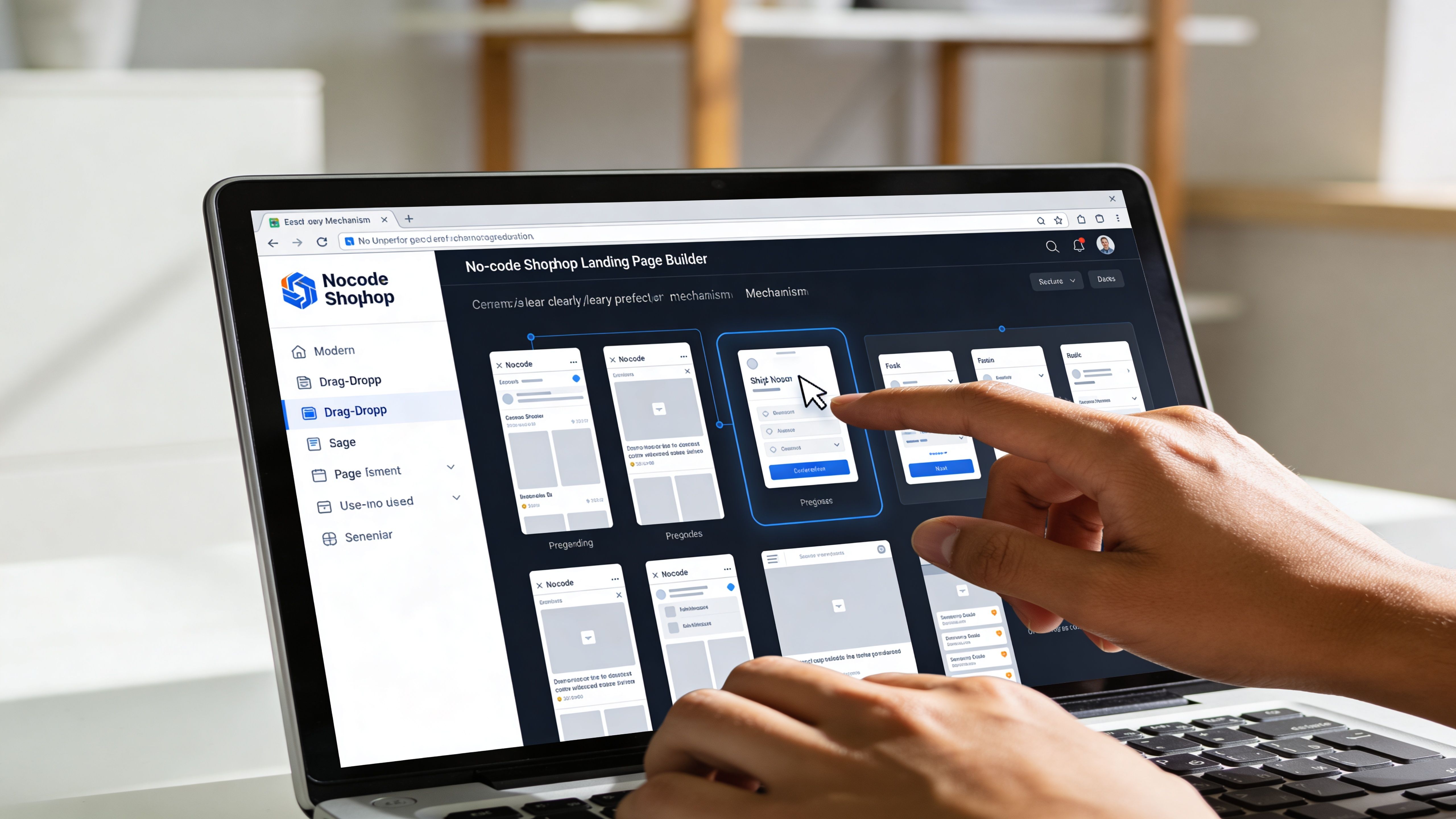
Use sections like building blocks
The fastest way to build is to start with a structure that already matches the page goal. For example, a product launch page and a lead capture page shouldn’t start from the same template just because both are “landing pages.”
A practical build sequence looks like this:
Start with the conversion path: Hero, proof, offer details, CTA, and objection handling.
Choose only the sections the page needs: If a block doesn’t support conversion, cut it.
Pull in real Shopify data early: Products, pricing, variants, and collections should be connected before final styling.
Review every section for message match: The copy and imagery should reflect the ad, email, or creator mention driving the traffic.
The best builders make this easier by letting the team duplicate sections, save reusable blocks, and edit layouts visually instead of touching Liquid for every change.
Build mobile first, not mobile later
Many teams still design on desktop and “check mobile at the end.” That’s how mobile pages end up with overlong hero stacks, broken spacing, impossible tap targets, and review carousels that bury the CTA.
Shopify data shows a meaningful gap between average and top mobile store performance, which is enough reason to treat mobile layout as a core build requirement rather than QA cleanup, as noted earlier in the article.
A builder is only as good as its mobile controls. Before committing to one, look for:
Responsive section editing: Different spacing, stacking, and visibility rules by device.
Preview modes that are usable: Not just a narrow desktop frame.
Media controls: Fast image swapping, cropping, and compression support.
Reusable mobile-safe components: Sticky CTA bars, compact proof rows, and short accordions.
A page that looks polished on desktop but awkward on mobile usually loses before the visitor reads the offer.
Use modern tools to compress production time
No-code used to mean drag-and-drop only. The newer standard is broader. Teams now expect builders to help with content generation, design transfer, image production, and testing.
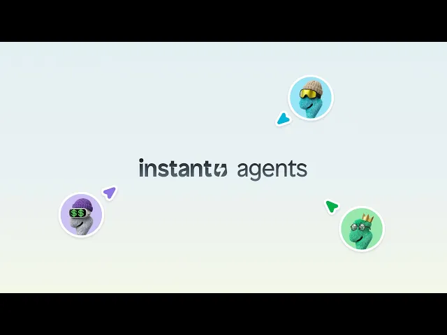
Some tools focus on templated page assembly. Others go further. For example, no-code Shopify brand page building for complex designs shows how teams can move from more custom visual concepts into publishable Shopify sections without rebuilding everything manually. Instant Commerce is one option in this category, alongside other builders that support drag-and-drop workflows with deeper design flexibility.
This kind of workflow matters most when the creative team already works in Figma or needs to publish campaign variants quickly. Instead of treating the builder as a simplified website editor, the team can treat it as the production layer for launch.
A short demo helps clarify what this workflow looks like in practice:
The key trade-off is simple. Some builders are easier for quick pages but more restrictive when the design gets custom. Others require a bit more setup discipline but pay off when the brand wants more control over components, experiments, and reusable systems.
Integrating Your Essential Marketing and Sales Apps
The biggest myth in no-code Shopify building is that once the page looks right, the job is done. It isn’t. A landing page has to work with the rest of the stack, or the campaign breaks in quieter ways that are harder to catch.
The usual failure points show up around subscriptions, reviews, popups, upsells, and email capture. A page can look perfect in the builder preview and still fail to pass the right data to Klaviyo, render a live review widget correctly, or preserve Recharge behavior without extra work.
How to vet integrations before building
Before choosing a shopify landing page builder, the team should test the exact workflows the campaign depends on. Not generic integrations. The actual stack.
A short evaluation checklist works better than feature-page browsing:
App type | What to test |
|---|---|
Email and SMS | Form submission, list mapping, event tracking, popup behavior |
Reviews | Live widget support, star rating placement, schema handling |
Subscription | Selling plan rendering, variant behavior, checkout continuity |
Upsell and cart tools | Offer triggers, drawer conflicts, bundle logic |
Analytics | Event firing, attribution consistency, variant tracking |
If a builder needs repeated manual theme edits to support core apps, it isn’t functioning like a no-code tool for that store.
For most brands, the cleanest setup comes from choosing a builder that already has native support for the apps that drive retention and revenue. That keeps the landing page part of the funnel instead of turning it into a disconnected microsite.
Optimizing for Speed SEO and Continuous Conversion
Once traffic starts, optimization begins. A Shopify landing page builder helps a team launch faster, but speed to publish is only half the job. The pages that keep converting are the ones that hold up under real traffic, get indexed cleanly when needed, and give the team a reliable way to test changes without breaking tracking or app behavior.
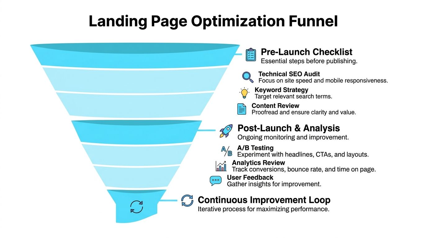
Protect page speed before traffic arrives
Slow pages waste paid clicks. They also distort test results, because a weak variant and a slow variant are not the same problem.
Builders can create very different performance outcomes depending on how they render pages, how many scripts they load, and whether the campaign page inherits the same theme and app weight as the rest of the store. Some setups stay fast even with richer creative. Others get sluggish as soon as reviews, popups, heatmaps, and upsell tools stack together. Headless delivery used by tools such as GemPages and Instant Commerce can reduce some of that overhead by serving pages through a separate delivery layer instead of pushing every campaign through the same storefront setup.
A pre-launch speed check should cover the page as it will run in market:
Compress hero images and background media: Large visuals are often the first avoidable bottleneck.
Remove scripts that do not support the campaign goal: Storewide app code does not need to appear on every landing page.
Audit third-party widgets together: Reviews, chat, popups, and analytics tags can create cumulative delay.
Test on mobile networks: Builder previews rarely show the actual experience of a slower connection.
Check post-consent behavior: Some pages load acceptably at first, then slow down once tracking and personalization scripts fire.
For a broader performance checklist, use these Shopify speed optimization tips for your online store performance.
Handle SEO during publishing, not later
Many campaign pages are paid-first assets, but basic SEO work still matters. It improves page clarity, supports sharing, and prevents messy indexing if the page starts attracting organic traffic or backlinks.
The common failure is not technical complexity. It is rushed publishing. Teams finish design, connect tracking, QA the form, and skip titles, meta descriptions, alt text, and canonical decisions because launch is already late.
A cleaner publish checklist looks like this:
Write a title that matches the offer and query intent.
Set a meta description that supports the click instead of repeating the headline.
Use a readable URL slug tied to the campaign or product.
Keep one clear H1 and a logical heading structure below it.
Add alt text where images carry product or feature meaning.
Decide whether the page should be indexed, especially for short-lived promos.
Teams trying to improve ecommerce conversion rates usually get better results from this kind of cleanup than from another round of cosmetic edits. Clear metadata, faster loads, and sharper message match reduce friction before any major redesign happens.
Run tests you can trust
A/B testing breaks down when the workflow is sloppy. This is one of the roadblocks basic tutorials skip. A variant is only useful if tracking is consistent, page speed is similar across versions, and the builder does not introduce layout or app conflicts that muddy the result.
Start with one meaningful hypothesis. Test the hero headline, offer framing, CTA copy, review placement, or page length. Do not change all of them at once unless the goal is a full-page replacement and the traffic volume can support it.
A practical testing rhythm works well:
Pick one primary metric: Usually signup rate, add-to-cart rate, or purchase rate.
Watch supporting behavior: Scroll depth, bounce rate, and click distribution help explain why a version won or lost.
Keep integrations identical across variants: Different popup timing, different event firing, or broken attribution can invalidate the test.
Log every change: Record the hypothesis, date range, audience source, and result.
Push winners into production quickly: Insights lose value when they sit in a backlog while traffic keeps hitting the weaker page.
The point is not constant experimentation for its own sake. The point is to build a repeatable workflow where strategy, build quality, integrations, and testing all hold together after launch.
What usually causes a landing page launch to go wrong
The most common issues are muddy messaging, poor mobile layout, broken integrations, and launching without a test plan. A page can look polished and still underperform if the offer isn’t clear or the stack isn’t connected.
Instant page builder fits this workflow for teams that want to build, test, and publish Shopify landing pages without custom code while keeping data connected across tools like Klaviyo, Yotpo, Recharge, and Shopify itself. Merchants comparing builders can review Instant alongside other options and judge it on the factors that matter most in practice: speed, flexibility, integrations, and how quickly the team can move from idea to live page.


