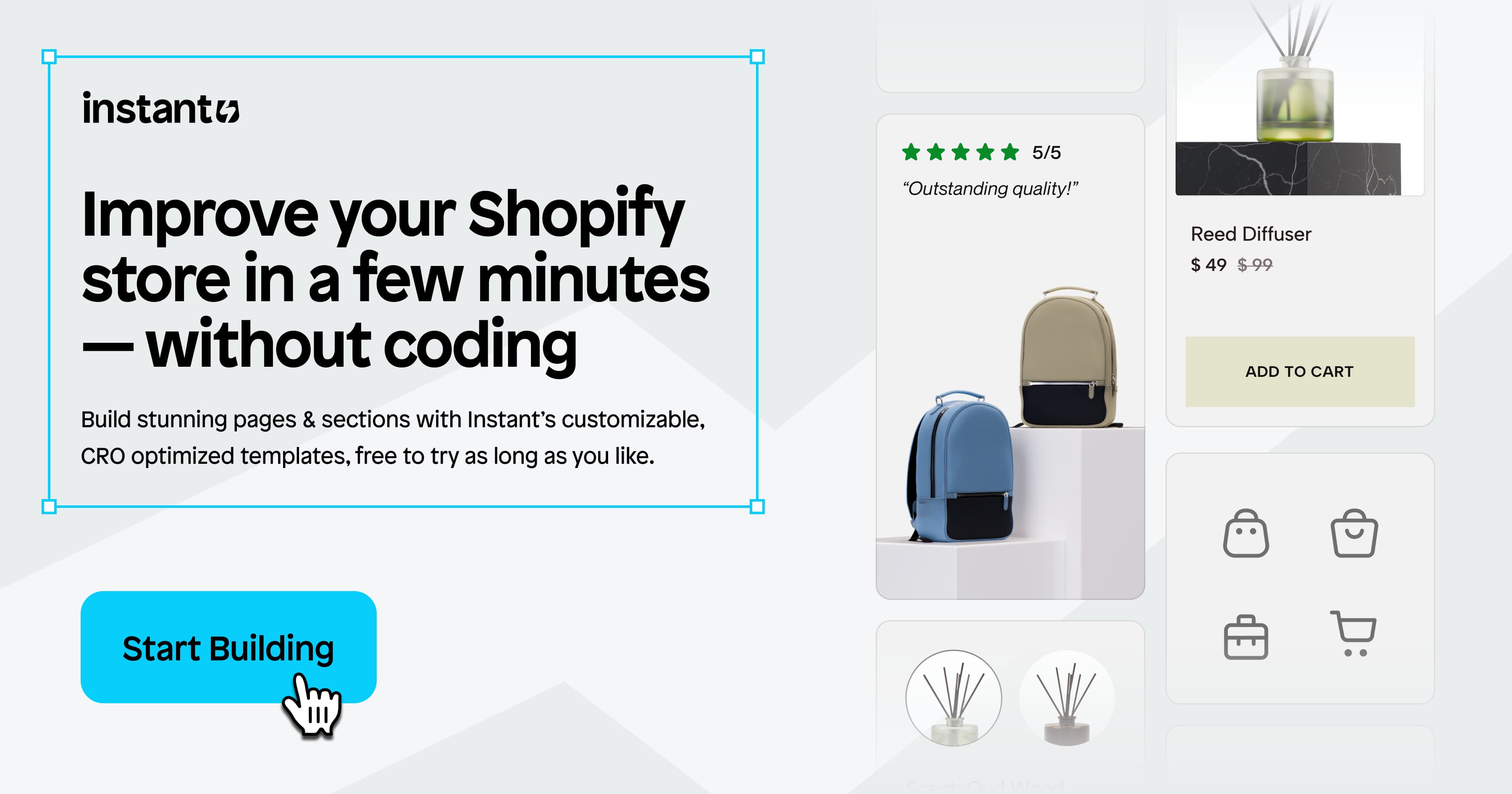
If you're running a Shopify store, chances are you're always looking for ways to increase conversions, boost average order value, and improve the customer journey. But optimizing your storefront shouldn’t require a developer or a complete redesign.
That’s where Instant Shopify Store Builder comes in.
This checklist is built for Shopify brands who want to optimize their store design for conversions using Instant’s intuitive no-code tools. Whether you're launching a new homepage, launching your new product, or reworking your product detail pages (PDPs), these are the exact features and actions you can take to drive better results without waiting on dev time.
Here’s what we’ll be covering:
Homepage CRO checklist
Product page CRO checklist
Coming soon/waitlist page CRO checklist
Shopify homepage CRO checklist:
Your Shopify homepage sets the tone for your entire store. It should clearly communicate your brand’s value, make products easy to explore, and help customers quickly understand your offer. And the faster they find what they’re looking for, the more likely they are to convert!
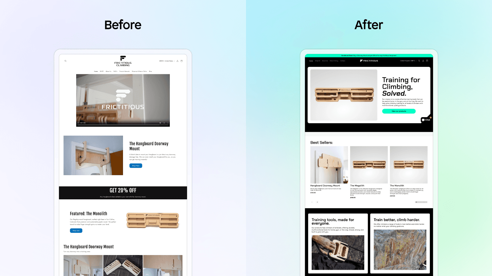
For example, Frictitious Climbing built an entirely new homepage in Instant, and experienced a significant conversion lift and decrease in customer support inquires.
With Instant, you can upgrade your current homepage by adding custom theme sections or set any page as your Shopify homepage.
Here are key optimizations you can make to improve your homepage performance:
1. Announcement banner bar
Adding an announcement bar to the top of your homepage offers the perfect place to communicate information to your visitors, including discounts/sales, new collection drops, countdown timers till a deal goes live, holiday promotions, free shipping info, and more.
How to optimize your announcement bar:
Keep it concise: Aim for one clear, benefit-driven message.
Use urgency or scarcity: Highlight limited-time offers or low stock to drive action.
Include a clickable link: Direct shoppers where you want them to go.
Make it mobile-friendly: Ensure text isn’t cut off or hard to tap on small screens.
Use contrasting colors or a gradient: Make the banner stand out without clashing with your brand.
Highlight free shipping or returns: These perks can boost trust and conversion.
Test different messages: Try promoting different offers or benefits and see what performs best.
Sticky banner: If you want to ensure your banner stays in view while scrolling, use Instant’s position sticky feature.
Instant’s Template Library has multiple banner bars you can customize to match your Shopify theme.
2. Hero section
Start your homepage with a strong hero section that clearly communicates what you sell and why customers should care. Be sure to include a bold headline, a subheading with supporting info, and a clear call-to-action (CTA)!
How to optimize your hero section:
Lead with a clear value proposition: Tell visitors what you sell and why they should care in 1–2 punchy lines.
Use high-quality visuals: Feature your product in action or show the transformation it creates.
Add a background video or animation: Captivate visitors with an embedded background video or animation (e.g., you could embed Spline 3D elements).
Have a strong primary CTA: Make the next step obvious (e.g., “Shop Bestsellers” or “Build Your Box”).
Make it above-the-fold: Ensure key info (headline + CTA) is visible without scrolling.
Highlight social proof: Embed star ratings icon from your product reviews app of choice and add a quote (e.g., “Over 10,000 5-star reviews”).
For example, Spacegoods used Instant to build a high-performing homepage that starts with a strong hero section:

Their hero section is designed to instantly capture attention and build trust with potential customers. It features a high-resolution product image, an impactful title, prominent star ratings, and a clear call-to-action button that directs users to the product page.
Learn more: Analyzing Spacegoods’ homepage layout (and what makes it so effective!)
3. Best sellers slider section
Remember, your best sellers are often best sellers for a reason: they tend to convert well, so putting them front and center can boost sales!
Product or category sliders are a space-efficient way to highlight these top converting products and give new visitors an overview of the diversity of your product catalog. This will speed up the path to purchase and signal what your brand is known for or what customers love most, reinforcing your brand identity.
How to optimize your best sellers section:
Lead with a headline: Use something persuasive like “Our Most-Loved Products” or “Featured Products” or “Best sellers”.
Showcase social proof: Include star ratings, reviews, or customer quotes directly beneath product cards.
Use urgency if relevant: Tag items with “Almost Gone” or “Selling Fast” to encourage quicker decisions.
Keep the layout simple and scannable: Use consistent image sizes and clear product titles.
Enable quick add-to-cart: Reduce friction with buttons like “Add to Bag” or “Quick Shop.”
Add chevrons: Add arrow signs to help the visitors click through your product offerings.
Prioritize mobile usability: Ensure smooth scrolling, readable pricing, and tappable CTAs.
For example, Prodigy Disc saw that 70% of their traffic was coming from mobile, so they added custom, mobile-first sections built with Instant and saw a significant conversion rate increase!
“With Instant, we crafted a custom slider for our homepage, spotlighting our key collections,” says Ben Rosenberg, Head of E-commerce & Digital Marketing, “This straightforward enhancement significantly improved our conversion rates, demonstrating the power of effective visualization.”
Keep reading: How Prodigy Disc improved their homepage conversion rate with Instant.
4. Trust-building elements
Including these trust-building optimizations helps turn casual visitors into confident buyers by reducing friction and building trust early in the customer journey. Each section on your homepage—from the hero to best sellers to trust signals—plays a key role in guiding shoppers toward conversion. By being intentional with layout, copy, and social proof, you create a seamless experience that encourages action.
How to optimize your homepage to build trust:
Use real customer reviews: Include star ratings, photos, and short quotes from happy customers.
Add a moving logo ticker: Showcase recognizable logos, press mentions, brand partners, or retailers you work with to boost credibility.
Include "As seen in" or media badges: If your brand has been featured anywhere, flaunt it!
Highlight guarantees or policies: Call out things like “30-day free returns,” “Satisfaction guaranteed,” or “Ships from the USA.”
Use founder or brand story blurbs: A short, authentic note from the founder helps humanize the brand and build connection.
Feature UGC or customer photos: Embed customer social media mentions, photos, videos, or quotes.
Add trust badges/icons: Secure checkout, payment options, or certifications (like vegan, cruelty-free, eco-friendly).
Keep it high up on the page: Don’t bury your trust elements at the bottom; make them visible early in the scroll.
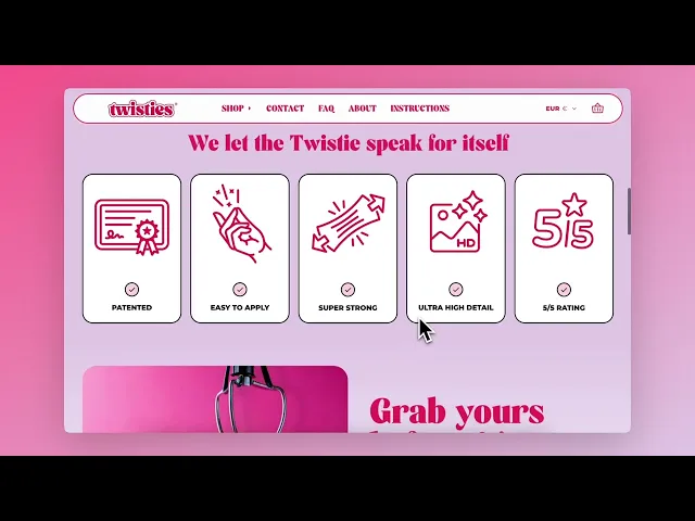
For example, Twisties' homepage incorporates a variety of these elements:
5. Navigation menu
Your navigation is one of the first touchpoints shoppers interact with—and it often determines whether they stay or bounce. A cluttered or confusing menu adds friction, while a clear, intuitive one builds trust and helps shoppers find what they’re looking for faster.

The best navigation menus reduce decision fatigue, guide users toward high-converting pages, and make browsing effortless on both desktop and mobile.
How to optimize your navigation menu:
Keep it simple and clear: Use short, descriptive labels that shoppers instantly understand (e.g. “Shop All,” “New Arrivals,” “Best Sellers”).
Prioritize your top-converting categories: Put your highest-performing or most important links first.
Use dropdowns wisely: Organize dropdowns by category, benefit, or product type to reduce overwhelm.
Add a standout CTA: Highlight one action like “Take the Quiz” or “Build Your Box” in a contrasting color.
Language/currency selectors: Make it easy for shoppers across the globe.
Make it sticky on desktop and mobile: Keep your menu accessible as users scroll.
Limit the number of top-level items: Aim for 4–6 max to avoid decision fatigue.
Use icons or badges sparingly: Call attention to sales, new drops, or best sellers without making it feel cluttered.
Provide helpful links: Add links in the footer to your return & privacy policy, shipping information, terms & conditions, and FAQ page.
For additional tips on how to create an easy to navigate nav menu, read our guide.
6. Pop-ups and overlays
Pop-ups can either boost your conversion rates—or frustrate users and increase bounce. The difference comes down to timing, relevance, and design. Used thoughtfully, pop-ups are powerful tools for capturing emails, preventing cart abandonment, and promoting limited-time offers.
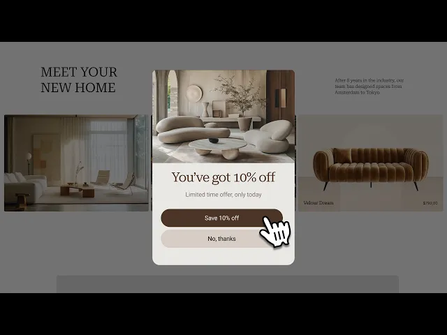
With Instant, you can quickly add and customize pop-ups and overlays to match your brand, target the right segments, and drive action without hurting the user experience.
How to optimize pop-ups and overlays:
Offer a compelling incentive: Give users a reason to engage, like 10% off, early access, or free shipping.
Keep messaging short and clear: One benefit, one CTA. Avoid overwhelming users with too much copy.
Make it mobile-friendly: Ensure buttons are tappable and text fits small screens without zooming.
Add delay timers: Don’t interrupt users immediately—trigger pop-ups after 10–15 seconds or on scroll.
Test different formats: Try overlays, slide-ins, or sticky bars to see what works best for your audience.
Make it easy to close: Always include a clear “X” or “No thanks” option—respecting the user builds trust.
Pro tip: You can also use overlays to highlight bundle options, offer upgrades, or promote limited-time deals right on the PDP, without taking users to a new page.
Extra resources: How to build your homepage with Instant
To learn how to build your Shopify homepage in Instant, you can watch our tutorial or read this guide.
Product page CRO checklist:
Your product detail page (PDP) is where customers make buying decisions—so optimizing it is one of the most powerful ways to increase conversions and reduce drop-off. A high-performing PDP should remove doubt, showcase the product clearly, and make purchasing effortless.
With Instant, you can redesign any PDP section-by-section without touching code or relying on devs.
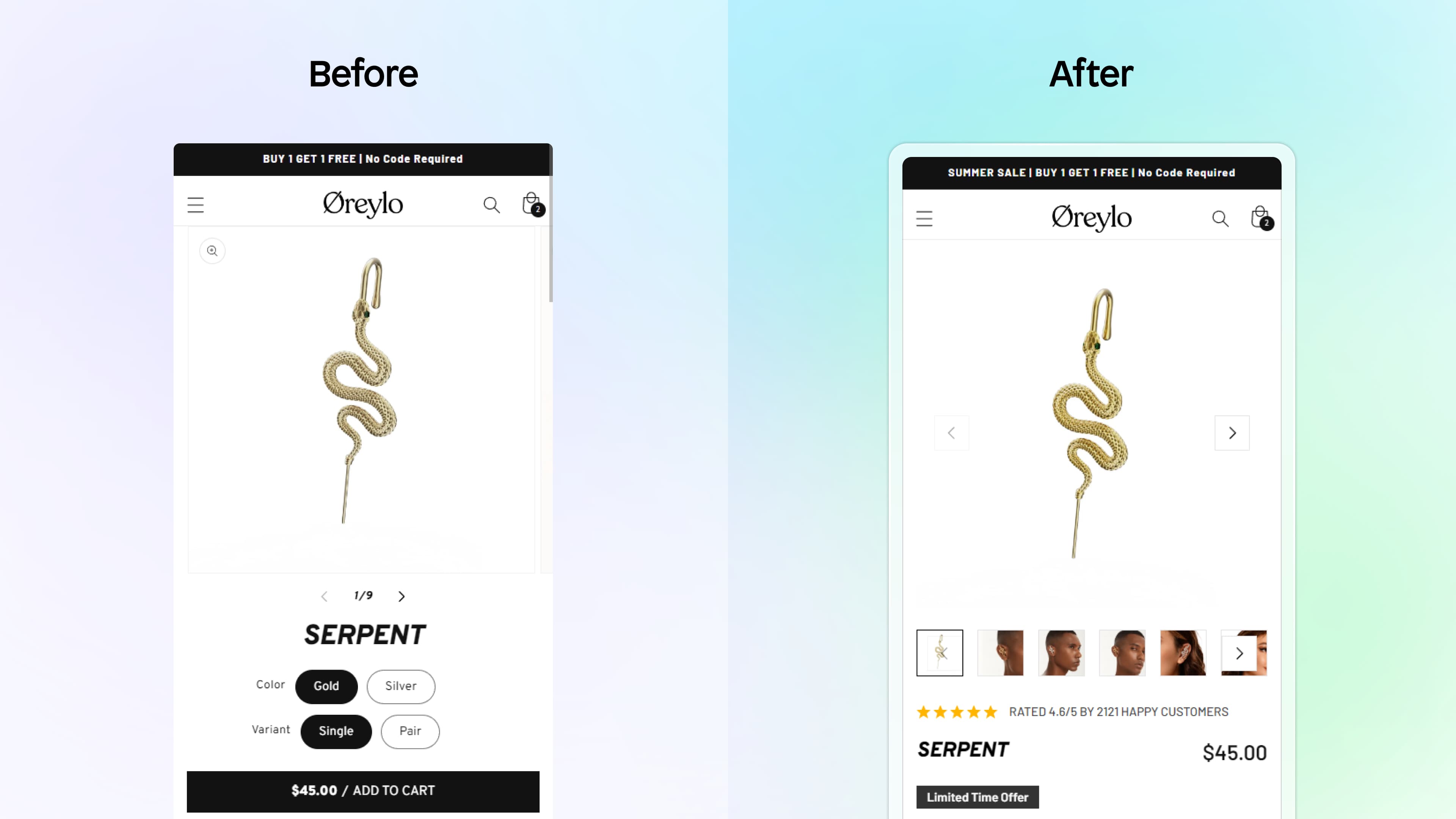
For example, Seven Ecom optimized Oreylo's PDP design, leading to an additional $202,452 in annual profit.
Here are the key areas to focus on to optimize your PDP within Instant:
1. Product gallery & visuals
Your visuals are the first thing customers look at—make them inspiring and informative. Help visitors imagine themselves using your product and eliminate any uncertainty about what they’ll receive.
How to optimize your visuals:
Include multiple angles: Show front, back, close-ups, and the product in context.
Add lifestyle images: Help customers imagine themselves using the product.
Embed short product videos: Demonstrate use or show the product in motion.
Use consistent image dimensions: Prevent layout shifts that interrupt the experience.
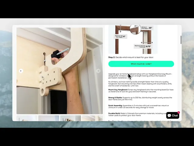
Frictitious Climbing's PDP is a good example of showing images of the product in use, so customers can better understand how it works:
2. Product titles & descriptions
Titles and descriptions should do more than describe—they should sell. This is your chance to communicate the value, features, and uniqueness of your product in a few clear lines.
How to optimize your PDP text:
Use benefit-led titles: Focus on what the product does, not just what it is.
Keep descriptions scannable: Use bullet points and short sentences.
Address common objections: Include FAQs or info on sizing, ingredients, materials, etc.
Optimize for SEO: Use searchable keywords naturally.
Personalize copy: Use your brand voice—whether fun, helpful, bold, or minimalist.
Pro tip: You can use Instant’s Practical AI features to help you improve your text or generate ideas!
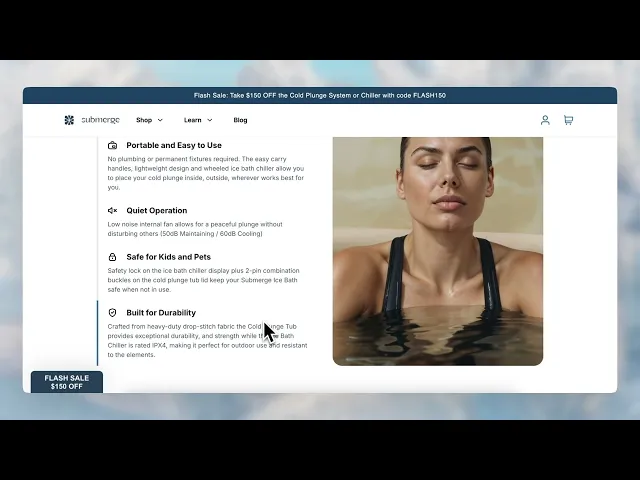
Submerge Ice Bath's PDP is a good example of well-optimized text:
3. Pricing, variants & CTAs
This is the most conversion-critical section of the page. Don’t let confusion around pricing, options, or the next step cost you the sale.
How to optimize pricing & CTA blocks:
Make your CTA stand out: Use a bold button with clear copy (“Add to Cart”).
Show variant availability: Don’t hide sizing or color options.
Use urgency: Display low-stock indicators or shipping cutoffs.
Show savings: Highlight discounts (“Save 20%”) or compare at prices.
Keep CTAs sticky: Use Instant’s sticky tools so “Add to Cart” follows the shopper on scroll.
4. Social proof & trust signals
Shoppers want to know that other people like them have bought—and loved—your product. Add credibility where it matters most.
How to optimize your trust section:
Add a star rating icon: Easily integrate this from your current Shopify review app.
Show reviews near your CTA: Make it easy to read ratings before purchasing.
Embed customer photos or videos: Let shoppers see real-world use cases.
Add expert quotes or influencer shoutouts: Boost authority.
Use media badges or logos: Highlight “As Seen In” features if you have them.
Include badges like “Cruelty-Free,” “BPA-Free,” or “Sustainably Made” for extra reassurance.
5. Delivery info & returns policy
Shipping and return details can make or break a sale—especially for first-time customers. Keep this info visible and easy to understand.
How to build trust with logistics:
Display shipping perks: Call out free shipping thresholds or same-day dispatch.
Include delivery timelines: “Arrives in 2–4 business days.”
Summarize return policies: Make it reassuring and simple.
Add icons or visual cues: Help users scan the info quickly.
Extra resources: Building your Shopify PDP template
To learn how to build a Shopify product page template in Instant, you can watch our tutorial or read this guide.
Coming Soon / Waitlist page CRO checklist:
Even if your product isn’t ready to ship, you can still start building demand. A high-converting “Coming Soon” or waitlist page helps you collect emails, build anticipation, and validate your offer before launch.
Use Instant to launch a high-converting coming soon page in minutes with email opt-ins, countdown timers, and dynamic visuals.
For example, RARE BEEHIVE created this waitlist page with an embedded Klaviyo form:

Here’s how to create an effective pre-launch experience:
1. Lead with a teaser
First impressions matter. Grab attention and build excitement with a compelling headline and visual that leaves visitors wanting more.
How to grab attention:
Use a bold headline: Something like “Coming Soon” or “Launching This Month.”
Add a subheading with context: Explain what’s launching and why it matters.
Include a product image or sneak peek: Even blurred or partial views work.
Use a countdown timer: Create urgency with a visual deadline.
2. Collect emails (or phone numbers)
Turn interest into a subscriber list you can launch to. Instant integrates with Klaviyo and Omnisend to make embedding forms into your coming soon pages easy.
How to optimize your signup form:
Use a compelling reason to sign up: (“Be first in line,” “Get early access,” “Claim your exclusive discount.”)
Limit form fields: Stick to name and email (or just email).
Use an inline form or modal popup: Don’t interrupt the flow.
Offer an incentive: Early access, limited inventory alert, or special launch offer.
3. Build social proof
Even before your product launches, you can still build credibility and trust. Social proof helps reassure potential customers that your brand is legit, your product is worth the wait, and others are already excited about it.
How to optimize early trust:
Include press mentions or founder blurbs: Highlight any media coverage or share a personal note from the founder to build connection.
Show social momentum: Add a line like “Join 1,200+ people already on the waitlist” to create a sense of popularity.
Add early testimonials: Feature quotes from testers, beta users, or influencers who’ve tried the product.
Embed quotes from your team: Let potential customers hear why the launch matters and what inspired the product.
Extra resources: How to build a Shopify waitlist page:
To learn how to build a Shopify waitlist page in Instant, you can read this guide.
or these blogs:
Final thoughts: Build faster, convert smarter
Conversion rate optimization doesn’t have to mean months of A/B testing or expensive dev work. With Instant, you can take control of your storefront and make meaningful improvements in minutes, not weeks.
Whether you’re revamping your homepage, launching a landing page, or prepping for a product drop, this checklist gives you a clear roadmap to boost conversions and create a smoother shopping experience.
Start by implementing just 2–3 of these changes, measure the impact, then keep iterating from there.
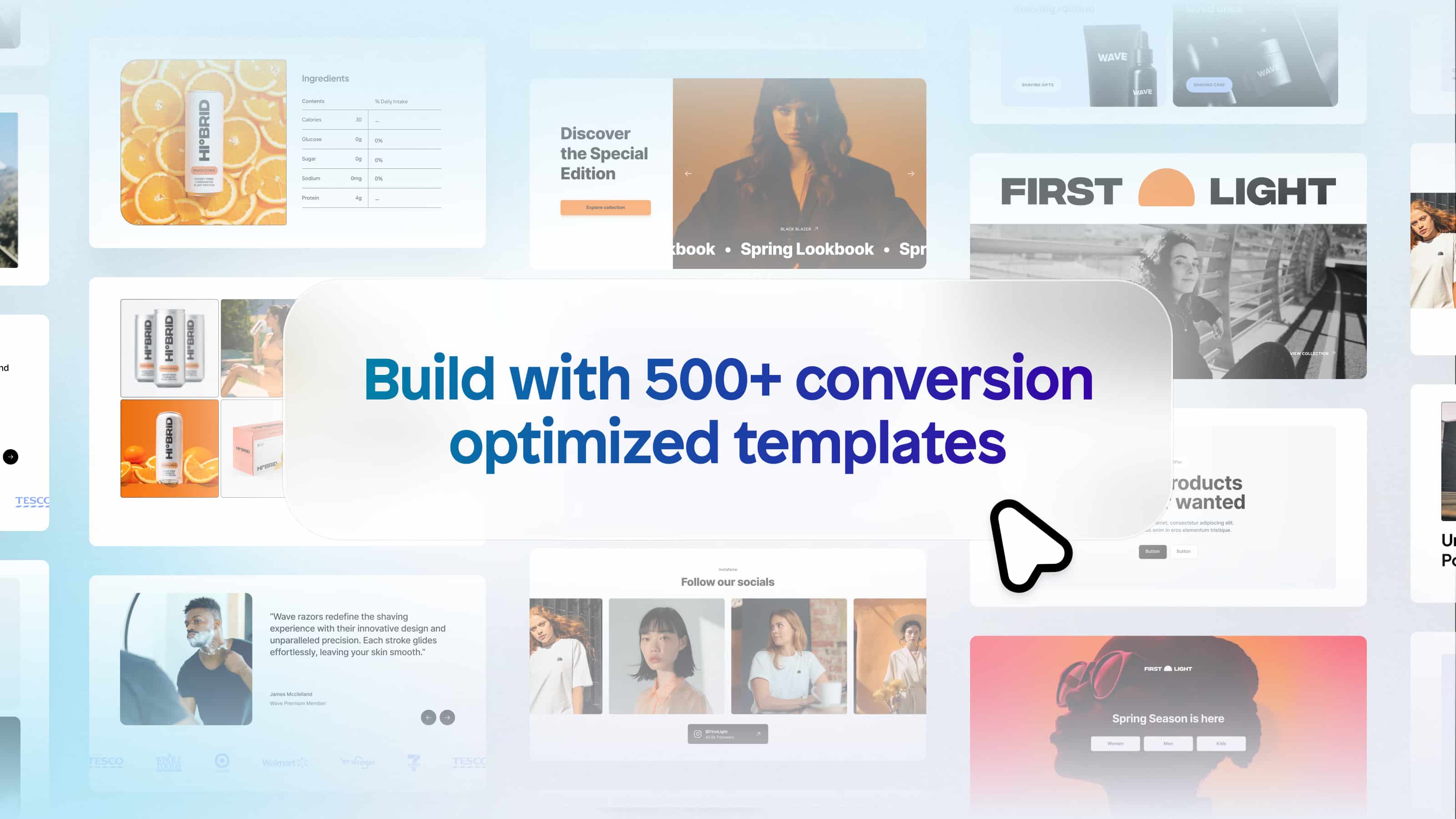
Need inspiration? Browse templates in the Instant Library or explore our customer examples to see what’s working for other high-growth brands.
Ready to optimize your Shopify store?
👉 Get started with Instant for free and build your first high-converting page today—no dev required.